This Is the Place, Apparently
By Julia Silge
January 3, 2016
My family and I moved to Utah about 5 years ago and we have found ourselves thoroughly in love in with our new home state. I didn’t know much about it before we began the process of contemplating a move here, and I find that is often true of many people. Let’s use some choropleth maps and demographic exploration to learn a bit more about this place I call home now.
I’ve really enjoyed learning how to use the choroplethr package in R developed by Ari Lamstein; he offers a
free email course for getting started using it. The package comes with basic demographic statistics from the 2013 American Community Survey, so let’s start by looking at some of those for the counties in Utah.
library(choroplethr)
library(ggplot2)
library(RColorBrewer)
data(df_county_demographics)
df_county_demographics$value <- df_county_demographics$total_population
choro = CountyChoropleth$new(df_county_demographics)
choro$set_zoom("utah")
choro$title = "Where Do People in Utah Live?"
choro$set_num_colors(1)
choro$ggplot_scale = scale_fill_gradientn(name = "Population", colours = brewer.pal(8, "GnBu"))
choro$render()
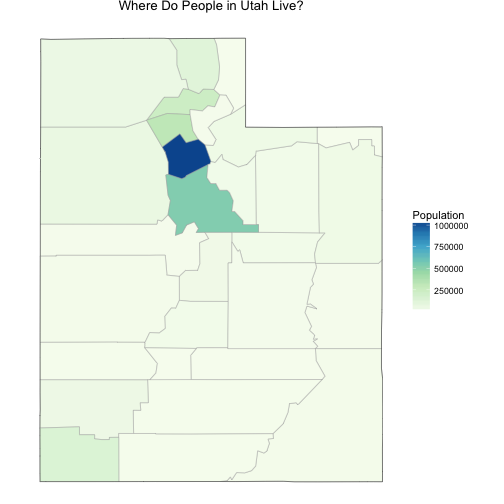
You can see that we are not very evenly distributed here in Utah. The population is concentrated where I live in Salt Lake County (where Salt Lake City is), with a lower level of population to the north and south in Davis and Utah Counties, and then many very rural counties.
df_county_demographics$value <- df_county_demographics$median_rent
choro = CountyChoropleth$new(df_county_demographics)
choro$set_zoom("utah")
choro$title = "Median Rent in Utah Counties"
choro$set_num_colors(1)
choro$ggplot_scale = scale_fill_gradientn(name = "Median Rent ($)", colours = brewer.pal(8, "GnBu"))
choro$render() + geom_text(data = data.frame(long = -111.88, lat = 40.67, label = "Salt Lake"),
                           aes(long, lat, label = label, group = NULL), color = "black", size = 3)
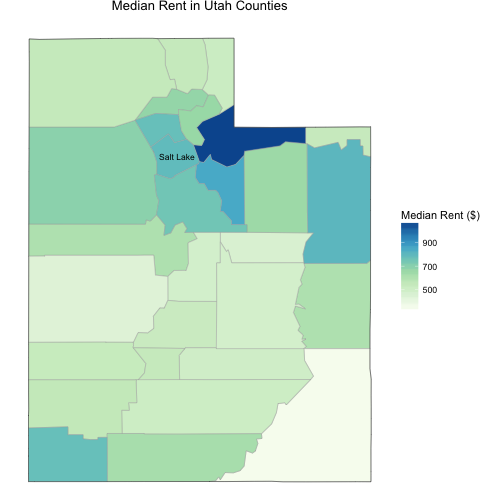
The cost of renting a place to live is distributed very differently from population, which is rather unusual compared to most states. That expensive county to the east of Salt Lake is Summit County, up in the Wasatch Mountains. It’s mountains, ski resorts, Park City, the Sundance Film Festival, and such up there. This time of year it is all fancy skiing, but it is pretty darn nice during any season.
df_county_demographics$value <- df_county_demographics$percent_white
choro = CountyChoropleth$new(df_county_demographics)
choro$set_zoom("utah")
choro$title = "How Much of Utah's Population Is White?"
choro$set_num_colors(1)
choro$ggplot_scale = scale_fill_gradientn(name = "Percent", colours = brewer.pal(8, "GnBu"))
choro$render() + geom_text(data = data.frame(long = -111.88, lat = 40.67, label = "Salt Lake"),
                           aes(long, lat, label = label, group = NULL), color = "black", size = 3)
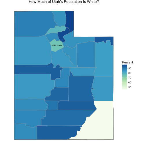
The racial/ethnic demographics of Utah are not super diverse, to put it mildly. The county where I live is more diverse than most of the state, and as in many counties that contain a good-sized city, certain neighborhoods and suburbs are significantly more and less white than average. This means it is possible to experience more diversity in Salt Lake County than the average for the county reflects. The unusual county in the southeast corner (Utah’s part of the Four Corners) is San Juan County; it is very rural with a low population that is about 50% Native American.
So there you have a couple of basic demographic maps!
Things Not to Discuss At a Dinner Party
The real things that everyone wants to know when I say I live in Utah:
- whether I am Mormon
- what it is like to live in a place where the LDS church is so important culturally and historically
The answer to the first question is no, but Mormons are among my neighbors and friends now so the way these questions are asked often makes me uneasy. Religion may not make for polite dinner conversation but it certainly makes for interesting demographics, at least here where I live.
The Association of Statisticians of American Religious Bodies (ASARB) publishes data on the number of congregations and adherents for many religious groups for each county in the United States. The last large “religion census” they published was in 2010; they make some data exploration and visualization tools available here, the original data file available here, and the codebook available here.
The file made available at the Association of Religion Data Archives is an SPSS file. I have never touched SPSS at all but the foreign library worked perfectly and I had no problems accessing the file. After opening the file, let’s keep only the Utah counties and then get rid of white space and the word “County” in the county names.
library(foreign)
library(dplyr)
counties <- read.spss("./ReligiousMembershipCounties2010.SAV",
                      to.data.frame = TRUE)
counties <- counties[counties$STABBR == "UT",]
counties$CNTYNAME <- as.character(counties$CNTYNAME)
counties$CNTYNAME <- sub("County", "", counties$CNTYNAME)
counties$CNTYNAME <- sub("\\s+$", "", counties$CNTYNAME)
Next, let’s get rid of all the denomination columns that have zero adherents in Utah (this was quite a few; we don’t need them hanging around cluttering things up).
counties <- counties[,!sapply(counties, function(x) all(is.na(x)))]
Now let’s make a data frame with the most important columns, give them some better column names, adjust the data types, and set the NA values to zero, since that is what they mean in this case.
myDF <- as.data.frame(cbind(counties$CNTYNAME, counties$FIPS, counties$POP2010,
                            counties$TOTRATE, counties$LDSRATE, counties$MPRTRATE,
                            counties$EVANRATE, counties$CATHRATE, counties$OTHRATE,
                            counties$ORTHRATE, counties$BPRTRATE))
colnames(myDF) <- c("county", "region", "population", "total", "LDS",
                    "mainline", "evangelical", "catholic", "originalother",
                    "orthodox", "blackprot")
myDF[,2:11] <- lapply(myDF[,2:11], as.character)
myDF[,2:11] <- lapply(myDF[,2:11], as.numeric)
myDF[is.na(myDF)] <- 0
The “other” category in the original file included LDS so we definitely want to take that out since we will be looking at that separately. We might as well add the Orthodox and Black Protestant numbers (originally separate columns, not in the original “other” column) back in to our “other” category, since they are very small numbers here in Utah.
myDF <- mutate(myDF, other = (originalother - LDS + orthodox + blackprot))
We have been adding and subtracting these numbers which are rates per 1000 population, so let’s check to see that what we have ended up with makes sense. Let’s compare the total of all of our categories to the total from the original file.
myDF <- mutate(myDF, allchurchytypes =
                       (LDS + mainline + evangelical + catholic + other))
myDF <- mutate(myDF, difference = (total - allchurchytypes))
c(mean(myDF$difference), sd(myDF$difference))
## [1] 0.0008812261 0.0056295024
If everything was measured with perfect precision, these numbers should both be zero. This looks pretty good, especially considering that some of the counties have populations only in the 1000s.
The other thing we will want to address here are the people who are not adherents to any of the reporting religious groups. The ASARB is clear that this is not directly a measure of atheism or agnosticisim. They surveyed religious groups and did as thorough a census as they could manage; they did not survey the population and ask them, “Hey, you there, do you believe in God? If so, what kind?” However, the number here must be some kind of an estimate of the religiously unaffiliated. At the very least, it is an upper limit on those who do not claim an active religious affiliation.
myDF <- mutate(myDF, unclaimed = (1000. - allchurchytypes))
Now let’s make some maps!
myDF$value <- myDF$LDS
choro = CountyChoropleth$new(myDF)
choro$set_zoom("utah")
choro$title = "LDS Adherents by County"
choro$set_num_colors(1)
choro$ggplot_scale = scale_fill_gradientn(name = "Adherence rate\n(per 1000 population)",
                                          colours = brewer.pal(8, "YlGnBu"))
choro$render() + geom_text(data = data.frame(long = -111.88, lat = 40.67, label = "Salt Lake"),
                           aes(long, lat, label = label, group = NULL), color = "black", size = 3)
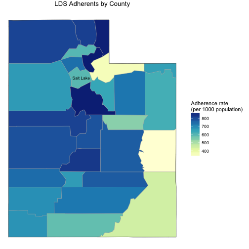
There are in fact lots of LDS people here in Utah; most of the counties have LDS adherence rates that are over 50%, some of them over 80%. Most of these counties are also very rural with low populations, but that county just south of Salt Lake is Utah County, the second most populous county in Utah and the home of Brigham Young University.
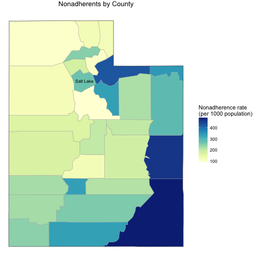
Behind being Mormon, the next most common religious affiliation in most Utah counties is to be not affiliated with any of the religious groups surveyed in the census. There appear to be some east-to-west differences here.
myDF$value <- myDF$unclaimed
choro = CountyChoropleth$new(myDF)
choro$set_zoom("utah")
choro$title = "Nonadherents by County"
choro$set_num_colors(1)
choro$ggplot_scale = scale_fill_gradientn(name = "Nonadherence rate\n(per 1000 population)",
                                          colours = brewer.pal(8, "YlGnBu"))
choro$render() + geom_text(data = data.frame(long = -111.88, lat = 40.67, label = "Salt Lake"),
                           aes(long, lat, label = label, group = NULL), color = "black", size = 3)
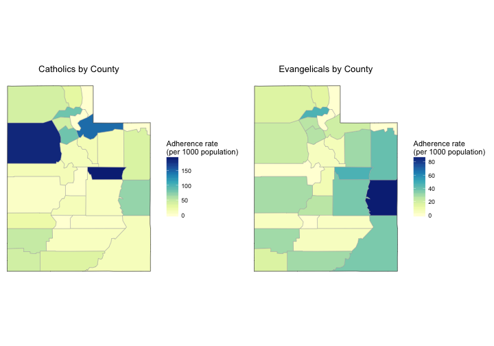
Let’s look at the maps for Catholic and evangelical religious groups, the two next most common affiliations. These numbers are significantly lower.
library(gridExtra)
myDF$value <- myDF$catholic
choro1 = CountyChoropleth$new(myDF)
choro1$set_zoom("utah")
choro1$title = "Catholics by County"
choro1$set_num_colors(1)
choro1$ggplot_scale = scale_fill_gradientn(name = "Adherence rate\n(per 1000 population)",
                                          colours = brewer.pal(8, "YlGnBu"))
myDF$value <- myDF$evangelical
choro2 = CountyChoropleth$new(myDF)
choro2$set_zoom("utah")
choro2$title = "Evangelicals by County"
choro2$set_num_colors(1)
choro2$ggplot_scale = scale_fill_gradientn(name = "Adherence rate\n(per 1000 population)",
                                          colours = brewer.pal(8, "YlGnBu"))

grid.arrange(choro1$render(), choro2$render(), ncol = 2)
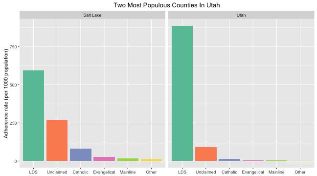
Crossing County Lines
Let’s make some bar charts to see the breakdown of religious affiliation in the counties in Utah. We can make a “tidy” data frame for plotting, with the religion column a factor that is reordered so that it is ordered from highest to lowest for Salt Lake County.
library(reshape2)
meltedDF <- melt(myDF[,c(1,5:8,12,15)])
colnames(meltedDF) <- c("county", "religion", "rate")
meltedDF$religion <- as.factor(meltedDF$religion)
meltedDF$religion <- factor(meltedDF$religion,
                           levels(meltedDF$religion)[c(1,6,4,3,5,2)])
First, let’s look only at the two most populous counties in Utah. These are counties that border each other, Salt Lake County (my home) and Utah County, but they are quite different from each other. The rates for Salt Lake County actually seem rather high for LDS and rather low for everything else to me based on my impressions of who I live among, but I live in a downtown neighborhood near the University of Utah; the county as a whole includes the suburbs which are demographically more like Utah County.
ggplot(meltedDF[(meltedDF$county == "Salt Lake"| meltedDF$county == "Utah"),],
       aes(x = religion, y = rate, group = county, fill = religion)) +
        geom_bar(stat = "identity") +
        facet_wrap(~county, ncol = 2) +
        scale_fill_brewer(palette = "Set2") +
        theme(legend.position="none", axis.title.x = element_blank()) +
        ylab("Adherence rate (per 1000 population)") +
        ggtitle("Two Most Populous Counties In Utah") +
        scale_x_discrete(labels=c("LDS", "Unclaimed", "Catholic", "Evangelical",
                                  "Mainline", "Other"))
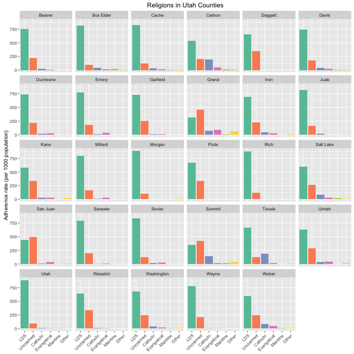
Now let’s look at all the counties. You can see some interesting patterns and examples here; counties like Utah County, Cache County, and others have extremely high LDS rates while counties such as Summit County and San Juan County actually have fewer LDS adherents than religiously unaffiliated people.
ggplot(meltedDF, aes(x = religion, y = rate, group = county, fill = religion)) +
        geom_bar(stat = "identity") +
        facet_wrap(~county, ncol = 6) +
        scale_fill_brewer(palette = "Set2") +
        theme(legend.position="none", axis.title.x = element_blank(),
              axis.text.x= element_text(angle=45, hjust = 1)) +
        ylab("Adherence rate (per 1000 population)") +
        ggtitle("Religions in Utah Counties") +
        scale_x_discrete(labels=c("LDS", "Unclaimed", "Catholic", "Evangelical",
                                  "Mainline", "Other"))
The End
The religion data used here are from 2010; you might be wondering how things have changed since then. The best info I could find on that is some work done by Pam Perlich, a demographer at the University of Utah, in 2014; the local paper reported on the results with a headline that asserts some increase in the Mormon populace, but the actual numbers look mostly flat to me. The R Markdown file used to make this blog post is available here. I enjoyed making these maps and doing some demographic exploration of the place I call home these days; I am happy to hear feedback and suggestions as I continue to learn new skills.
The religion data were downloaded from the Association of Religion Data Archives, www.TheARDA.com, and were collected by Clifford Grammich, Kirk Hadaway, Richard Houseal, Dale E. Jones, Alexei Krindatch, Richie Stanley, and Richard H. Taylor.
Apologies to Brigham Young for my blog title.