Death Comes to Us All
By Julia Silge
February 5, 2016
I have been working with a data set on causes of death in my adopted home state of Utah for a little while now, and I had been struggling with the best way to visualize it. This week,
David Robinson released the gganimate package to create animated ggplot2 plots and I thought “AH HA! This is what I have needing.” The data on causes of death in Utah is available
here via Utah’s Open Data Catalog and can be accessed via Socrata Open Data API.
library(RSocrata)
deathDF <- read.socrata("https://opendata.utah.gov/resource/fu2n-aa2y.csv")
colnames(deathDF) <- c("cause", "year", "number", "notes", "population",
                    "adjustedrate", "LL95CI", "UL95CI", "standarderror")
I have been having a lot of fun exploring Utah’s Open Data Catalog but I’ve got to admit that this particular data set is a bit of a mess compared to the other ones I have used. Let’s make this more amenable to analysis. To start with, what are we dealing with?
dim(deathDF)
## [1] 655 9
sapply(deathDF, class)
##         cause          year        number         notes    population
##      "factor"     "integer"     "integer"      "factor"      "factor"
##  adjustedrate        LL95CI        UL95CI standarderror
##      "factor"      "factor"      "factor"      "factor"
There are some rows that contain sums of the other rows and are not actual observations of numbers of deaths in years, so let’s get rid of those. After that, let’s remake the cause of death factor because it had entries that were links to a website and other not-so-useful information.
deathDF <- deathDF[!is.na(deathDF$year),]
deathDF$cause <- as.factor(as.character(deathDF$cause))
The data set includes 46 different causes of death.
The population column contains commas (!) and is a factor so let’s get this fixed and transform it to numeric values.
deathDF$population <- as.numeric(gsub("[[:punct:]]", "", deathDF$population))
summary(deathDF$population)
##    Min. 1st Qu.  Median    Mean 3rd Qu.    Max.    NA's
## 2193000 2325000 2526000 2541000 2774000 2901000      67
There are a handful of NA values for some inexplicable reason, but we will deal with that in a little bit. In the columns that record the age adjusted mortality rate, 95% confidence interval, and standard error, there are double asterisks (!!!) instead of zeroes or NA values for years and causes of death where no one died from that cause in that year.
deathDF[,6:9] <- apply(deathDF[,6:9], 2, function(x) gsub("\\*", "", x))
deathDF[,6:9] <- apply(deathDF[,6:9], 2, as.numeric)
There are some rows in this data set that do have a zero recorded (i.e. zero people died of a certain cause in a certain year), but then there are a whole bunch missing. This is going to make analysis and plotting difficult, so let’s complete this data frame. I
just read a great explanation of how tidyr uses complete to fill in missing rows and turn implicit missing values into explicit missing values. In our case here, these aren’t “missing” values so much as zeroes; we’ll get to that a bit later.
library(tidyr)
deathDF <- complete(deathDF, cause, year)
This data set had the total number of deaths and total age adjusted mortality rate on separate rows for each year, but it will be helpful to have these as columns for each observation. Let’s make a data frame of just the total numbers for each year and then join this data frame to the original one. This will also take care of those NA values in the population column.
library(dplyr)
totalDF <- deathDF[deathDF$cause == "Total",]
deathDF <- left_join(deathDF[,c("cause", "year", "number", "adjustedrate")],
                     totalDF[,c("year", "number", "population", "adjustedrate")],
                     by = "year")
colnames(deathDF) <- c("cause", "year", "number", "adjustedrate", "totalnumber",
                       "population", "totaladjustedrate")
Now let’s replace NA values with zeroes for the number of deaths and age adjusted mortality rate.
deathDF$number[is.na(deathDF$number)] <- 0
deathDF$adjustedrate[is.na(deathDF$adjustedrate)] <- 0
summary(deathDF$number)
##    Min. 1st Qu.  Median    Mean 3rd Qu.    Max.
##     0.0     4.0    32.5   473.2   172.2 12670.0
summary(deathDF$adjustedrate)
##    Min. 1st Qu.  Median    Mean 3rd Qu.    Max.
##    0.00    0.21    1.63   25.34    9.24  657.50
Are we done? I think we’re done. Let’s look at our cleaned, tidy data.
head(deathDF)
## Source: local data frame [6 x 7]
##
##                                cause  year number adjustedrate totalnumber
##                               (fctr) (int)  (dbl)        (dbl)       (int)
## 1 Acute bronchitis and bronchiolitis  1999      0            0        9959
## 2 Acute bronchitis and bronchiolitis  2000      0            0       10341
## 3 Acute bronchitis and bronchiolitis  2001      0            0       10233
## 4 Acute bronchitis and bronchiolitis  2002      0            0       10635
## 5 Acute bronchitis and bronchiolitis  2003      0            0       10672
## 6 Acute bronchitis and bronchiolitis  2004      0            0       10571
## Variables not shown: population (dbl), totaladjustedrate (dbl)
What are the most important causes of death in Utah? Let’s find the top 10 causes of death for the 15 years in this data set.
top10 <- deathDF[deathDF$cause != "Total",] %>%
        group_by(cause) %>% summarise(adjustedrate = mean(adjustedrate)) %>%
        top_n(10, adjustedrate) %>% arrange(desc(adjustedrate))
top10
## Source: local data frame [10 x 2]
##
##                                          cause adjustedrate
##                                         (fctr)        (dbl)
## 1                            Diseases of heart    164.78400
## 2                          Malignant neoplasms    136.81533
## 3                     Cerebrovascular diseases     46.25533
## 4                       Unintentional injuries     35.82467
## 5           Chronic lower respiratory diseases     33.51800
## 6                            Diabetes mellitus     28.01533
## 7                      Influenza and pneumonia     21.08067
## 8                          Alzheimer's disease     20.86467
## 9              Intentional self-harm (suicide)     16.72600
## 10 Nephritis, nephrotic syndrome and nephrosis     11.73200
Heart disease and cancer are far away the most important causes of death in Utah. Let’s take these top 10 causes of death and make a new data frame for some plotting, although this does mean we won’t get to talk about “Arthropod-borne viral encephalitis” and how people in Utah have died from that!
deathDFtop10 <- deathDF[deathDF$cause %in% top10$cause,]
deathDFtop10$cause <- as.factor(as.character(deathDFtop10$cause))
deathDFtop10$shortcause <- deathDFtop10$cause
levels(deathDFtop10$shortcause) <- c("Alzheimer's", "Stroke", "COPD", "Diabetes",
                                "Heart disease", "Flu/pneumonia", "Suicide",
                                "Cancer", "Kidney disease", "Accident")
deathDFtop10$shortcause <- as.factor(as.character(deathDFtop10$shortcause))
I made a shorter version of the cause of death name for plotting purposes.
Heart Disease
Let’s take a look at Utah’s #1 killer, heart disease. First let’s plot the raw number of how many people have died each year.
library(ggplot2)
ggplot(data = deathDF[deathDF$cause == "Diseases of heart",], aes(x = year, y = number)) +
        geom_line(size = 2.5, alpha = 0.7, color = "mediumseagreen") +
        geom_point(size = 0.5) + xlab("Year") + ylab("Number of deaths") +
        ggtitle("Heart Disease Deaths in Utah")
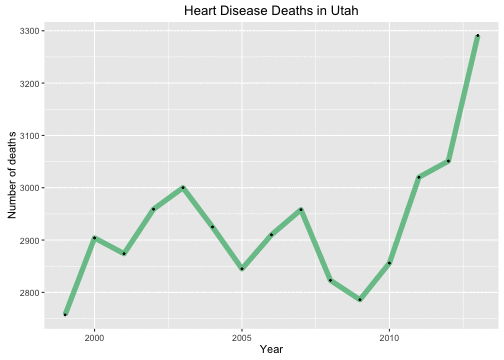
Oh no! This is very bad, right? Heart disease deaths are going up UP UP. But of course, Utah’s population has been growing steadily during these years as well, so perhaps this is not a particularly meaningful graph. Let’s look at the per capita number of heart disease deaths. These things are typically measured per 100,000 population.
ggplot(data = deathDF[deathDF$cause == "Diseases of heart",],
       aes(x = year, y = 1e5*number/population)) +
        geom_line(size = 2.5, alpha = 0.7, color = "mediumseagreen") +
        geom_point(size = 0.5) + xlab("Year") + ylab("Number of deaths per 100,000 population") +
        ggtitle("Heart Disease Deaths in Utah")
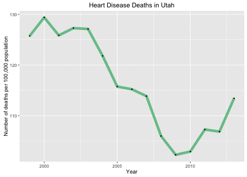
Very different, right? But actually, not only has the population in Utah been growing, but it has been changing in demographics significantly. Utah is very young in population compared to the United States as a whole, but it is less young than it once was. The birth rate in Utah is dropping so the population 10 years ago was younger than the population today. What we really want to look at is the age adjusted mortality rate.
ggplot(data = deathDF[deathDF$cause == "Diseases of heart",],
       aes(x = year, y = adjustedrate)) +
        geom_line(size = 2.5, alpha = 0.7, color = "mediumseagreen") +
        geom_point(size = 0.5) + xlab("Year") +
        ylab("Age adjusted mortality (deaths per 100,000 population") +
        ggtitle("Heart Disease Age Adjusted Mortality in Utah")
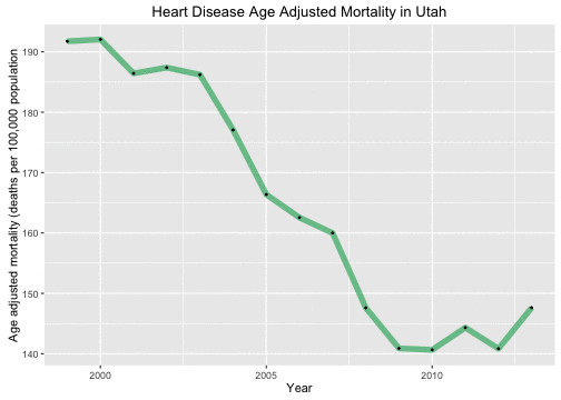
By this measure, we can see that heart disease outcomes have improved in Utah during these years.
Let’s Animate Something
The gganimate package works by using some variable in one’s data as the frame with which to animate a plot. Let’s start with looking at how the causes of death change over the years in the data set and animate over the causes of death. This is so nice because the plot was way too crowded when I tried to plot them all together.
p <- ggplot(data = deathDFtop10,
            aes(x = year, y = adjustedrate, color = cause, frame = as.character(cause))) +
        geom_line(size = 2.5, alpha = 0.7) +
        geom_point(size = 0.5, color = "black") + xlab("Year") +
        theme(legend.position="none") +
        ylab("Age adjusted mortality (deaths per 100,000 population)")
gg_animate(p)
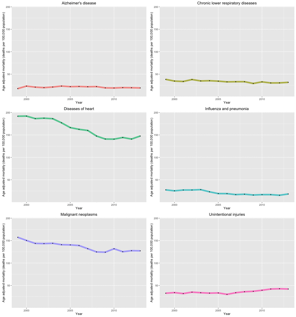
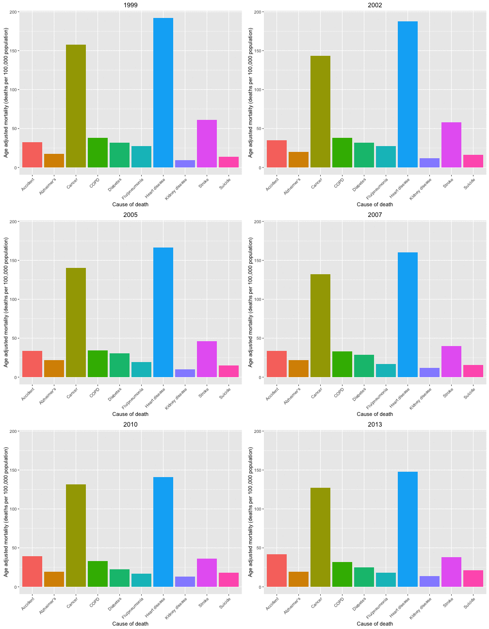
Now let’s look at the causes of death in each year and animate over the years in the data set.
p <- ggplot(data = deathDFtop10,
       aes(x = shortcause, y = adjustedrate, fill = shortcause, frame = year)) +
        geom_bar(stat = "identity", position = "dodge") +
        theme(legend.position="none",
              axis.text.x= element_text(angle=45, hjust = 1)) +
        ylab("Age adjusted mortality (deaths per 100,000 population)") +
        xlab("Cause of death")
gg_animate(p)
The End
This is perhaps a bit heavy and grim for the weekend, but you know, one of these 46 causes of death (or something very similar) will be written down on a death certificate for all of us one day. Carpe diem, and may you enjoy many more animated GIFs in your life.
The R Markdown file used to make this blog post is available here. I am very happy to hear feedback or questions!