Mapping Election Results in Utah
By Julia Silge
November 11, 2016
My adopted home state of Utah has been a weird place this election cycle. For the unfamiliar, Utah is extremely conservative when it comes to politics; it is one of the reddest of the red states and has backed the Republican candidate for president for the past many decades. In 2012, about 3/4 of the popular vote went to Mitt Romney (who is LDS, like many here in the state) and there were no counties where Mitt Romney did not win.
The story during the 2016 election cycle has been very different, and well, kind of strange, if you ask me. For starters, Utah voters did not vote for the winning candidate in either party’s primary. Donald Trump is extremely unpopular here because his personality and values do not align with the typical Utah Republican. At the same time, Hillary Clinton is also quite unpopular here; the Clintons have just generally been unpopular here for a quarter decade with traditional Utah Republicans and she was not the first choice of Utah’s liberal voters. The winners of Utah’s primaries were Ted Cruz and Bernie Sanders. To complicate this situation, in the last weeks of our long, national nightmare that has been the 2016 campaign, Evan McMullin rose to some prominence as an independent candidate in Utah.
Utah isn’t particularly large or populous or really important, but it is where I live, so let’s look at the results of last Tuesday’s election!
Getting the data
Utah makes election results available online, but also Mike Kearney has gathered county-level election results for the U.S. and put it on GitHub. Let’s load the libraries I’ll use here, and then open the data that Mike has gathered.
library(readr)
library(choroplethr)
library(choroplethrMaps)
library(ggplot2)
library(ggthemes)
library(RColorBrewer)
library(gridExtra)
library(dplyr)
library(stringr)
library(tidyr)

all_results <- read_csv("https://raw.githubusercontent.com/mkearney/presidential_election_county_results_2016/master/pres16results.csv")
What does this look like?
head(all_results)
## # A tibble: 6 × 8
##      X1 cand_id       cand_name    votes     total state  fips         pct
##   <int>   <chr>           <chr>    <int>     <int> <chr> <chr>       <dbl>
## 1     1  US8639    Donald Trump 59821874 126061003    US    US 0.474547025
## 2     2  US1746 Hillary Clinton 60122876 126061003    US    US 0.476934774
## 3     3 US31708    Gary Johnson  4087972 126061003    US    US 0.032428522
## 4     4   US895      Jill Stein  1223828 126061003    US    US 0.009708220
## 5     5 US65775   Evan McMullin   425991 126061003    US    US 0.003379245
## 6     6 US59414  Darrell Castle   175956 126061003    US    US 0.001395800
Counties in Utah have FIPS codes that start with 49.
utah <- all_results %>%
    filter(str_detect(fips, "^49"))

utah
## # A tibble: 290 × 8
##       X1 cand_id          cand_name votes total state  fips          pct
##    <int>   <chr>              <chr> <int> <int> <chr> <chr>        <dbl>
## 1  16087 UT55311       Donald Trump  1800  2434    UT 49001 0.7395234182
## 2  16088 UT55316      Evan McMullin   316  2434    UT 49001 0.1298274445
## 3  16089 UT55310    Hillary Clinton   258  2434    UT 49001 0.1059983566
## 4  16090 UT55313       Gary Johnson    36  2434    UT 49001 0.0147904684
## 5  16091 UT55312     Darrell Castle    12  2434    UT 49001 0.0049301561
## 6  16092 UT55318         Jill Stein    10  2434    UT 49001 0.0041084634
## 7  16093 UT55315     Alyson Kennedy     1  2434    UT 49001 0.0004108463
## 8  16094 UT55317   Monica Moorehead     1  2434    UT 49001 0.0004108463
## 9  16095 UT55314 Rocky De La Fuente     0  2434    UT 49001 0.0000000000
## 10 16096 UT55319     Rocky Giordani     0  2434    UT 49001 0.0000000000
## # ... with 280 more rows
There are 29 counties in Utah. Let’s just check to make sure they’re all here.
n_distinct(utah$fips)
## [1] 29
This is great. I would just like to say a big THANK YOU to Mike Kearney because this CSV is so well-formated and tidy!
Formatting the data for mapping
In election results, we see a lot of maps like this one, where each county is colored with who won and the color intensity scales with the margin by which the candidate won that county; these maps are great and communicate a certain kind of information. However, it seemed like Utah might be a three-way race (and you can see from that NYTimes link that McMullin did in fact get 20% of the vote here) so let’s try a different way of visualizing these results, just to get a different view.
I’m going to use Ari Lamstein’s choroplethr package for mapping the results. Ari has a lot of exciting stuff going on over at his website these days, with his free email course and a membership community. To use the data with the choroplethr package, I actually need to convert it to a wide, “un-tidy” format, so let’s work on that.
utah_spread <- utah %>%
    filter(cand_name %in% c("Donald Trump", "Hillary Clinton", "Evan McMullin")) %>%
    select(fips, cand_name, pct) %>%
    mutate(pct = pct * 100,
           region = as.numeric(fips)) %>%
    spread(cand_name, pct) %>%
    select(-fips)

utah_spread
## # A tibble: 29 × 4
##    region `Donald Trump` `Evan McMullin` `Hillary Clinton`
## *   <dbl>          <dbl>           <dbl>             <dbl>
## 1   49001       73.95234       12.982744         10.599836
## 2   49003       62.38820       21.700508         10.962050
## 3   49005       46.74996       27.672505         20.515627
## 4   49007       66.04390        7.747583         21.857852
## 5   49009       70.32258        8.602151         16.344086
## 6   49011       44.94619       27.521151         22.397698
## 7   49013       79.50689       10.427846          7.222625
## 8   49015       79.80296        8.491673          8.890453
## 9   49017       68.74455       11.987794         15.344377
## 10  49019       43.46058        6.189293         43.370228
## # ... with 19 more rows
That will do it!
Making maps
Now let’s set up the code to make the maps. I will make one map for each candidate and then stitch them together, because I want to see how each candidate did across the state.
utah_spread$value <- utah_spread$`Donald Trump`
choro1 = CountyChoropleth$new(utah_spread)
choro1$set_zoom("utah")
choro1$title = "Donald Trump"
choro1$set_num_colors(1)
choro1$ggplot_polygon = geom_polygon(aes(fill = value), color = NA)
choro1$ggplot_scale = scale_fill_gradientn(name = "Percent",
                                          colours = brewer.pal(8, "Reds"))

utah_spread$value <- utah_spread$`Hillary Clinton`
choro2 = CountyChoropleth$new(utah_spread)
choro2$set_zoom("utah")
choro2$title = "Hillary Clinton"
choro2$set_num_colors(1)
choro2$ggplot_polygon = geom_polygon(aes(fill = value), color = NA)
choro2$ggplot_scale = scale_fill_gradientn(name = "Percent",
                                          colours = brewer.pal(8, "Blues"))

utah_spread$value <- utah_spread$`Evan McMullin`
choro3 = CountyChoropleth$new(utah_spread)
choro3$set_zoom("utah")
choro3$title = "Evan McMullin"
choro3$set_num_colors(1)
choro3$ggplot_polygon = geom_polygon(aes(fill = value), color = NA)
choro3$ggplot_scale = scale_fill_gradientn(name = "Percent",
                                          colours = brewer.pal(8, "Greens"))

grid.arrange(choro1$render() + theme(text=element_text(family="KerkisSans")),
             choro2$render() + theme(text=element_text(family="KerkisSans")),
             choro3$render() + theme(text=element_text(family="KerkisSans")), ncol = 3)

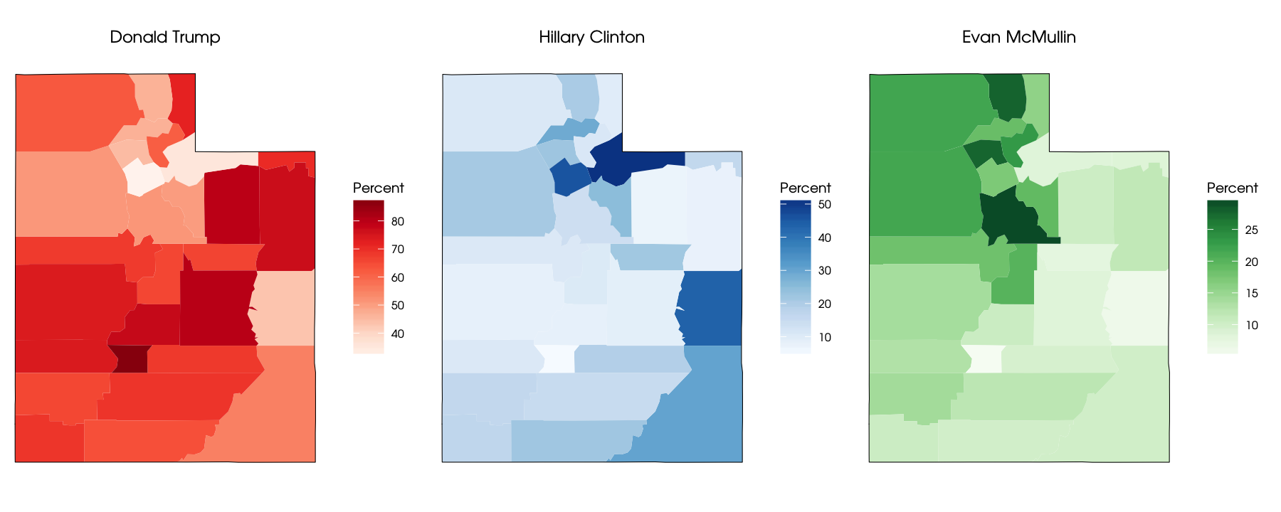
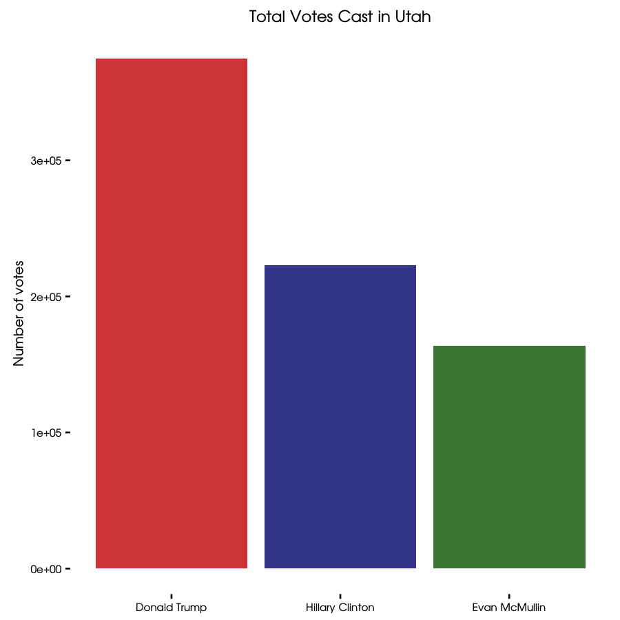
Gosh, as someone who lives here, it is so satisfying to see this set of maps. First of all, that county where Evan McMullin did the best is Utah County, Utah’s second most populous county and the seat of Brigham Young University. Hillary Clinton did well in Salt Lake County (the most populous county, where I live and the site of protests last night) and Summit County (where Park City and the ski resorts are); in fact, she won the popular vote in both of those counties. Donald Trump won the rest of the counties. Talk about your urban/rural divide right there. He won by enough overall that, as we know of course, he won the state’s electoral votes. Let’s make a plot of that, just for kicks.
votes <- utah %>%
    filter(cand_name %in% c("Donald Trump", "Hillary Clinton", "Evan McMullin")) %>%
    mutate(cand_name = factor(cand_name,
                              levels = c("Donald Trump", "Hillary Clinton", "Evan McMullin"))) %>%
    group_by(cand_name) %>%
    summarise(sum = sum(votes))

votes
## # A tibble: 3 × 2
##         cand_name    sum
##            <fctr>  <int>
## 1    Donald Trump 375006
## 2 Hillary Clinton 222858
## 3   Evan McMullin 163573
These total numbers are a bit lower than what is currently being reported on Utah’s official election results website, but just proportionately a little lower overall. Utah’s election results won’t be officially certified until November 22.
ggplot(votes, aes(cand_name, sum, fill = cand_name)) +
    geom_bar(stat = "identity", alpha = 0.8) +
    theme_tufte(base_family = "KerkisSans") +
    scale_fill_manual(values = c("red3", "navyblue", "darkgreen")) +
    theme(legend.position="none") +
    labs(title = "Total Votes Cast in Utah", y = "Number of votes", x = NULL)

This is a big change from 2012. Hillary Clinton did several percentage points better than Barack Obama; Utah is one of the few places where this is true. Trump’s showing around 45% of the vote is much, much worse (around 30 percentage points worse) than how Mitt Romney did here in 2012. It is perhaps not news that Trump is this unpopular here in Utah, and enough people still voted for him in this intensely Republican state for him to win the electoral votes.
What about total turnout?
utah %>%
    summarise(total = sum(votes))
## # A tibble: 1 × 1
##    total
##    <int>
## 1 801248
This is more than 20% lower than the 2012 turnout; that is a BIG DROP! I do want to note that this number is lower than what is currently being reported on Utah’s official election results site so the total number of votes cast is higher than this. I’m not sure what the total number will eventually be once the vote is certified, but surely there are not 20% more votes still out there to be counted. Assuming there is a drop in turnout, I’m sure it reflects Utah’s unhappiness with both of the major party candidates. I am concerned, like many others, with problems with voter suppression and the gutting of the Voting Rights Act but I don’t think these were big issues in Utah. I think this is an issue of turnout and people not being excited to vote for either candidate.
The End
Politics has not been one of my life’s great passions, but I do care about my community and my neighbors and with that comes politics, I guess. I am an ex-academic with a PhD who has always lived in cities, so it is probably not a big shock to anybody that I am disappointed by the results of Tuesday’s election and concerned about what it means for our country. I am at a bit of a loss about what to say about all of that, to be honest, but I have appreciated the perspectives of other people on how we talk about this election, or maybe just the Onion. The R Markdown file used to make this blog post is available here. I am very happy to hear feedback or questions!