Trump Losing and Feeling the Bern in Utah
By Julia Silge
March 25, 2016
Well, it’s been an interesting election season so far, right? Everybody holding up OK? Utah held its caucuses this past Tuesday on March 22 and I thought I would do a bit of plotting to show the results. We can get the JSON data from CNN, as pointed out by Bob Rudis in his post here. Utah’s results were not available when he wrote that post but I was able to poke around and find them using the guidance he provided there. Many thanks to CNN for all the hard work they do in reporting!
library(jsonlite)
utahRJSON <- fromJSON("http://data.cnn.com/ELECTION/2016primary/UT/county/S.json",
               flatten=TRUE)
utahDJSON <- fromJSON("http://data.cnn.com/ELECTION/2016primary/UT/county/E.json",
               flatten=TRUE)
Every county in Utah was won by the same Republican or Democratic candidate, so it will not be particularly interesting to make maps showing who won the caucuses. Instead, what I’m going for here is to see if there are any differences in voting patterns for the various candidates. To do that, let’s make a data frame for each candidate with his/her results. First up, the Republicans.
library(purrr)
library(dplyr)
cruz <- mutate(map_df(utahRJSON$counties$race.candidates, function(x) {
        x %>% filter(lname == "Cruz")
        }), FIPS=utahRJSON$counties$countycode)
kasich <- mutate(map_df(utahRJSON$counties$race.candidates, function(x) {
        x %>% filter(lname == "Kasich")
        }), FIPS=utahRJSON$counties$countycode)
trump <- mutate(map_df(utahRJSON$counties$race.candidates, function(x) {
        x %>% filter(lname == "Trump")
        }), FIPS=utahRJSON$counties$countycode)
This was my first time to use purrr, Hadley Wickham’s library which is sort of similar to dplyr but for functions. I am a HUGE fan of dplyr and it is very soothing and makes me happy, so I am looking forward to getting used to purrr and using it more. Let’s do the Democratic candidates now.
sanders <- mutate(map_df(utahDJSON$counties$race.candidates, function(x) {
        x %>% filter(lname == "Sanders")
        }), FIPS=utahDJSON$counties$countycode)
clinton <- mutate(map_df(utahDJSON$counties$race.candidates, function(x) {
        x %>% filter(lname == "Clinton")
        }), FIPS=utahDJSON$counties$countycode)
For plotting, I am going to use Ari Lamstein’s choroplethr package which needs the data in wide format. Let’s start getting that set up, first with the Republicans.
cruzwide <- cruz %>% select(region = FIPS, cruzpct = vpct, cruzvotes = votes)
kasichwide <- kasich %>% select(region = FIPS, kasichpct = vpct, kasichvotes = votes)
trumpwide <- trump %>% select(region = FIPS, trumppct = vpct, trumpvotes = votes)
republicans <- left_join(cruzwide, kasichwide)
republicans <- left_join(republicans, trumpwide)
Now for the Democrats.
clintonwide <- clinton %>% select(region = FIPS, clintonpct = vpct, clintonvotes = votes)
sanderswide <- sanders %>% select(region = FIPS, sanderspct = vpct, sandersvotes = votes)
democrats <- left_join(sanderswide, clintonwide)
What do these data frames look like?
head(republicans)
## Source: local data frame [6 x 7]
##
##   region cruzpct cruzvotes kasichpct kasichvotes trumppct trumpvotes
##    (int)   (int)     (int)     (int)       (int)    (int)      (int)
## 1  49001      63       229        13          47       24         87
## 2  49003      74      3314        14         638       12        520
## 3  49005      71      7172        19        1892       10       1049
## 4  49007      61       595         9          90       30        293
## 5  49009      38        36        27          25       35         33
## 6  49011      68     17528        20        5214       11       2902
head(democrats)
## Source: local data frame [6 x 5]
##
##   region sanderspct sandersvotes clintonpct clintonvotes
##    (int)      (int)        (int)      (int)        (int)
## 1  49001          0            0          0            0
## 2  49003         76          281         24           90
## 3  49005         81         2906         18          630
## 4  49007         62          235         33          128
## 5  49009         87           13          6            1
## 6  49011         82         3563         17          747
Now, Some Plots!
Before we look at any plots, I’d like to tell/remind everyone that the population in Utah is not evenly distributed. I’ve done some demographic mapping for Utah in a previous blog post, but just as a reminder, Salt Lake County (where I live) has a population over 1 million and the rest of the counties have much lower populations. Utah County, just to the south of Salt Lake, has a population that is about half of Salt Lake’s and the numbers drop off precipitously after that. There are a number of very rural counties with populations in the 1000s. Utah’s Republican caucus has a rule where if someone gets more than 50% of the vote, then a winner-takes-all rule kicks in for delegates. Utah’s Democratic caucus does not have a similar rule; it chooses some delegates based on the overall statewide vote and some based on votes in the four congressional districts.
SO! Let’s do this.
library(choroplethr)
library(choroplethrMaps)
library(ggplot2)
library(RColorBrewer)
library(gridExtra)
republicans$value <- republicans$cruzpct
choro1 = CountyChoropleth$new(republicans)
choro1$set_zoom("utah")
choro1$title = "Ted Cruz"
choro1$set_num_colors(1)
choro1$ggplot_polygon = geom_polygon(aes(fill = value), color = NA)
choro1$ggplot_scale = scale_fill_gradientn(name = "Percent",
                                          colours = brewer.pal(8, "YlGn"))
republicans$value <- republicans$kasichpct
choro2 = CountyChoropleth$new(republicans)
choro2$set_zoom("utah")
choro2$title = "John Kasich"
choro2$set_num_colors(1)
choro2$ggplot_polygon = geom_polygon(aes(fill = value), color = NA)
choro2$ggplot_scale = scale_fill_gradientn(name = "Percent",
                                          colours = brewer.pal(8, "Purples"))
republicans$value <- republicans$trumppct
choro3 = CountyChoropleth$new(republicans)
choro3$set_zoom("utah")
choro3$title = "Donald Trump"
choro3$set_num_colors(1)
choro3$ggplot_polygon = geom_polygon(aes(fill = value), color = NA)
choro3$ggplot_scale = scale_fill_gradientn(name = "Percent",
                                          colours = brewer.pal(8, "YlOrRd"))
grid.arrange(choro1$render() + theme(text=element_text(family="KerkisSans")),
             choro2$render() + theme(text=element_text(family="KerkisSans")),
             choro3$render() + theme(text=element_text(family="KerkisSans")), ncol = 3)

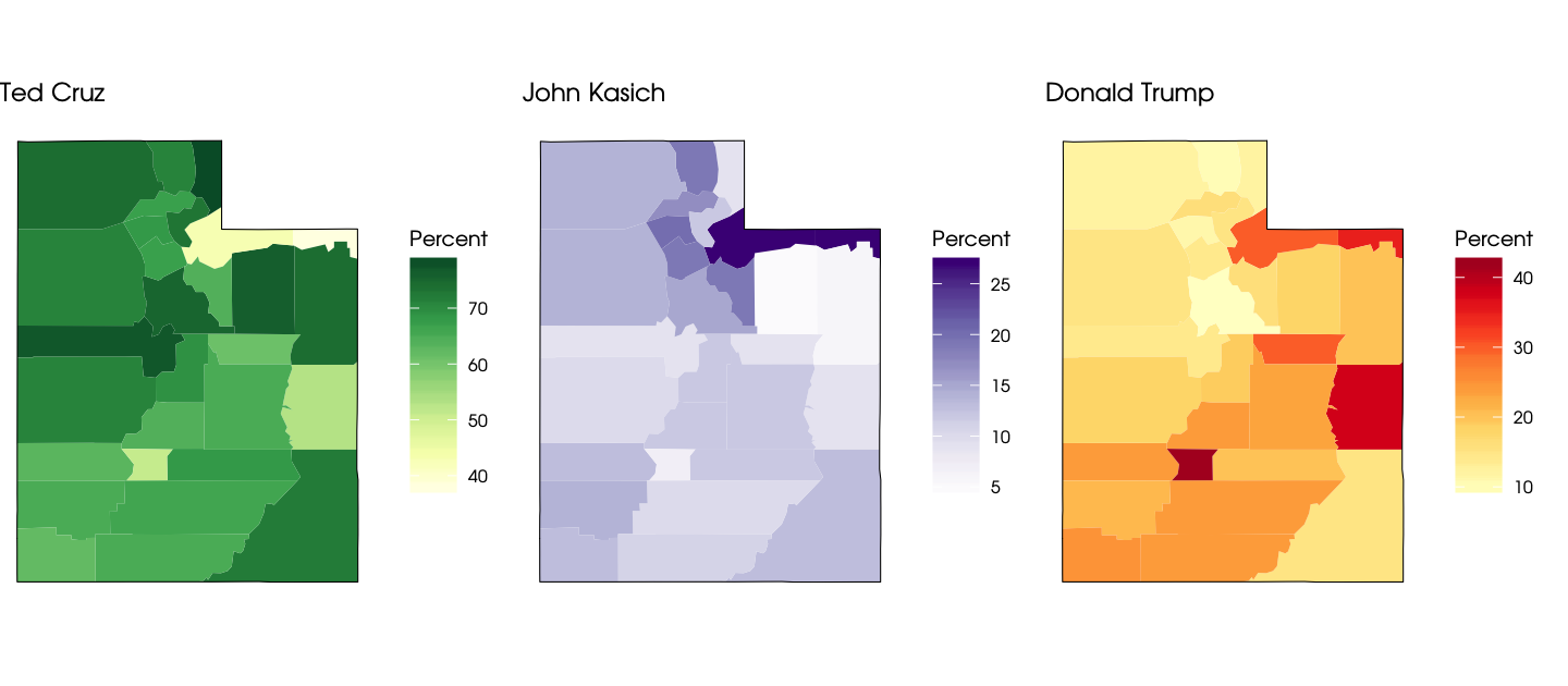
Ted Cruz won the Republican caucus in all counties, handily in almost all of them. They seem to quite like John Kasich over there in Park City and Summit County. Trump did better (but did not win) in some extremely rural counties: Piute, Grand, and Daggett. I don’t want to fall into the trap of just telling a sensible-sounding story for what happened, but Republicans here in Utah are very establishment-type Republicans and it makes sense that Trump’s appeal is not strong. Also, as Nate Silver pointed out in a different context (whether Utah might go for Hillary Clinton vs. Trump), the authoritarian populism of Trump is unappealing in many ways to a religious minority such as Mormons.
OK, let’s look at the Democratic race.
democrats$value <- democrats$sanderspct
choro1 = CountyChoropleth$new(democrats)
choro1$set_zoom("utah")
choro1$title = "Bernie Sanders"
choro1$set_num_colors(1)
choro1$ggplot_polygon = geom_polygon(aes(fill = value), color = NA)
choro1$ggplot_scale = scale_fill_gradientn(name = "Percent",
                                          colours = brewer.pal(8, "YlOrBr"))
democrats$value <- democrats$clintonpct
choro2 = CountyChoropleth$new(democrats)
choro2$set_zoom("utah")
choro2$title = "Hillary Clinton"
choro2$set_num_colors(1)
choro2$ggplot_polygon = geom_polygon(aes(fill = value), color = NA)
choro2$ggplot_scale = scale_fill_gradientn(name = "Percent",
                                           colours = brewer.pal(8, "PuBu"))
grid.arrange(choro1$render() + theme(text=element_text(family="KerkisSans")),
             choro2$render() + theme(text=element_text(family="KerkisSans")), ncol = 2)

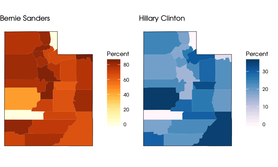
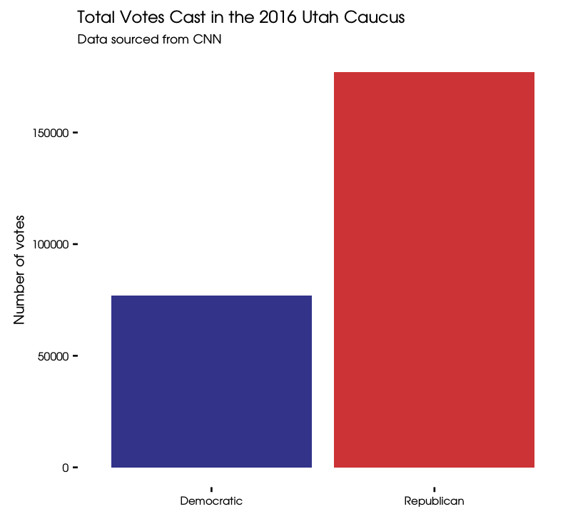
Bernie Sanders did extremely well in most counties in Utah, even better than he was expected to. There are a couple of counties where zero people voted for any Democratic candidate, though. There was record turnout for the caucuses this year (I have heard this especially in the context of the Democratic caucuses) but let’s look at this in the context of comparing the caucuses; how many people voted for either a Republication or a Democratic candidate?
totaldem <- democrats %>% summarise(total1 = sum(sandersvotes), total2 = sum(clintonvotes)) %>%
        summarise(sum = total1 + total2)
totalrep <- republicans %>% summarise(total1 = sum(cruzvotes),
                                      total2 = sum(kasichvotes),
                                      total3 = sum(trumpvotes)) %>%
        summarise(sum = total1 + total2 + total3)
votetotals <- data_frame(party = c("Republican", "Democratic"),
                        totalvote = c(as.integer(totalrep), as.integer(totaldem)))
library(ggthemes)
ggplot(votetotals, aes(x = party, y = totalvote, fill = party)) +
        geom_bar(stat = "identity", alpha = 0.8) +
        theme_tufte(base_family = "KerkisSans") +
        theme(legend.position="none") +
        theme(axis.title.x = element_blank()) +
        scale_fill_manual(values = c("navyblue", "red3")) +
        labs(title = "Total Votes Cast in the 2016 Utah Caucus", y = "Number of votes",
             subtitle = "Data sourced from CNN")

That is quite a difference. The number of Republican voters in the caucus was this much higher despite the fact that you have to be a registered Republican to vote in that caucus while the Democratic caucus was open to registered Independents and unaffiliated voters.
The End
As the caucus was approaching and preparations were being made, I kept thinking, “Why don’t I remember voting in a caucus before?!” I have always lived in primary states previously, but I did live here in Utah during the last presidential election. Politics is not one of my top life passions, but I almost always manage to muster the energy to go vote. A passing remark by a friend led me to do some research and then realize that Utah was not a caucus state the last time around. Since the last presidential election, Utah has switched from a primary system (run by the state government) to a caucus system (run by the political parties). The Utah Republican Party wanted to do this while the Utah Democratic Party did not; I leave it to you to infer from the last plot how successful state Democratic politicians are at achieving such goals. The Utah Republican Party set up a caucus with an option of voting online, while the Utah Democratic Party went with paper ballots (literally, 8.5x11 copied sheets of paper). There is a big difference in available resources between the parties here. The turnout was unexpectedly high at the Democratic caucuses; they were expecting about 65,000 voters and almost 80,000 voters came to caucus. There were long lines winding around the blocks, locations running out of ballots and having to copy more, and lots of waiting. I haven’t heard of many voters from these caucuses being angry, though; there seemed to be a sense of camaraderie and excitement. The R Markdown file used to make this blog post is available here. I am very happy to hear feedback or questions!