Song Lyrics Across the United States
By Julia Silge
September 26, 2016
The inspiration for this post is a joint venture by both me and my husband, and its genesis lies more than 15 years in our past. One of the recurring conversations we have in our relationship (all long-term relationships have these, right?!) is about song lyrics and place names. I think the first time we ever had this conversation was in the late 1990s and was about Baltimore. “Why do so many songs talk about Baltimore?” we asked each other. “And why does it always sound so miserable there?” At the time we were listening to a lot of Lyle Lovett, and Counting Crows was on the radio a lot.
We have continued to have this conversation many, many times over our years together, noticing state and city names in song lyrics and wondering if or why certain places are mentioned more often. Are certain locations mentioned in song lyrics at a higher rate, perhaps at a higher rate relative to their population? I’ve recently realized that I know of pretty good data sets to make a stab at answering this, so let’s go!
Downloading Population Data for U.S. States
For this first blog post, I am only going to look at mentions of state names, so let’s download state population data from the U.S. Census Bureau. I use Census data from the
American Community Survey for my work, so let’s use the acs package to find the most recent total population estimates for each state. (If you haven’t used the acs package before, you will need to get an API key and run api.key.install() one time to install your key on your system.)
library(acs)
library(dplyr)
library(reshape2)
stategeo <- geo.make(state = "*")
popfetch <- acs.fetch(geography = stategeo,
                      endyear = 2014,
                      span = 5,
                      table.number = "B01003",
                      col.names = "pretty")
pop_df <- tbl_df(melt(estimate(popfetch))) %>%
    mutate(state_name = tolower(Var1),
           pop2014 = value) %>%
    select(state_name, pop2014) %>%
    filter(state_name != "puerto rico")

## sorry, Puerto Rico!
What do we have here, just to check?
pop_df %>%
    arrange(desc(pop2014)) %>%
    top_n(10)
## # A tibble: 10 × 2
##        state_name  pop2014
##             <chr>    <dbl>
## 1      california 38066920
## 2           texas 26092033
## 3        new york 19594330
## 4         florida 19361792
## 5        illinois 12868747
## 6    pennsylvania 12758729
## 7            ohio 11560380
## 8         georgia  9907756
## 9        michigan  9889024
## 10 north carolina  9750405
There we go! We now have a data frame ready to go with the state names and their corresponding populations.
Song Lyrics
For a data set of song lyrics, I am going to use the compilation of Billboard’s Year-End Hot 100 from 1958 to the present put together by Kaylin Walker. Her analysis is wonderful and so fun, and she has the data as well as her code for scraping/analysis on GitHub. This is a data set of pop lyrics; this means that a) my beloved Lyle Lovett is not in it and b) it is certainly going to be biased in certain ways compared to other genres when it comes to mentions of place names. However, it is somewhere to start.
library(readr)
song_lyrics <- read_csv("./billboard_lyrics_1964-2015.csv")
names(song_lyrics)
## [1] "Rank" "Song" "Artist" "Year" "Lyrics" "Source"
Finding the State Names in the Song Lyrics
Now we need to find the mentions of each state as they appear in these song lyrics. State names are one or two words, so we will use unnest_tokens from the
tidytext package, but we will do it twice. First, we’ll unnest looking for single words and then we’ll unnest making bigrams, all the combination of two words in the song lyrics. We will bind these two data frames together with all the possible words and bigrams that might contain state names.
library(tidytext)
tidy_lyrics <- bind_rows(song_lyrics %>%
                             unnest_tokens(state_name, Lyrics),
                         song_lyrics %>%
                             unnest_tokens(state_name, Lyrics,
                                           token = "ngrams", n = 2))
tidy_lyrics
## # A tibble: 3,201,196 × 6
##     Rank        Song                        Artist  Year Source
##    <int>       <chr>                         <chr> <int>  <int>
## 1      1 wooly bully sam the sham and the pharaohs  1965      3
## 2      1 wooly bully sam the sham and the pharaohs  1965      3
## 3      1 wooly bully sam the sham and the pharaohs  1965      3
## 4      1 wooly bully sam the sham and the pharaohs  1965      3
## 5      1 wooly bully sam the sham and the pharaohs  1965      3
## 6      1 wooly bully sam the sham and the pharaohs  1965      3
## 7      1 wooly bully sam the sham and the pharaohs  1965      3
## 8      1 wooly bully sam the sham and the pharaohs  1965      3
## 9      1 wooly bully sam the sham and the pharaohs  1965      3
## 10     1 wooly bully sam the sham and the pharaohs  1965      3
##       state_name
##            <chr>
## 1            sam
## 2            the
## 3           sham
## 4  miscellaneous
## 5          wooly
## 6          bully
## 7          wooly
## 8          bully
## 9            sam
## 10           the
## # ... with 3,201,186 more rows
The variable state_name in this data frame contains all the possible words and bigrams that might be state names in all the lyrics.
Now we can use an inner join to find all the state names that are actually there.
inner_join(tidy_lyrics, pop_df)
## # A tibble: 526 × 7
##     Rank               Song         Artist  Year Source state_name
##    <int>              <chr>          <chr> <int>  <int>      <chr>
## 1     12   king of the road   roger miller  1965      1      maine
## 2     29 eve of destruction  barry mcguire  1965      1    alabama
## 3     49   california girls the beach boys  1965      3 california
## 4     49   california girls the beach boys  1965      3 california
## 5     49   california girls the beach boys  1965      3 california
## 6     49   california girls the beach boys  1965      3 california
## 7     49   california girls the beach boys  1965      3 california
## 8     49   california girls the beach boys  1965      3 california
## 9     49   california girls the beach boys  1965      3 california
## 10    49   california girls the beach boys  1965      3 california
##     pop2014
##       <dbl>
## 1   1328535
## 2   4817678
## 3  38066920
## 4  38066920
## 5  38066920
## 6  38066920
## 7  38066920
## 8  38066920
## 9  38066920
## 10 38066920
## # ... with 516 more rows
Let’s only count each state once per song that it is mentioned in.
tidy_lyrics <- inner_join(tidy_lyrics, pop_df) %>%
    distinct(Rank, Song, Artist, Year, state_name, .keep_all = TRUE)

tidy_lyrics
## # A tibble: 253 × 7
##     Rank                          Song                         Artist
##    <int>                         <chr>                          <chr>
## 1     12              king of the road                   roger miller
## 2     29            eve of destruction                  barry mcguire
## 3     49              california girls                 the beach boys
## 4     10            california dreamin           the mamas  the papas
## 5     77            message to michael                 dionne warwick
## 6     61             california nights                    lesley gore
## 7      4 sittin on the dock of the bay                   otis redding
## 8     10                    tighten up        archie bell  the drells
## 9     25                      get back the beatles with billy preston
## 10    25                      get back the beatles with billy preston
##     Year Source state_name  pop2014
##    <int>  <int>      <chr>    <dbl>
## 1   1965      1      maine  1328535
## 2   1965      1    alabama  4817678
## 3   1965      3 california 38066920
## 4   1966      3 california 38066920
## 5   1966      1   kentucky  4383272
## 6   1967      1 california 38066920
## 7   1968      1    georgia  9907756
## 8   1968      3      texas 26092033
## 9   1969      3    arizona  6561516
## 10  1969      3 california 38066920
## # ... with 243 more rows
Calculating Counts
Let’s count these up now!
state_counts <- tidy_lyrics %>%
    group_by(state_name) %>%
    summarise(n = n()) %>%
    arrange(desc(n))

state_counts
## # A tibble: 33 × 2
##     state_name     n
##          <chr> <int>
## 1     new york    64
## 2   california    34
## 3      georgia    22
## 4    tennessee    14
## 5        texas    14
## 6      alabama    12
## 7  mississippi    10
## 8     kentucky     7
## 9       hawaii     6
## 10    illinois     6
## # ... with 23 more rows
Now, I am going to use my vast knowledge of pop culture here and suggest that these mentions of New York are referencing New York City, not the state of New York, as lovely as it may be. I’ll keep them in for now but we should be aware of that. Also, I am a bit surprised the numbers are this low overall; this makes me long for BIGGER DATA.
Let’s calculate a number relative to the population of each state (mentions per million population).
pop_df <- pop_df %>%
    left_join(state_counts) %>%
    mutate(rate = n/pop2014*1e6)

pop_df %>%
    arrange(desc(rate)) %>%
    top_n(10)
## # A tibble: 10 × 4
##     state_name  pop2014     n     rate
##          <chr>    <dbl> <int>    <dbl>
## 1       hawaii  1392704     6 4.308166
## 2  mississippi  2984345    10 3.350819
## 3     new york 19594330    64 3.266251
## 4      alabama  4817678    12 2.490826
## 5        maine  1328535     3 2.258126
## 6      georgia  9907756    22 2.220483
## 7    tennessee  6451365    14 2.170083
## 8      montana  1006370     2 1.987341
## 9     nebraska  1855617     3 1.616713
## 10    kentucky  4383272     7 1.596981
I was a little surprised that Maine was so high so I checked on those.
tidy_lyrics %>%
    filter(state_name == "maine") %>%
    select(Song, Artist, Year)
## # A tibble: 3 × 3
##               Song                      Artist  Year
##              <chr>                       <chr> <int>
## 1 king of the road                roger miller  1965
## 2       every girl                 young money  2009
## 3          bedrock young money featuring lloyd  2010
“King of the Road”, OK, sure, but it turns out that Mack Maine is a rap artist who is the president of a label named Young Money. It is possible there are other examples of this kind of confusion in this analysis, but I checked most of the other states and did not find anyway. The other state names seen here seem less likely to fall into such a mistake anyway. Let’s drop Maine’s number down to 1 and recalculate the rate.
pop_df$n[pop_df$state_name == "maine"] <- 1
pop_df <- pop_df %>%
    mutate(rate = n/pop2014*1e6)
Making a Map
Let’s map these values so we can visualize which states have more or fewer mentions in the Billboard Year-End Hot 100. I’m going to use the minimap package from Sean Kross because I think a tile grid map is a good way to display this kind of information. (I don’t want the relative geographical areas of states to mess too much with people’s visual perception here.)
The minimap package needs two things (mainly) to make a map: a vector of state postal abbreviations and a vector of colors. Let’s work on making those.
## abbreviations for states
state_abb <- c(state.abb[1:7], "DC", state.abb[8:50])
pop_df <- pop_df %>%
    bind_cols(data_frame(abb = state_abb))

## colors for each state
library(RColorBrewer)
pop_df <- pop_df %>%
    bind_cols(data_frame(n_ntile = ntile(desc(pop_df$n), 11),
                         rate_ntile = ntile(desc(pop_df$rate), 11))) %>%
    mutate(color_n = if_else(is.na(n_ntile),
                           "gray95",
                           brewer.pal(9,"BuPu")[9-n_ntile]),
           color_rate = if_else(is.na(rate_ntile),
                                "gray90",
                                brewer.pal(9,"BuPu")[9-rate_ntile]))
Now let’s make some maps.
library(minimap)
quartzFonts(roboto = c("Roboto Condensed Regular",
                       "Roboto Bold",
                       "Roboto Condensed Italic",
                       "Roboto Bold Italic"))
par(family = 'roboto')
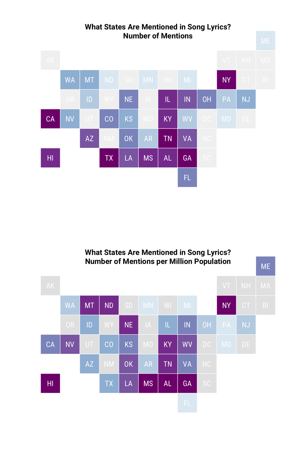
miniusa(pop_df$abb, pop_df$color_n,
        state_name_cex = 1.2, font = "RobotoCondensed-Regular")
title(main = "What States Are Mentioned in Song Lyrics?\nNumber of Mentions",
      line = -1)

miniusa(pop_df$abb, pop_df$color_rate,
        state_name_cex = 1.2, font = "RobotoCondensed-Regular")
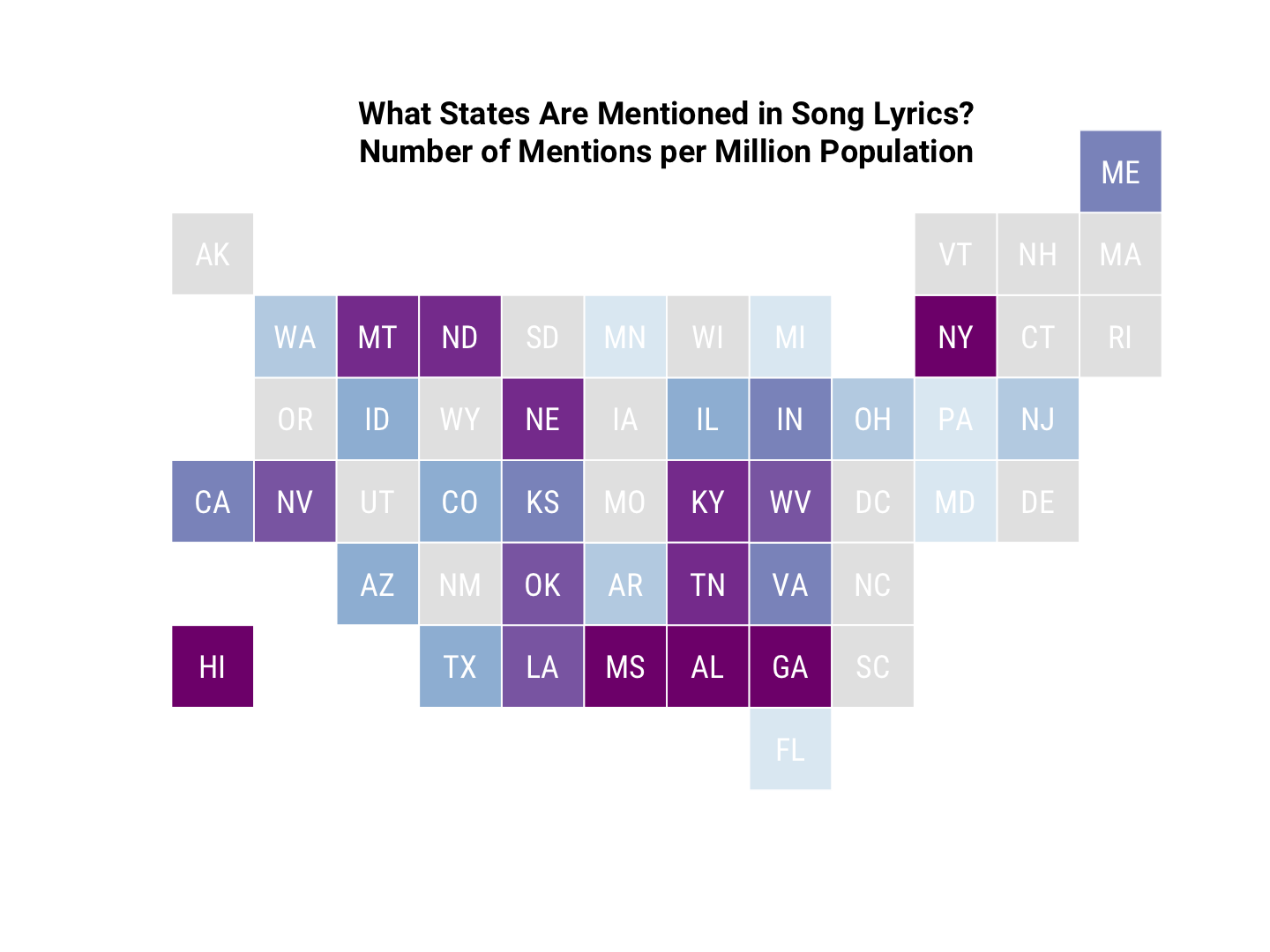
title(main = "What States Are Mentioned in Song Lyrics?\nNumber of Mentions per Million Population",
      line = -1)

LOOK, EVERYONE, I DID BASE GRAPHICS. (After I made these plots, I rediscovered that Bob Rudis has a ggplot-based package for a similar tile grid map called statebins.) Also, as a reminder, we can probably ignore the numbers for New York, as they all appear to reference New York City, not the state.
Let’s combine these into an animated GIF using the magick package.
library(magick)
map1 <- image_read("../figs/2016-09-26-Song-Lyrics-Across/minimap-1.png")
map2 <- image_read("../figs/2016-09-26-Song-Lyrics-Across/minimap-2.png")
(animate_map <- image_animate(c(map1, map2), fps = 0.8))
##   format width height colorspace filesize
## 1    gif  1440   1080       sRGB        0
## 2    gif  1440   1080       sRGB        0
image_write(animate_map, "../figs/2016-09-26-Song-Lyrics-Across/animate_map.gif")

Cartogram Map
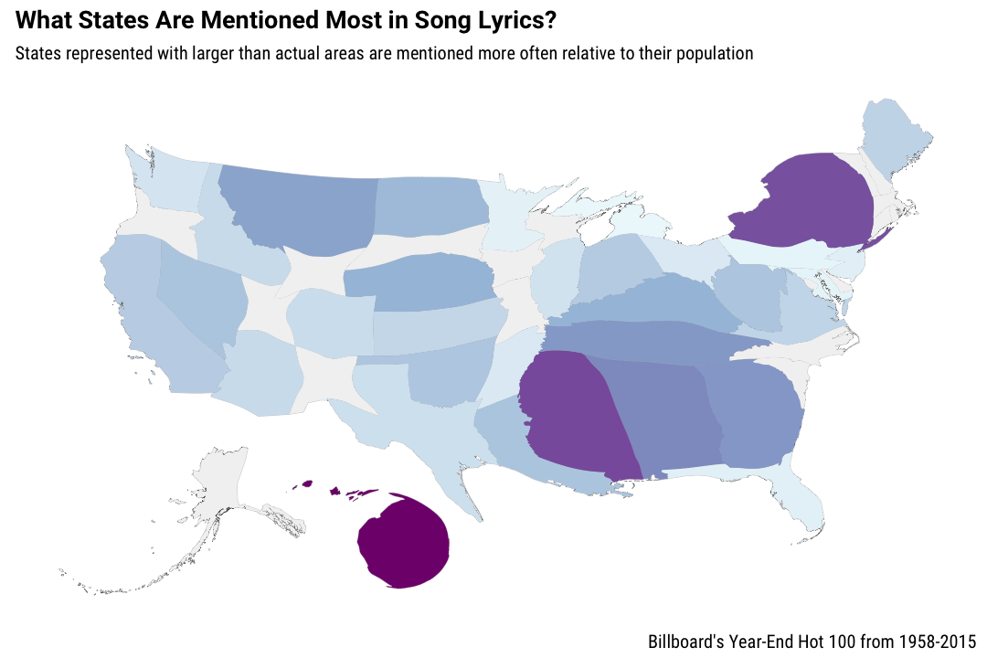
Another way we might visualize this kind of information could be a cartogram, where the geometry of a map is distorted to show some variable. You can see some comparisons of tile grid maps (square and hexagonal) and a cartogram at this
NPR post from last year. There is an R package from Sebastian Jeworutzki that will
create a cartogram from a SpatialPolygonDataFrame, so let’s give it a go.
library(ggplot2)
library(ggthemes)
library(ggalt)
library(scales)
library(rgeos)
library(maptools)
library(albersusa)
library(cartogram)

pop_df <- pop_df %>%
    mutate(rate_all = rate)
pop_df$rate_all[is.na(pop_df$rate_all)] <- 0.05
usa <- usa_composite()
usa <- spTransform(usa, CRS("+proj=laea +lat_0=45 +lon_0=-100 +x_0=0 +y_0=0 +a=6370997 +b=6370997 +units=m +no_defs"))
usa@data <- usa@data %>%
    mutate(name2 = tolower(name)) %>%
    left_join(pop_df, by = c("name2" = "state_name"))
distorted <- cartogram(usa, "rate_all", 5)
The cartogram function could not accept some of the states having NA or zero for their rate value, which makes sense. When I tried using a very small number for the states which have zero mentions in this data set, the algorithm could not converge in a reasonable amount of time. I ended up using a small-ish but not-too-close to zero number for those states in order to have the distorting algorithm converge. Anyway, that code above has done the distorting; now let’s map this.
us_map <- fortify(distorted, region="name")

ggplot() +
    geom_map(data = us_map, map = us_map,
             aes(x = long, y = lat, map_id = id),
             color = "#2b2b2b", size = 0.05, fill = NA) +
    geom_map(data = usa@data, map = us_map,
             aes(fill = rate, map_id = name),
             color = NA) +
    scale_fill_distiller(palette = "BuPu", direction = 1, guide=FALSE, na.value = "grey95") +
    theme_map(base_family = "RobotoCondensed-Regular") +
    theme(plot.title=element_text(family="Roboto-Bold")) +
    labs(title="What States Are Mentioned Most in Song Lyrics?",
         subtitle="States represented with larger than actual areas are mentioned more often relative to their population",
         caption="Billboard's Year-End Hot 100 from 1958-2015")

I’m actually not so sure about this one. It’s cool that it is possible but I think I prefer the tile map for actually communicating the information.
Both kinds of maps show how important states like Mississippi, Georgia, Alabama, Tennessee, and Kentucky are in song lyrics. And remember that this is nominally pop music, not country music per se! Hawaii and Montana also have strong showings, relative to their populations.
The End
The rates per million population presented in the map are more uncertain for states that were mentioned in, say, 2 songs (like Montana) than for states that were mentioned many more times (like Georgia), even if those numbers relative to population were about the same. Georgia was mentioned about 10 times more often than Montana, meaning the sample size used to calculate Georgia’s rate is about 10 times bigger than the sample size used to calculate Montana’s rate. Thanks to our old friend, the Central Limit Theorem, this means the uncertainty associated with Montana’s rate measurement is about $$\sqrt{10}$$ times bigger. For a more rigorous analysis, it might be worth calculating those differences in uncertainty and reporting them.
I would like to extend this analysis to city names next, but I feel like I barely eked out anything useful or meaningful here, given the song counts I ended up with. I would love to work with a different data set of song lyrics that included more lyrics and/or more genres of music; I’ve thought about doing something with the Million Song Dataset from musiXmatch, or maybe I need to do some scraping myself. The R Markdown file used to make this blog post is available here. I am very happy to hear feedback or questions!