Predicting class membership for the #TidyTuesday Datasaurus Dozen
By Julia Silge in rstats tidymodels
October 14, 2020
This is the latest in my series of
screencasts demonstrating how to use the
tidymodels packages, from starting out with first modeling steps to tuning more complex models. Today’s screencast uses a smaller dataset but lets us try out some important skills in modeling, using this week’s
#TidyTuesday dataset on the
Datasaurus Dozen.
Here is the code I used in the video, for those who prefer reading instead of or in addition to video.
Explore data
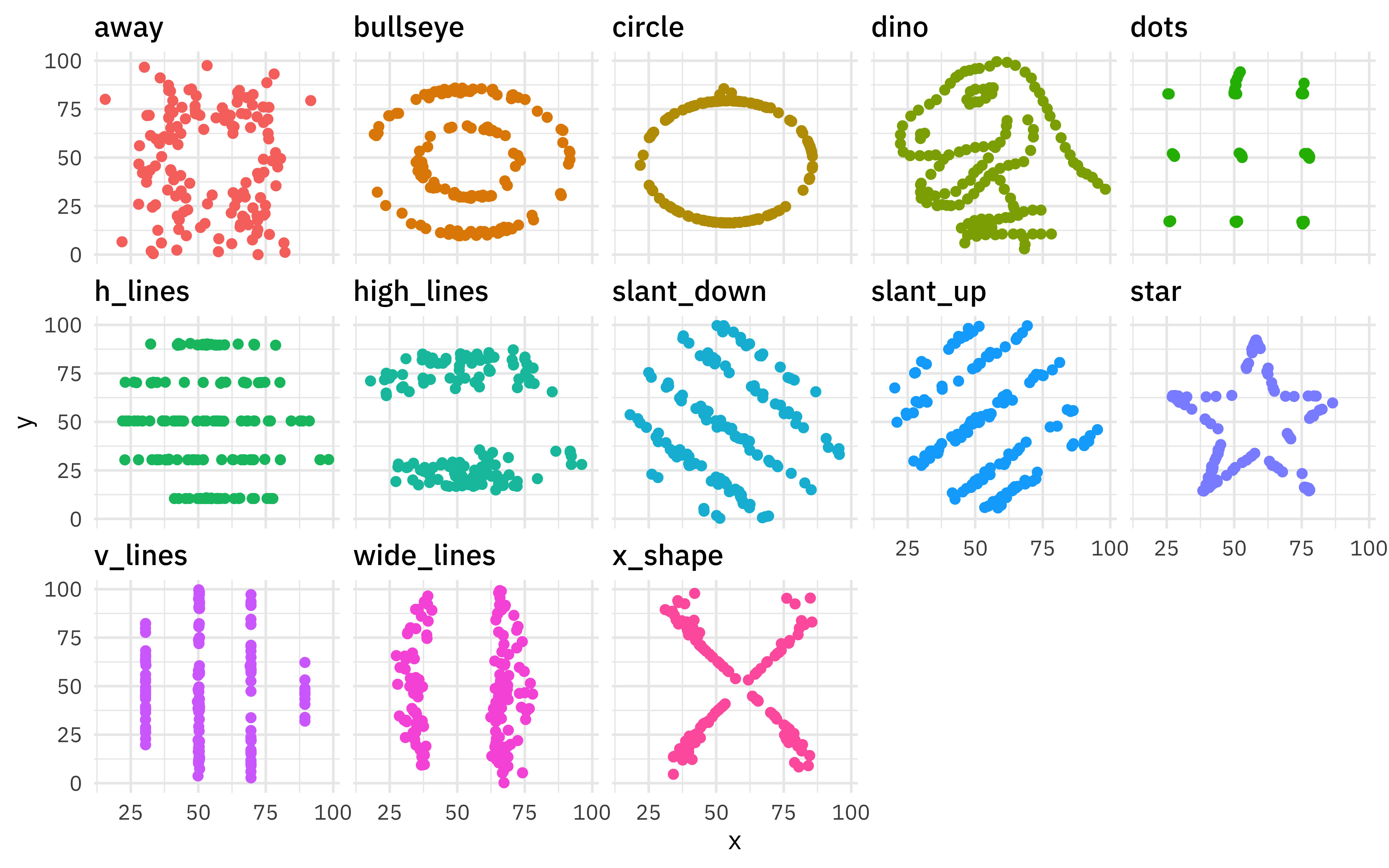
The
Datasaurus Dozen dataset is a collection of 13 sets of x/y data that have very similar summary statistics but look very different when plotted. Our modeling goal is to predict which member of the “dozen” each point belongs to.
Let’s start by reading in the data from the datasauRus package.
library(tidyverse)
library(datasauRus)

datasaurus_dozen
## # A tibble: 1,846 x 3
##    dataset     x     y
##    <chr>   <dbl> <dbl>
##  1 dino     55.4  97.2
##  2 dino     51.5  96.0
##  3 dino     46.2  94.5
##  4 dino     42.8  91.4
##  5 dino     40.8  88.3
##  6 dino     38.7  84.9
##  7 dino     35.6  79.9
##  8 dino     33.1  77.6
##  9 dino     29.0  74.5
## 10 dino     26.2  71.4
## # … with 1,836 more rows
These datasets are very different from each other!
datasaurus_dozen %>%
  ggplot(aes(x, y, color = dataset)) +
  geom_point(show.legend = FALSE) +
  facet_wrap(~dataset, ncol = 5)
But their summary statistics are so similar.
datasaurus_dozen %>%
  group_by(dataset) %>%
  summarise(across(c(x, y), list(mean = mean, sd = sd)),
    x_y_cor = cor(x, y)
  )
## # A tibble: 13 x 6
##    dataset    x_mean  x_sd y_mean  y_sd x_y_cor
##    <chr>       <dbl> <dbl>  <dbl> <dbl>   <dbl>
##  1 away         54.3  16.8   47.8  26.9 -0.0641
##  2 bullseye     54.3  16.8   47.8  26.9 -0.0686
##  3 circle       54.3  16.8   47.8  26.9 -0.0683
##  4 dino         54.3  16.8   47.8  26.9 -0.0645
##  5 dots         54.3  16.8   47.8  26.9 -0.0603
##  6 h_lines      54.3  16.8   47.8  26.9 -0.0617
##  7 high_lines   54.3  16.8   47.8  26.9 -0.0685
##  8 slant_down   54.3  16.8   47.8  26.9 -0.0690
##  9 slant_up     54.3  16.8   47.8  26.9 -0.0686
## 10 star         54.3  16.8   47.8  26.9 -0.0630
## 11 v_lines      54.3  16.8   47.8  26.9 -0.0694
## 12 wide_lines   54.3  16.8   47.8  26.9 -0.0666
## 13 x_shape      54.3  16.8   47.8  26.9 -0.0656
Let’s explore whether we can use modeling to predict which dataset a point belongs to. This is not a large dataset compared to the number of classes (13!) so this isn’t a tutorial that shows best practices for a predictive modeling workflow overall, but it does demonstrate how to evaluate a multiclass model, as well as a bit about how random forest models work.
datasaurus_dozen %>%
  count(dataset)
## # A tibble: 13 x 2
##    dataset        n
##    <chr>      <int>
##  1 away         142
##  2 bullseye     142
##  3 circle       142
##  4 dino         142
##  5 dots         142
##  6 h_lines      142
##  7 high_lines   142
##  8 slant_down   142
##  9 slant_up     142
## 10 star         142
## 11 v_lines      142
## 12 wide_lines   142
## 13 x_shape      142
Build a model
Let’s start out by creating bootstrap resamples of the Datasaurus Dozen. Notice that we aren’t splitting into testing and training sets, so we won’t have an unbiased estimate of performance on new data. Instead, we will use these resamples to understand the dataset and multiclass models better.
library(tidymodels)

set.seed(123)
dino_folds <- datasaurus_dozen %>%
  mutate(dataset = factor(dataset)) %>%
  bootstraps()

dino_folds
## # Bootstrap sampling
## # A tibble: 25 x 2
##    splits             id
##    <list>             <chr>
##  1 <split [1.8K/672]> Bootstrap01
##  2 <split [1.8K/689]> Bootstrap02
##  3 <split [1.8K/680]> Bootstrap03
##  4 <split [1.8K/674]> Bootstrap04
##  5 <split [1.8K/692]> Bootstrap05
##  6 <split [1.8K/689]> Bootstrap06
##  7 <split [1.8K/689]> Bootstrap07
##  8 <split [1.8K/695]> Bootstrap08
##  9 <split [1.8K/664]> Bootstrap09
## 10 <split [1.8K/671]> Bootstrap10
## # … with 15 more rows
Let’s create a random forest model and set up a model workflow with the model and a formula preprocessor. We are predicting the dataset class (dino vs. circle vs. bullseye vs. …) from x and y. A random forest model can often do a good job of learning complex interactions in predictors.
rf_spec <- rand_forest(trees = 1000) %>%
  set_mode("classification") %>%
  set_engine("ranger")

dino_wf <- workflow() %>%
  add_formula(dataset ~ x + y) %>%
  add_model(rf_spec)

dino_wf
## ══ Workflow ════════════════════════════════════════════════════════════════════
## Preprocessor: Formula
## Model: rand_forest()
##
## ── Preprocessor ────────────────────────────────────────────────────────────────
## dataset ~ x + y
##
## ── Model ───────────────────────────────────────────────────────────────────────
## Random Forest Model Specification (classification)
##
## Main Arguments:
##   trees = 1000
##
## Computational engine: ranger
Let’s fit the random forest model to the bootstrap resamples.
doParallel::registerDoParallel()
dino_rs <- fit_resamples(
  dino_wf,
  resamples = dino_folds,
  control = control_resamples(save_pred = TRUE)
)

dino_rs
## # Resampling results
## # Bootstrap sampling
## # A tibble: 25 x 5
##    splits            id          .metrics       .notes         .predictions
##    <list>            <chr>       <list>         <list>         <list>
##  1 <split [1.8K/672… Bootstrap01 <tibble [2 × … <tibble [0 × … <tibble [672 × 1…
##  2 <split [1.8K/689… Bootstrap02 <tibble [2 × … <tibble [0 × … <tibble [689 × 1…
##  3 <split [1.8K/680… Bootstrap03 <tibble [2 × … <tibble [0 × … <tibble [680 × 1…
##  4 <split [1.8K/674… Bootstrap04 <tibble [2 × … <tibble [0 × … <tibble [674 × 1…
##  5 <split [1.8K/692… Bootstrap05 <tibble [2 × … <tibble [0 × … <tibble [692 × 1…
##  6 <split [1.8K/689… Bootstrap06 <tibble [2 × … <tibble [0 × … <tibble [689 × 1…
##  7 <split [1.8K/689… Bootstrap07 <tibble [2 × … <tibble [0 × … <tibble [689 × 1…
##  8 <split [1.8K/695… Bootstrap08 <tibble [2 × … <tibble [0 × … <tibble [695 × 1…
##  9 <split [1.8K/664… Bootstrap09 <tibble [2 × … <tibble [0 × … <tibble [664 × 1…
## 10 <split [1.8K/671… Bootstrap10 <tibble [2 × … <tibble [0 × … <tibble [671 × 1…
## # … with 15 more rows
We did it!
Evaluate model
How did these models do overall?
collect_metrics(dino_rs)
## # A tibble: 2 x 5
##   .metric  .estimator  mean     n std_err
##   <chr>    <chr>      <dbl> <int>   <dbl>
## 1 accuracy multiclass 0.449    25 0.00337
## 2 roc_auc  hand_till  0.846    25 0.00128
The accuracy is not great; a multiclass problem like this, especially one with so many classes, is harder than a binary classification problem. There are so many possible wrong answers!
Since we saved the predictions with save_pred = TRUE we can compute other performance metrics. Notice that by default the positive predictive value (like accuracy) is macro-weighted for multiclass problems.
dino_rs %>%
  collect_predictions() %>%
  group_by(id) %>%
  ppv(dataset, .pred_class)
## # A tibble: 25 x 4
##    id          .metric .estimator .estimate
##    <chr>       <chr>   <chr>          <dbl>
##  1 Bootstrap01 ppv     macro          0.428
##  2 Bootstrap02 ppv     macro          0.431
##  3 Bootstrap03 ppv     macro          0.436
##  4 Bootstrap04 ppv     macro          0.418
##  5 Bootstrap05 ppv     macro          0.445
##  6 Bootstrap06 ppv     macro          0.413
##  7 Bootstrap07 ppv     macro          0.420
##  8 Bootstrap08 ppv     macro          0.423
##  9 Bootstrap09 ppv     macro          0.393
## 10 Bootstrap10 ppv     macro          0.429
## # … with 15 more rows
Next, let’s compute ROC curves for each class.
dino_rs %>%
  collect_predictions() %>%
  group_by(id) %>%
  roc_curve(dataset, .pred_away:.pred_x_shape) %>%
  ggplot(aes(1 - specificity, sensitivity, color = id)) +
  geom_abline(lty = 2, color = "gray80", size = 1.5) +
  geom_path(show.legend = FALSE, alpha = 0.6, size = 1.2) +
  facet_wrap(~.level, ncol = 5) +
  coord_equal()
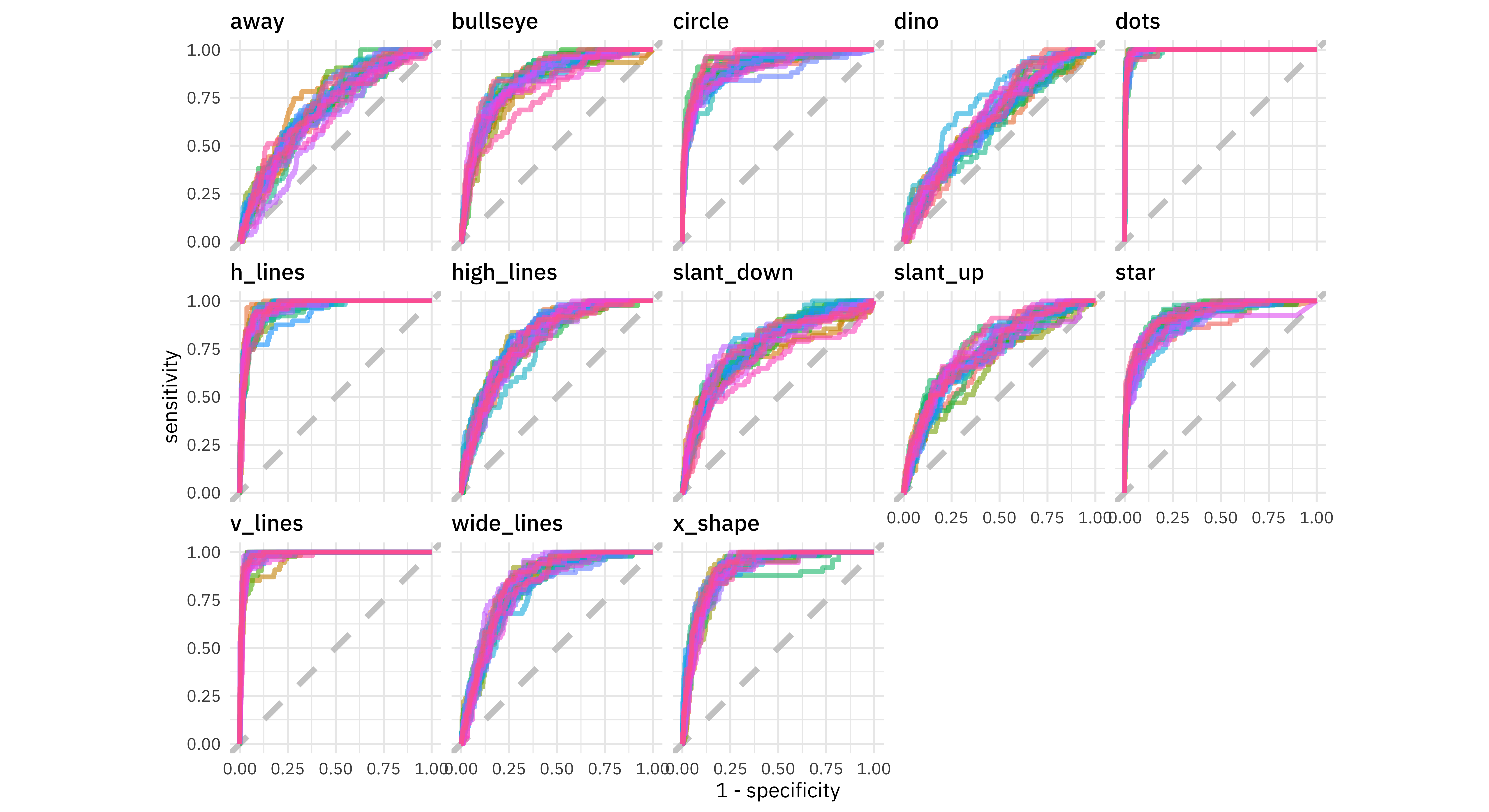
We have an ROC curve for each class and each resample in this plot. Notice that the points dataset was easy for the model to identify while the dino dataset was very difficult. The model barely did better than guessing for the dino!
We can also compute a confusion matrix. We could use tune::conf_mat_resampled() but since there are so few examples per class and the classes were balanced, let’s just look at all the resamples together.
dino_rs %>%
  collect_predictions() %>%
  conf_mat(dataset, .pred_class)
##             Truth
## Prediction   away bullseye circle dino dots h_lines high_lines slant_down slant_up star v_lines wide_lines x_shape
##   away        220       78     50   59    9      55         78        130       96   58       4        118      83
##   bullseye    125      470     17   97    3      38        101         74      109   31      40         93      55
##   circle       99       16    852  105    4      34        147         49       98   85       6         62      30
##   dino         54       65     16  142    5      42         82        153      114   50      23         66      49
##   dots         22       20     22   33 1221      39         57         47       34   15      11         28      16
##   h_lines      52       81     37   60   26     897         37         42       54   34       4         56      36
##   high_lines  111      105     69  145    8      27        381         95      125   58      34         73      77
##   slant_down  137       55     24  158   10      30         69        318      114   33      41         89      27
##   slant_up     81       82     37  144    1      30         64        107      264   30      13         96      49
##   star         60       52     37   77   19      28         62         73       37  755       0         34      87
##   v_lines      32       66     30   69    7       9         45         78       56   20    1133         32      14
##   wide_lines  175      134     55  137    0      56         69        102      193   53      21        390     147
##   x_shape     158      102     65   79    4      27        121         67       44   92       1        136     648
These counts are can be easier to understand in a visualization.
dino_rs %>%
  collect_predictions() %>%
  conf_mat(dataset, .pred_class) %>%
  autoplot(type = "heatmap")
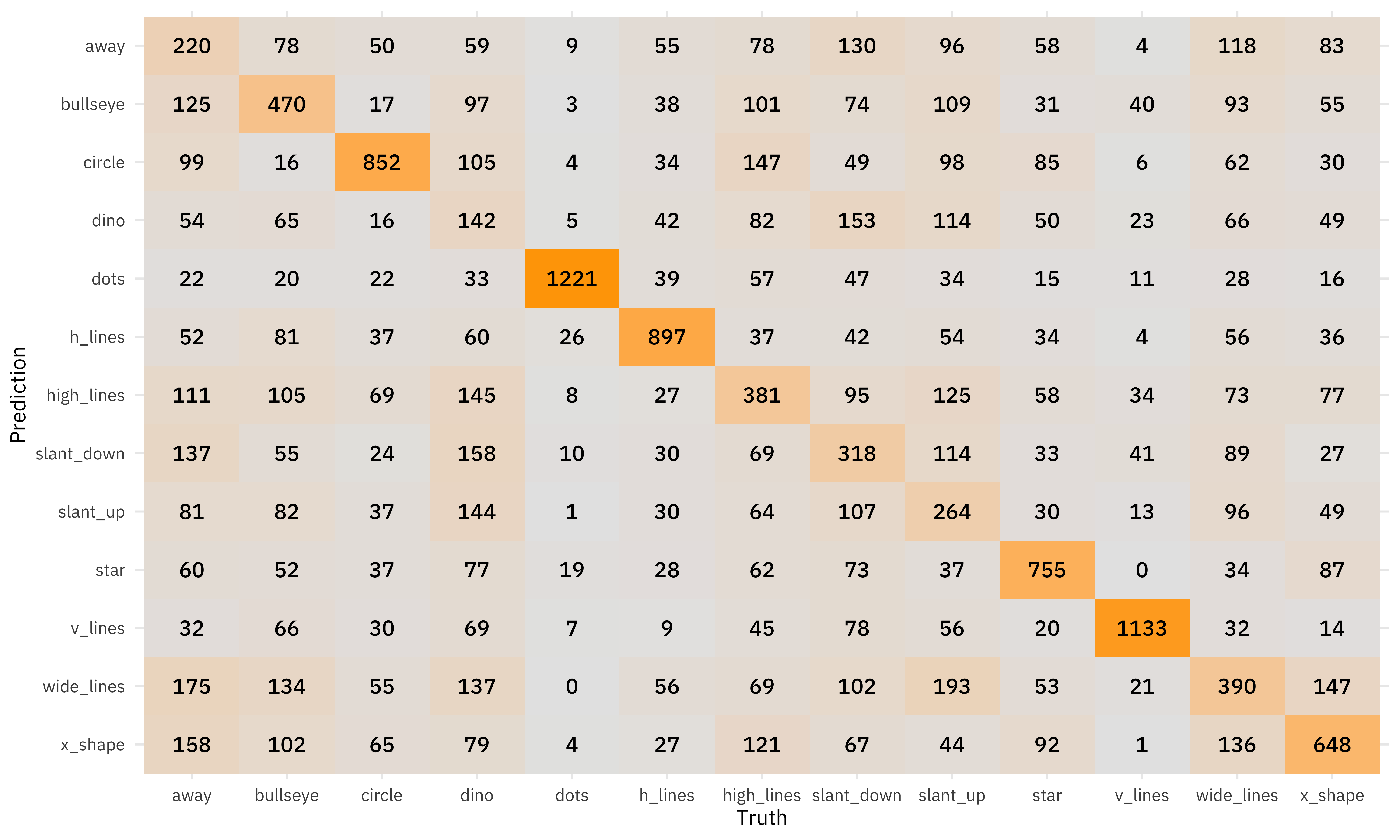
There is some real variability on the diagonal, with a factor of 10 difference from dinos to dots.
If we set the diagonal to all zeroes, we can see which classes were most likely to be confused for each other.
dino_rs %>%
  collect_predictions() %>%
  filter(.pred_class != dataset) %>%
  conf_mat(dataset, .pred_class) %>%
  autoplot(type = "heatmap")
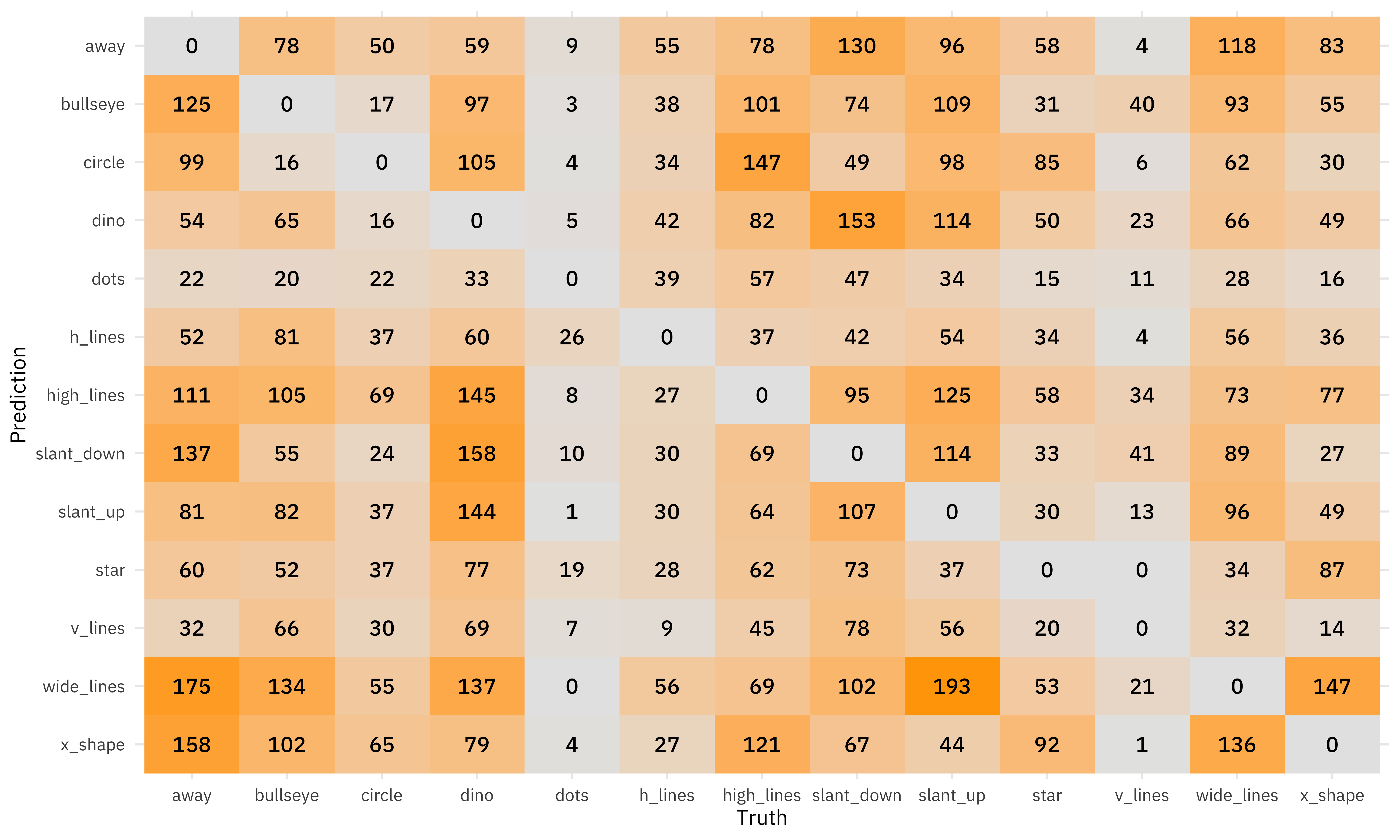
The dino dataset was confused with many of the other datasets, and wide_lines was often confused with slant_up.
- Posted on:
- October 14, 2020
- Length:
- 8 minute read, 1625 words
- Categories:
- rstats tidymodels
- Tags:
- rstats tidymodels