Water World
By Julia Silge
January 19, 2016
I live in Utah, an extremely dry state. Like much of the western United States, Utah is experiencing water stress from increasing demand, episodes of drought, and conflict over water rights. At the same time, Utahns use a lot of water per capita compared to residents of other states. According to the United States Geological Survey, in 2014 people in Utah used more water per person than in any other state, and in years before and after, Utah’s per capita water use is always near the very top in the U.S. Let’s explore water consumption in Salt Lake City, the largest city in Utah. A first step to any water solution in Utah is to better understand who is using water, when, and for what.
The city of Salt Lake makes water consumption data publicly available at the census tract and block level, with information on the type of water user (single residence, apartment, hospital, business, etc.) and amount of water used from 2000 into 2015. The data at the census tract level is available here via Utah’s Open Data Catalog and can be accessed via Socrata Open Data API.
library(RSocrata)
water <- read.socrata("https://opendata.utah.gov/resource/j4aa-ce7s.csv")
After loading the data, let’s do a bit of cleaning up. There are just a few rows with non-year values in the year column, and a few NA values for the water consumption value. Then, let’s adjust the data types.
water <- water[grep("[0-9]{4}", water$YEAR),]
water <- water[!is.na(water$CONSUMPTION),]
water[,1:4] <- lapply(water[,1:4], as.factor)
water[,5:6] <- lapply(water[,5:6], as.numeric)
How much data do we have now?
sapply(water, class)## YEAR MONTH TRACT TYPE CONSUMPTION CONNECTIONS
## "factor" "factor" "factor" "factor" "numeric" "numeric"dim(water)## [1] 99379 6So this data set after cleaning includes 99379 observations of water consumption in Salt Lake City.
Water Use by Type
Let’s group these observations by month, year, and type of user; the types include categories like single residence, park, business, etc. Then let’s sum up all water consumption within these groups so that we can see the distribution of aggregated monthly water consumption across the types of water users.
library(dplyr)
monthtype <- water %>% group_by(MONTH, YEAR, TYPE) %>%
        summarize(consumption = sum(CONSUMPTION))
Let’s see what these distributions look like.
library(ggplot2)
ggplot(monthtype, aes(x = TYPE, y = consumption, fill = TYPE)) +
        geom_boxplot() +
        theme(legend.position="none", axis.title.x = element_blank(),
              axis.text.x= element_text(angle=45, hjust = 1)) +
        ggtitle("Total Monthly Water Consumption in Salt Lake City") +
        ylab("Total monthly water consumption (100 cubic ft)")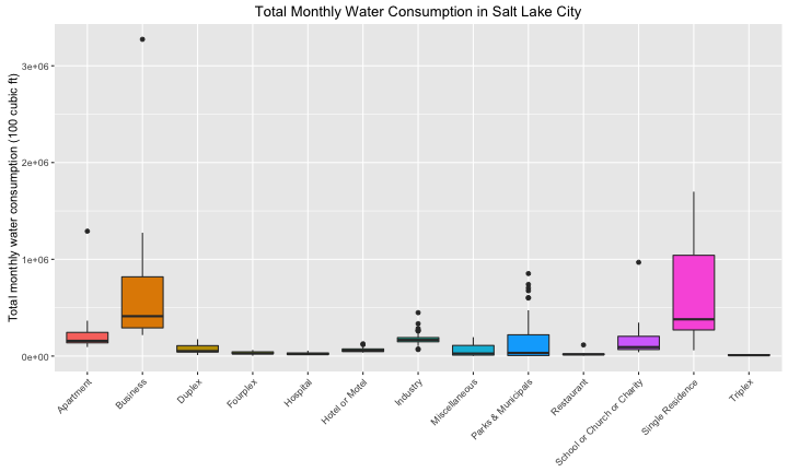
center
This box plot shows that single residence and business users consume the most water each month in Salt Lake City. There are some very high outliers; it turns out these points all come from 2014, a drought year for Utah.
Thirsty Summers
Now let’s see how water consumption has changed over time in Salt Lake City. If we group the observations by date and type, we can make a streamgraph to see how water consumption (in units of 100 cubic ft) has varied with time since 2000.
library(streamgraph)
library(dplyr)
water$date <- as.Date(paste0(water$YEAR,"-", water$MONTH, "-01"))
datetype <- water %>% group_by(date, TYPE) %>% summarize(consumption = sum(CONSUMPTION))
streamgraph(data = datetype, key = "TYPE", value = "consumption", date = "date",
                  offset = "zero", interpolate = "cardinal",
                  width = "750", height = "350") %>%
        sg_fill_tableau("cyclic") %>%
        sg_legend(TRUE, "Type: ") %>%
        sg_axis_x(tick_interval = 1, tick_units = "year", tick_format = "%Y")
The first thing I’m sure we all notice is the obvious annual pattern in water consumption. Also notice the unusual water consumption in 2014, a drought year here in Utah. How much does the distribution of water use change over the course of the year? The distribution is such that it’s hard to see unless we plot this on a log scale, actually.
library(lubridate)
ggplot(monthtype, aes(x = month(as.integer(MONTH), label = TRUE), y = consumption, fill = MONTH)) +
        geom_boxplot() + scale_y_log10() +
        theme(legend.position="none", axis.title.x = element_blank()) +
        ggtitle("Total Monthly Water Consumption in Salt Lake City") +
        ylab("Total monthly water consumption (100 cubic ft)")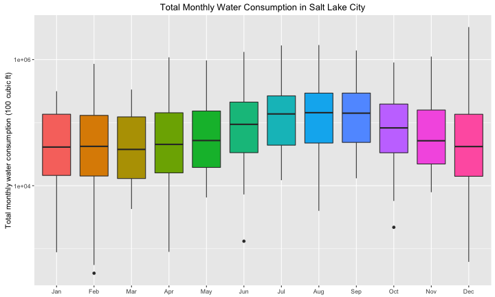
center
Time Series Decomposition
We can think about these water use data as a time series. Let’s add up the water use for all the types of users in all the census tracts and find the total water use in Salt Lake City for each month included in this data set. We can then change this to a time series object with ts().
watertimeseries <- water %>% group_by(YEAR, MONTH) %>% summarize(consumption = sum(CONSUMPTION))
myTS <- ts(watertimeseries$consumption, start=c(2000, 1), end=c(2015, 5), frequency=12)
There is, as we saw, a strong seasonal component to the water use, so why not do a seasonal decomposition? The stl function will decompose a time series into 3 components: the varying seasonal component, an underlying trend component, and the leftover irregular component.
library(ggfortify)
autoplot(stl(myTS, s.window = 'periodic'), ts.colour = 'midnightblue') +
        ylab("Water consumption (100 cubic ft)") +
        ggtitle("Seasonal Decomposition of Salt Lake's Water Use")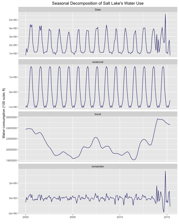
center
The trend component increases into 2013 and 2014; we can see the effect of drought there as water use increases. Also notice the scale on the y-axis for the remainder component and how large the remainder component is for the last years in this data set.
Party Like It’s 2013
Let’s pretend that it is the beginning of 2013 and we would like to use the water use data we have to predict water use in the future. Then let’s check how well that prediction matches the actual water use in 2013 - 2015. We can subset the time series with the window function and fit the data with an ARIMA model. I am new to using ARIMA models, but the idea is that they use differencing and autocorrelation (when a variable depends on past values of the variable itself) to fit the time series.
library(forecast)
myTS2013 <- window(myTS, start=c(2000, 1), end=c(2013, 1))
myArima <- auto.arima(myTS2013)
myForecast <- forecast(myArima, level = c(95), h = 50)
autoplot(myForecast, predict.colour = 'maroon') +
        ylab("Water consumption (100 cubic ft)") +
        ggtitle("Forecasting Salt Lake's Water Use")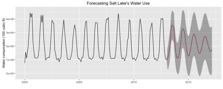
center
Let’s now go back to the data we held back, from 2013 and on, and see how well it agrees with the prediction from the ARIMA model. First, let’s do some data wrangling to make the plot because as far as I can tell, we can’t use autoplot from ggfortify to plot both a time series and a forecast at the same time. Definitely let me know if I am wrong!
myTS2014 <- window(myTS, start=c(2013, 1), end=c(2015, 5))
df1 <- data.frame(date = as.Date(time(myForecast$mean)), value = as.matrix(myForecast$mean),
                  low = as.matrix(myForecast$lower), high = as.matrix(myForecast$upper),
                  key = "predict")
df2 <- data.frame(date = as.Date(time(myTS2013)), value = as.matrix(myTS2013),
                  low = NA, high = NA, key = "data2013")
df3 <- data.frame(date = as.Date(time(myTS2014)), value = as.matrix(myTS2014),
                  low = NA, high = NA, key = "data2014")
colnames(df1) <- colnames(df2) <- colnames(df3) <- c("date", "value", "low", "high", "key")
tsDF <- rbind(df1, df2, df3)

ggplot(tsDF, aes(x = date, y = value)) +
        geom_ribbon(alpha = 0.5, aes(ymin = low, ymax = high)) +
        geom_line(aes(color = key)) +
        scale_color_manual(values = c("maroon", "black", "turquoise3")) +
        theme(legend.position="none", axis.title.x = element_blank()) +
        ggtitle("Forecasting Salt Lake City's Water Use: Not So Great?") +
        ylab("Total monthly water consumption (100 cubic ft)")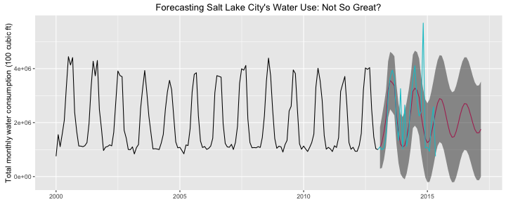
center
Most of the real data points for 2013 and later do fall within the 95% confidence bands of the prediction, but certainly not all of them. Let’s calculate how many of the monthly totals for 2013 and later are within the 95% confidence bands.
myTS2014 < myForecast$upper[1:29,] & myTS2014 > myForecast$lower[1:29,]## Jan Feb Mar Apr May Jun Jul Aug Sep Oct Nov Dec
## 2013 TRUE TRUE TRUE FALSE FALSE TRUE TRUE TRUE FALSE TRUE TRUE FALSE
## 2014 TRUE TRUE TRUE TRUE TRUE TRUE TRUE TRUE TRUE TRUE FALSE TRUE
## 2015 TRUE TRUE TRUE TRUE FALSEmean(myTS2014 < myForecast$upper[1:29,] & myTS2014 > myForecast$lower[1:29,])## [1] 0.7931034About 80% of the water use totals are within the 95% confidence bands of the prediction, which is not awful but not super great. The effects of drought have reduced the accuracy of the model’s prediction. An unusual circumstance like significant drought reduces our ability to reliably model future water use based on past water use. This is perhaps not a shocking revelation, but it’s a good reminder to check model assumptions and to ask whether the distribution underlying the data used to make a model is a good one for making a prediction.
The End
Understanding water use is important in western states like mine; this past last summer, there was a kerfluffle in our state government arguing over exactly how well we even know where Utah’s water is being used and for what. I certainly found this analysis interesting, and I hope to do a little more soon with the spatial information in this data set. The R Markdown file used to make this blog post is available here. I am very happy to hear feedback and other perspectives!