Health Care Indicators in Utah Counties
By Julia Silge
January 11, 2016
The state of Utah (my adopted home) has an Open Data Catalog with lots of interesting data sets, including a collection of health care indicators from 2014 for the 29 counties in Utah. The observations for each county include measurements such as the infant mortality rate, the percent of people who don’t have insurance, what percent of people have diabetes, and so forth. Let’s see how these health care indicators are related to each other and if we can use these data to cluster Utah counties into similar groups.
Something to Keep in Mind
Before we start, let’s look at one demographic map of Utah that is important to remember.
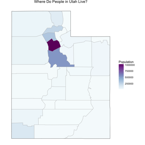
The population in Utah is not evenly distributed among counties. Salt Lake County, where I live, has a population over 1 million people and the rest of the counties have much lower populations. Utah County, just to the south of Salt Lake, has a population that is about half of Salt Lake’s, and the numbers go down very quickly after that; there are a number of counties with populations only in the 1000s. This will effect both the actual health care indicators (rural populations can have different healthcare issues than more urban ones) and the measurements of the health care indicators.
Getting Started
The data sets at Utah’s Open Data Catalog can be downloaded via Socrata Open API. Let’s load the data, fix the data types, and remove the row that contains numbers for the state as a whole.
library(RSocrata)
allHealth <- read.socrata("https://opendata.utah.gov/resource/qmsu-gki4.csv")
allHealth[,3:67] <- lapply(allHealth[,3:67], as.numeric)
allHealth <- allHealth[c(-1),]
Now let’s explore how some of these health care indicators are related to each other. Some of the indicators are correlated with each other in ways that make sense.
ggplot(data = allHealth,
       aes(x = Median.Household.Income, y = Children.Eligible.Free.Lunch...Free.Lunch)) +
        geom_point(alpha = 0.6, size = 3) +
        stat_smooth(method = "lm") +
        geom_point(data = subset(allHealth, County == "Salt Lake"), size = 5, colour = "maroon") +
        xlab("Median household income (dollars)") +
        ylab("Children eligible for free lunch (percent)")
myCor <- cor.test(allHealth$Median.Household.Income, allHealth$Children.Eligible.Free.Lunch...Free.Lunch)
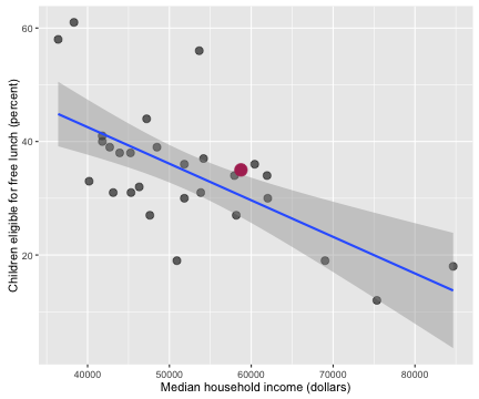
I’ve highlighted Salt Lake County in this plot and the following ones, just to give some context. The correlation coefficient between these two economic/health indicators is -0.652 with a 95% confidence interval from -0.822 to -0.374. Counties with higher incomes have fewer children eligible for free lunch.
ggplot(data = allHealth,
       aes(x = X65.and.over, y = X..Diabetic)) +
        geom_point(alpha = 0.6, size = 3) +
        stat_smooth(method = "lm") +
        geom_point(data = subset(allHealth, County == "Salt Lake"), size = 5, colour = "maroon") +
        xlab("Population over 65 (percent)") +
        ylab("Diabetic population (percent)")
myCor <- cor.test(allHealth$X65.and.over, allHealth$X..Diabetic)
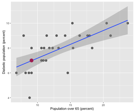
The correlation coefficient between the population percentage over 65 and the percentage of the population with diabetes is 0.667 with a 95% confidence interval from 0.398 to 0.831. Counties with more older people in them have more people with diabetes in them. Notice that Salt Lake County has less than 10% of its population 65 or older; we are very young here in Utah, the youngest in the nation, in fact.
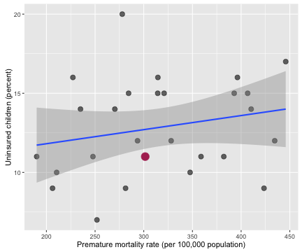
Then there are lots of health care indicators that are not correlated with each other.
ggplot(data = allHealth,
       aes(x = Premature.Age.adjusted.Mortality, y = X..Uninsured.Children.1)) +
        geom_point(alpha = 0.6, size = 3) +
        stat_smooth(method = "lm") +
        geom_point(data = subset(allHealth, County == "Salt Lake"), size = 5, colour = "maroon") +
        xlab("Premature mortality rate (per 100,000 population)") +
        ylab("Uninsured children (percent)")
myCor <- cor.test(allHealth$Premature.Age.adjusted.Mortality, allHealth$X..Uninsured.Children.1)
The correlation coefficient between the percentage of uninsured children and premature age adjusted mortality is 0.221 with a 95% confidence interval from -0.173 to 0.555.
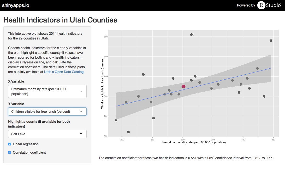
To facilitate exploring all of the health care indicators in the data set, I made a Shiny app where the user can plot any two indicators from the data set, add a linear regression line, calculate a correlation coefficient, and highlight any county of choice. Use the app to explore the data, and check out the code for the app on Github.
Woe Is Me, NA Values…
The clustering analysis we would like to do requires that each county has complete information for all columns, i.e. no missing values. The populations of some Utah counties are so low that some of these health care indicators cannot be measured or are zero. Let’s look at how this plays out.
health <- allHealth[,c(4:5,18,22,24,27,31,34,36,38,42,44,48,51,55,60,63,64)]
rownames(health) <- allHealth$County
colnames(health) <- c("PercentUnder18",
              "PercentOver65",
              "DiabeticRate",
              "HIVRate",
              "PrematureMortalityRate",
              "InfantMortalityRate",
              "ChildMortalityRate",
              "LimitedAccessToFood",
              "FoodInsecure",
              "MotorDeathRate",
              "DrugDeathRate",
              "Uninsured",
              "UninsuredChildren",
              "HealthCareCosts",
              "CouldNotSeeDr",
              "MedianIncome",
              "ChildrenFreeLunch",
              "HomicideRate")
scaledhealth <- scale(health)
library(viridis)
heatmap(scaledhealth, Colv = NA, Rowv = NA, margins = c(10,4),
        main = "Heatmap of Data Set Values", col = viridis(32, 1))
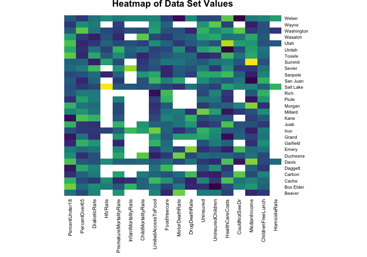
The values for the health indicators have been scaled for this heat map (otherwise, for example, the numbers for the median income would swamp out the numbers for the HIV rate because of the units they are measured with). The blank spaces in the heat map show where we have NA values to deal with. HIV/AIDs is not a very common disease and there are no reported cases of HIV in many of the sparsely populated counties in Utah. It probably makes sense to just put a zero in those spots because more urban areas have more HIV cases. Having an infant die is also quite uncommon in the United States and there are many counties in Utah where no infants died in 2014. Does it make sense to just put a zero in those spots?
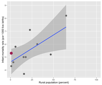
Probably not, right? Outcomes for newborn babies appear to be worse in more rural counties. While plugging in a zero for the infant mortality rate in a county where zero newborns died does make sense on one level, it is a problematic thing to do.
One option is to impute the missing values based on the values for other, similar counties. One possible method for this is the random forest, an ensemble decision tree algorithm.
library(missForest)
healthimputed <- missForest(health)
##   missForest iteration 1 in progress...done!
##   missForest iteration 2 in progress...done!
##   missForest iteration 3 in progress...done!
##   missForest iteration 4 in progress...done!
##   missForest iteration 5 in progress...done!
We can access the new matrix with the imputed values via healthimputed$ximp. Unfortunately, this was not a screaming success because some of the columns have so few real measured values; the mean squared error was not good and this approach doesn’t seem like a good idea. The good news is that I tested the rest of this analysis both with the random forest imputed data and just replacing NA values with 0, and the results were pretty much the same. There were some minor differences in exactly how the counties clustered, but no major differences in the main results. Given that, let’s just replace all the NA values with zeroes, scale and center the data, and move forward.
health[is.na(health)] <- 0
health <- scale(health)
Principal Component Wonderfulness
We can think of a data set like this as a high-dimensional space where each county is at a certain spot in that space. At this point in the analysis we are working with 18 columns of observations. We removed the columns that directly measure how many people live in each county such as population number, percentage of population who are rural dwellers, etc. and kept the columns on health care indicators such as child mortality rate, homicide rate, and percentage of population who is uninsured. Thus we have an 18-dimensional space and each county is located at its own spot in that space. Principal component analysis is a way to project these data points onto a new, special coordinate system. In our new coordinate system, each coordinate, or principal component, is a weighted sum of the original coordinates. The first principal component has the most variance in the data in its direction, the second principal component has the second most variance in the data in its direction, and so forth. Let’s do it!
myPCA <- prcomp(health)
Welp, that was easy.

I just love PCA; it’s one of my very favorite algorithmic-y things. Let’s see what the first few of the principal components actually look like.
library(reshape2)
melted <- melt(myPCA$rotation[,1:9])
ggplot(data = melted) +
        theme(legend.position = "none", axis.text.x = element_blank(),
              axis.ticks.x = element_blank()) +
        xlab("Health care indicator measurements") +
        ylab("Relative importance in each principle component") +
        ggtitle("Variables in Principal Component Analysis") +
        geom_bar(aes(x=Var1, y=value, fill=Var1), stat="identity") +
        facet_wrap(~Var2)
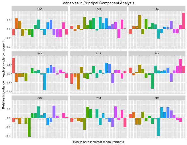
So each of these components are orthogonal to each other, and the colored bars show the contribution of each original health care indicator to that principal component. Each principal component is uncorrelated to the others and together, the principal components contain the information in the data set. Let’s zoom in on the first principal component, the one that has the largest variance and accounts for the most variability between the counties.
ggplot(data = melted[melted$Var2 == "PC1",]) +
         theme(legend.position = "none",
               axis.text.x= element_text(angle=45, hjust = 1),
               axis.ticks.x = element_blank()) +
         xlab("Health care indicator measurements") +
         ylab("Relative importance in principle component") +
         ggtitle("Variables in PC1") +
         geom_bar(aes(x=Var1, y=value, fill=Var1), stat="identity")
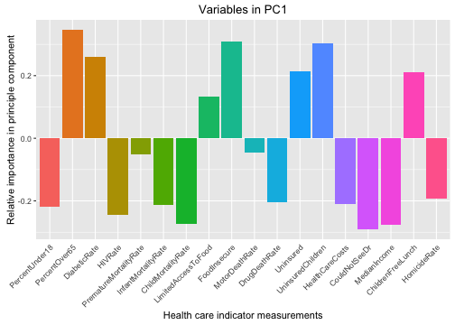
We can see here that counties with higher positive values for PC1 (the component that accounts for the most variability among the counties) have fewer children, more older people, low HIV and homicide rates, are more poor, and have more uninsured people. These sound like more rural counties.
It’s Clustering Time
Now let’s see if this data set of health care indicators can be used to cluster similar counties together. Clustering is an example of unsupervised machine learning, where we want to use an algorithm to find structure in unlabeled data. Let’s begin with hierarchical clustering. This method of clustering begins with all the individual items (counties, in our case) alone by themselves and then starts merging them into clusters with the items that are closest to them within the space we are considering. First, the algorithm merges them into two-item clusters, then it will merge another nearby item into each cluster, and so forth, until all the items are merged together into one big cluster. We can examine the tree structure the algorithm used to do the clustering to see what kind of clustering makes sense for the data, given the context, etc. Hierarchical clustering can be done with different methods of computing the distance (or similarity) of the items.
Let’s use the fpc package, a package with lots of resources for clustering algorithms, to do some hierarchical clustering of this county health data. Let’s do the hierarchical clustering algorithm, but let’s do it with bootstrap resampling of the county sample to assess how stable the clusters are to individual counties within the sample and what the best method for computing the distance/similarity is.
library(fpc)
myClusterBoot <- clusterboot(health,clustermethod=hclustCBI, method="ward.D", k=3, seed = 6789)
I tested different methods for computing the distance and found Ward clustering to be the most stable. The bootstrap results also indicate that 3 clusters is a stable, sensible choice. Let’s look at the results for these parameters for the hierarchical clustering.
myClusterBoot$bootmean
## [1] 0.8090913 0.7216360 0.6972370
myClusterBoot$bootbrd
## [1] 10 26 21
The bootmean value measures the cluster stability, where a value close to 1 indicates a stable cluster. The bootbrd value measures how many times (out of the 100 resampling runs) that cluster dissolved. These three clusters look pretty stable, so let’s take a look at how the hierarchical clustering algorithm has grouped the counties here.
library(dendextend)
myDend <- health %>% dist %>% hclust(method = "ward.D") %>%
    as.dendrogram %>%
    set("branches_k_color", k = 3) %>%
    set("labels_col", k=3) %>%
    hang.dendrogram(hang_height=0.8)
par(mar = c(3,3,3,7))
plot(myDend, horiz = TRUE,
     main = "Clustering in Utah County Health Care Indicators")
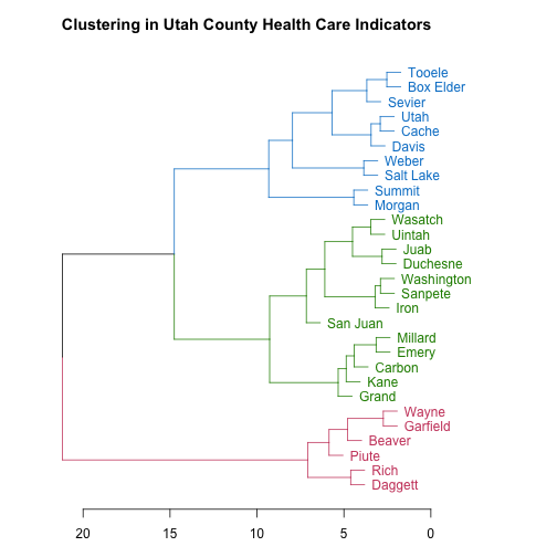
The scale along the bottom shows a measure of how separated the branches of the tree structure are. As a resident of Utah, these county names look like they may be in a certain order to me; let’s check it out. What if I looked at county names ordered from lowest population to highest? (This is from the original data frame, not the data used to do the clustering.)
allHealth$County[order(allHealth$Population)]
##  [1] "Daggett"    "Piute"      "Rich"       "Wayne"      "Garfield"
##  [6] "Beaver"     "Kane"       "Grand"      "Morgan"     "Juab"
## [11] "Emery"      "Millard"    "San Juan"   "Duchesne"   "Sevier"
## [16] "Carbon"     "Wasatch"    "Sanpete"    "Uintah"     "Summit"
## [21] "Iron"       "Box Elder"  "Tooele"     "Cache"      "Washington"
## [26] "Weber"      "Davis"      "Utah"       "Salt Lake"
Yes indeed! The pink counties are the lowest population counties, the green ones are intermediate in population, and the blue counties are the most populous. The hierarchical clustering algorithm groups the counties by population based on their health care indicators.
Another algorithm for grouping similar objects is k-means clustering. K-means clustering works a bit differently than hierarchical clustering. You decide ahead of time how many clusters you are going to have (the number k) and randomly pick centers for each cluster (perhaps by picking data points at random to be the centers of each cluster). Then, the algorithm assigns each data point (county, in our case) to the closest cluster. After the clusters have their new members, the algorithm calculates new centers for each cluster. These steps of calculating the centers and assigning points to the clusters are repeated until the assignment of points to clusters converges (hopefully to a real minimum). Then you have your final cluster assignments!
The kmeansruns function in the fpc library will run k-means clustering many times to find the best clustering.
myKmeans <- kmeansruns(health, krange=1:5)
Helpfully, this function estimates the number of clusters in the data; it can use two different methods for this estimate but both give the same answer for our county health data here. If we include 1 in the range for krange, this function also tests whether there should even be more than one cluster at all. For the county health data, the best k is 2. Let’s plot what this k-means clustering looks like.
library(ggfortify)
library(ggrepel)
set.seed(2346)
autoplot(kmeans(health, 2), data = health, size = 3, aes = 0.8) +
        ggtitle("K-Means Clustering of Utah Counties") +
        theme(legend.position="none") +
        geom_label_repel(aes(PC1, PC2,
                             fill = factor(kmeans(health, 2)$cluster),
                             label = rownames(health)),
                         fontface = 'bold', color = 'white',
                         box.padding = unit(0.5, "lines"))
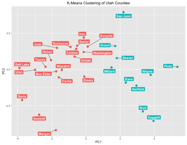
This plot puts the counties on a plane where the x-axis is the first principal component and the y-axis is the second principal component; this kind of plotting can be helpful to show how data points are different from each other. Like with hierarchical clustering, k-means clustering has grouped counties by population. The cluster on the right is a low-population cluster while the cluster on the left is a high population cluster.
Remember that when we looked in detail at PC1, lower negative values of PC1 correspond to higher homicide rate, higher HIV rate, more children and fewer older poeple, higher income, lower rates of being food insecure and children eligible for free lunch, etc. Notice which counties have the lowest negatives values for PC1: the three most populous counties in Utah. That is heartening to see.
The methods for estimating numbers of clusters in the k-means algorithm indicated that 2 was the best number, but we can do a 3-cluster k-means clustering to compare to the groups found by hierarchical clustering.
set.seed(2350)
autoplot(kmeans(health, 3), data = health, size = 3, aes = 0.8) +
        ggtitle("K-Means Clustering of Utah Counties") +
        theme(legend.position="none") +
        geom_label_repel(aes(PC1, PC2,
                             fill = factor(kmeans(health, 3)$cluster),
                             label = rownames(health)),
                         fontface = 'bold', color = 'white',
                         box.padding = unit(0.5, "lines"))
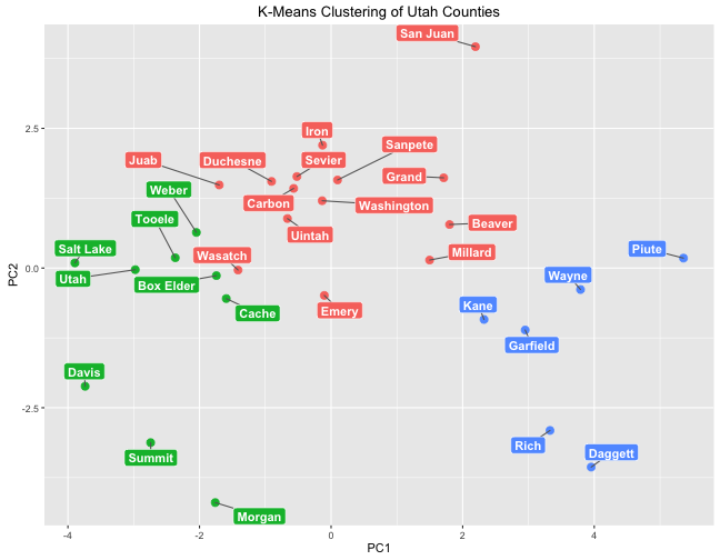
These groups are very similar to those found by hierarchical clustering.
The End
If you have a skeptical turn of mind (as I tend to do), you might suggest that what the clustering algorithms are actually finding is just how many NA values each county had. The least populous counties have the most NA values, counties with more intermediate populations have just a few NA values, and the most populous counties have none. There are a couple of things to consider about this perspective. One is that the pattern of NA values is not random; it could be considered informative in itself so perhaps it is not a problem if that affected the clustering results. Another is that I tested this clustering analysis with a subset of the data that excluded the columns that had many missing values (HIV rate, homicide rate, infant mortality rate, and child mortality rate). The clustering results still showed groups of low and high population counties, although the results were messier since there was less data and the excluded columns were highly predictive. The R Markdown file used to make this blog post is available
here. I am very happy to hear feedback and other perspectives!
