My Baby Boomer Name Might Have Been "Debbie"
By Julia Silge
February 29, 2016
I have always loved learning and thinking about names, how they are chosen and used, and how people feel about their names and the names around them. We had a traditional baby name book at our house when I was growing up (you know, lists of names with meanings), and I remember poring over it to find unusual or appealing names for my pretend play or the stories I wrote. As an adult, I read Laura Wattenberg’s excellent book on baby names when we were expecting our second baby, and I also discovered the NameVoyager on Wattenberg’s website. I just love that kind of thing.
The data used to make the NameVoyager interactive is from the Social Security Administration based on Social Security card applications, and Hadley Wickham has done the work of taking the same data and making it an R package. Lucky us! Let’s use this package and take a look at how the popularity of my name has changed over time.
library(babynames)
library(ggplot2)
library(dplyr)
data(babynames)
juliejulia <- babynames %>% filter(sex == "F", name %in% c("Julia", "Julie"))
ggplot(juliejulia, aes(x = year, y = prop, color = name)) +
        geom_line(size = 1.1) +
        theme(legend.title=element_blank()) +
        scale_color_manual(values = c("tomato", "midnightblue")) +
        ggtitle("My Name Is NOT JULIE!") +
        ylab("Proportion of total applicants for year") + xlab("Year")
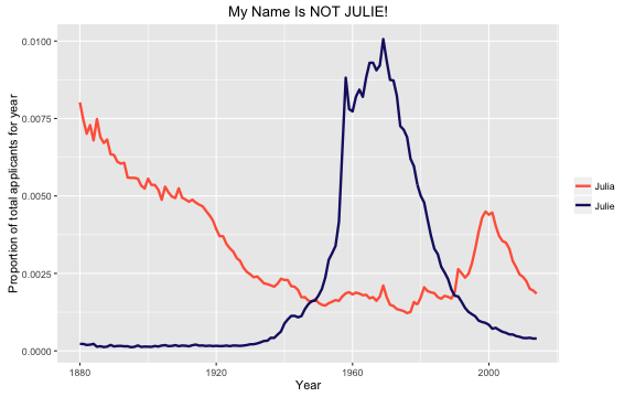
The babynames package includes data from 1880 through 2014. I was born in 1978; notice that for about 20 years or so before my birth, the name “Julie” was very popular, about 4 times as popular as “Julia”. This means that by the time I was born, there were many more girls and women named Julie walking around than those named Julia. During my childhood, I got called “Julie” all the time by people who misheard or misread my name, and oh, how it rankled! It bothered me so, so much at the time. My actual name started to gain in popularity a little after “Julie” started to decline in popularity, so this doesn’t happen to me much as an adult. In fact, I have known a number of other girls and women named Julia at this point in my life, although they have all been younger than me.
My Parents, the Trendsetters
I’ve always thought it was interesting that my parents somehow picked a name like mine; they picked a name that was on its way to becoming popular again, after its long decline from the 19th century, but wasn’t yet really. (They did the same thing for my one sibling, too; her name also was about to become popular when she was born and named.) Let’s look a bit more deeply at my name’s popularity around my birth year.
pickaname <- babynames %>% filter(sex == "F", name == "Julia")
pickaname[pickaname$year == 1978,]
## Source: local data frame [1 x 5]
##
##    year   sex  name     n        prop
##   (dbl) (chr) (chr) (int)       (dbl)
## 1  1978     F Julia  2592 0.001576993
So that is the proportion of the total applicants for Social Security cards who had the name “Julia” in 1978, a measure of the popularity of a name. How is the popularity changing? Let’s take 5 years before and after my birth year and fit a linear model to just those years.
subsetfitname <- pickaname %>% filter(year %in% seq(1978-5,1978+5))
myfit <- lm(prop ~ year, subsetfitname)
subsetfitname$prop <- myfit$fitted.values

fitname <- pickaname %>% mutate(fit = "data")
subsetfitname <- subsetfitname %>% mutate(fit = "fit")
fitname <- rbind(fitname, subsetfitname)
fitname$fit <- as.factor(fitname$fit)
goalprop <- as.numeric(fitname[fitname$year == 1978 & fitname$fit == "data",'prop'])
goalslope <- myfit$coefficients[2]

ggplot(fitname, aes(x = year, y = prop, color = fit, size = fit, alpha = fit)) +
        geom_line() +
        annotate("point", x = 1978, y = goalprop,
                 color = "tomato", size = 4, alpha = .8) +
        theme(legend.title=element_blank()) +
        scale_color_manual(values = c("black", "blue")) +
        scale_size_manual(values = c(1.1, 2)) +
        scale_alpha_manual(values = c(1, 0.8)) +
        ggtitle("How Was the Popularity of My Name Changing Around 1978?") +
        ylab("Proportion of total applicants for year") + xlab("Year")
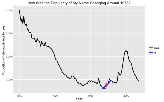
Here we can see the positive slope for the proportion of applicants with year; the popularity of the name “Julia” is increasing around 1978.
Finding Similar Names in a Different Year
Now we have a magnitude and a slope to characterize the popularity of my name in my birth year. Let’s find similar names in other years. This type of analysis was done by Time last year, but they ranked names and then matched names by their rank (i.e. what was the 112th most common name today and in the past decades?). Here, we are approaching the question a little differently. What names in other years have similar proportion of the total applicants and change in that proportion to my name in my birth year? My oldest daughter was born in 2006; let’s try that year. First, let’s find all the names with about the same proportion. Then, let’s calculate the slope for each of those names.
goalyear <- 2006
findmatches <- babynames %>% filter(sex == "F", year == goalyear,
                     prop < goalprop*1.1 & prop > goalprop*0.9) %>%
        mutate(slope = 0.00)

for (i in seq_along(findmatches$name)) {
        matchfitname <- babynames %>% filter(sex == "F",
                                             name == as.character(findmatches[i,'name']))
        matchfitname <- matchfitname %>% filter(year %in% seq(goalyear-5,goalyear+5))
        matchfit <- lm(prop ~ year, matchfitname)
        findmatches[i,'slope'] <- matchfit$coefficients[2]
}
Now, let’s keep only the names that have about the same slope as the original name. For matching purposes, the slopes here are divided into three categories: positive, negative, and mostly flat (between -0.00005 and 0.00005).
if (goalslope >= 0.00005) {
        matchnames <- findmatches %>% filter(slope >= 0.00005) %>% select(name)
} else if (goalslope <= -0.00005) {
        matchnames <- findmatches %>% filter(slope <= -0.00005) %>% select(name)
} else {
        matchnames <- findmatches %>%
                filter(slope > -0.00005 & slope < 0.00005) %>% select(name)
}

matchnames <- babynames %>% filter(sex == "F", name %in% matchnames$name)
plotname <- rbind(pickaname, matchnames)
So what do we have?
ggplot(plotname, aes(x = year, y = prop, color = name)) +
        geom_line(size = 1.1) +
        annotate("text", x = 1978, y = goalprop*1.3, label = "1978") +
        annotate("point", x = 1978, y = goalprop,
                 color = "blue", size = 4.5, alpha = .8) +
        annotate("text", x = goalyear, y = goalprop*1.3, label = goalyear) +
        annotate("point", x = goalyear, y = goalprop,
                 color = "blue", size = 4.5, alpha = .8) +
        theme(legend.title=element_blank()) +
        ggtitle("Which Names For a Girl Born in 2006 Are Similar to Julia Born in 1978?") +
        ylab("Proportion of total applicants for year") + xlab("Year")
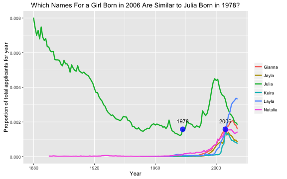
These names all have about the same proportion of the population in 2006 as “Julia” in 1978, and they are all increasing in popularity.
What If I Was a Baby Boomer?
My mom was born in 1953, so let’s do this one more time.
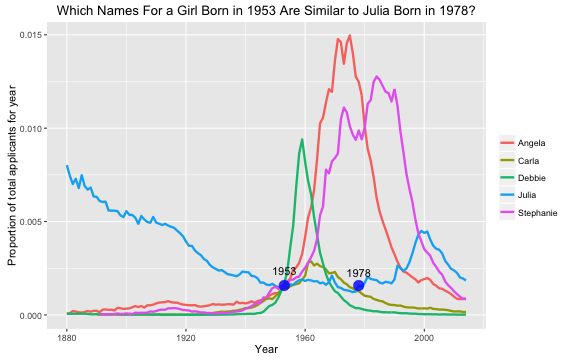
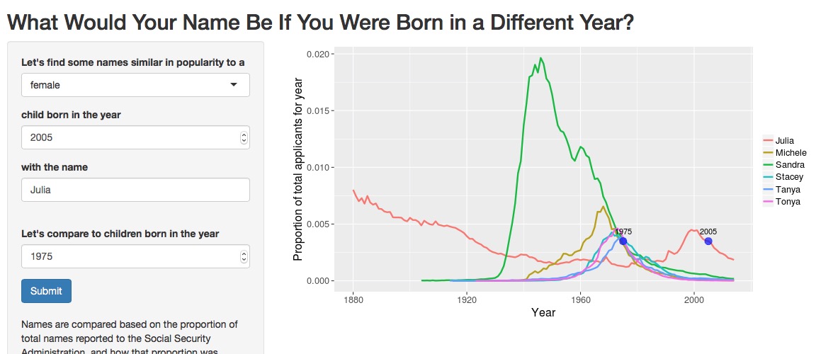
These names definitely sound different than the 2006 matches. They don’t necessarily sound like 1950s names, which makes sense when we look at the patterns in their popularity. These names were all at the beginning of becoming more popular in 1953, some of them extremely popular; they sound more like 1970s names to me. Coincidentally, the proportion for Julia at 1953 is within the bounds to match the proportion for Julia at 1978, but the slope at 1953 is flat and not increasing.
Explore the Names Yourself
I made a Shiny app to explore the names further. Check out the code for the app, and explore the names in the app itself. The app works pretty much just as described in this blog post. Let’s look at some screenshots for a few cases.
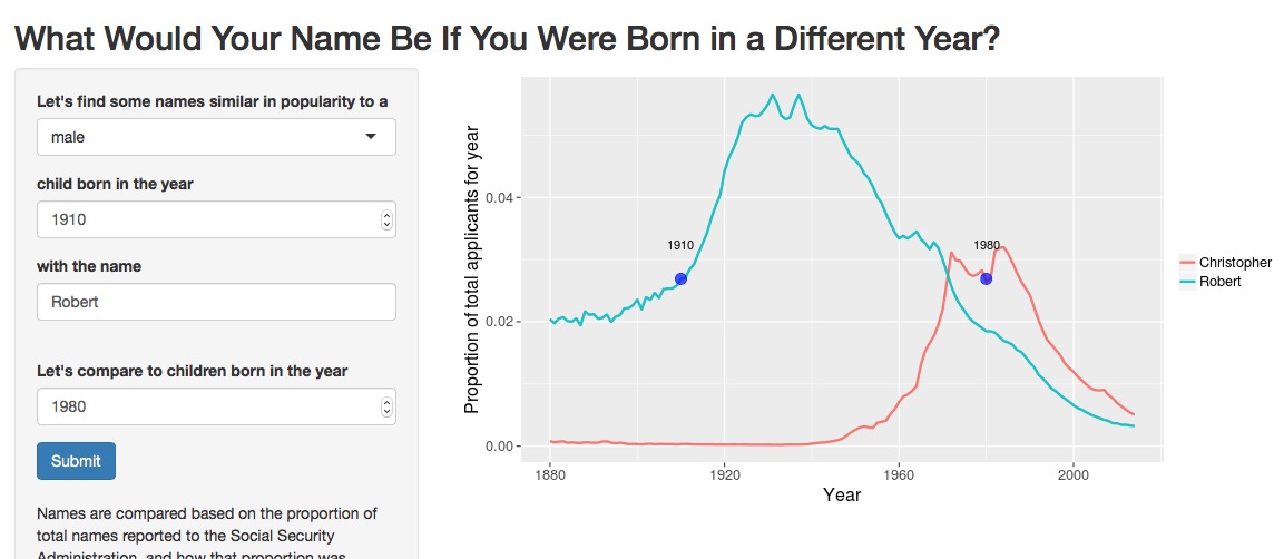
There is only one name in 1980 as popular as Robert in 1910, and that is Christopher, which was the second most popular male name in 1980. Robert is further down the list in 1910. This illustrates a trend in U.S. baby naming; in general, more parents now are choosing less common names than in the past. You can see this in the NameVoyager. That visualization includes the top 1000 names for each year; notice that this makes up a smaller proportion of total births in recent years than in earlier years.
It’s not that there aren’t ever very popular, common names in recent decades, though.
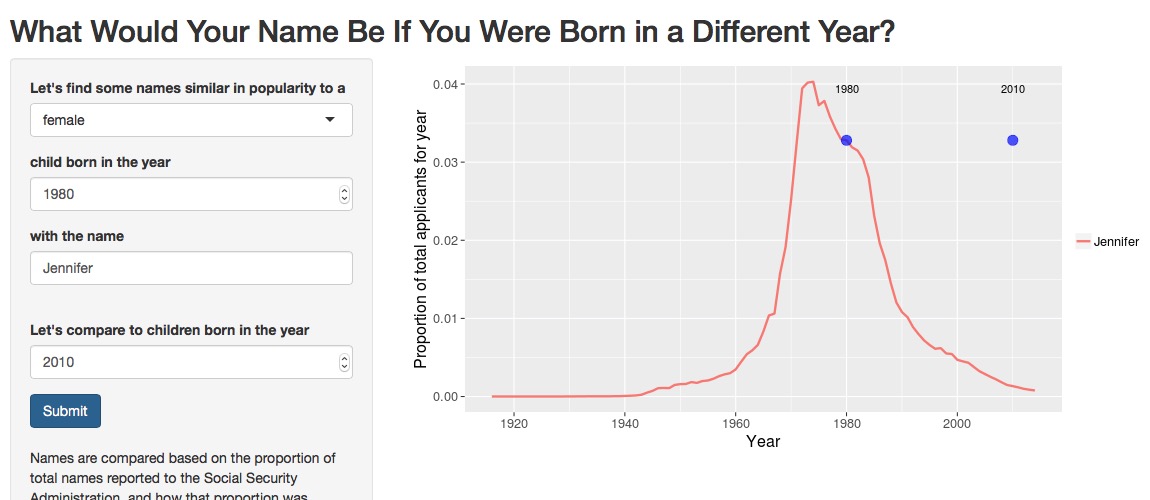
Gosh, Jennifer was just so dominant during my childhood. So much so that there was no name for girls as popular in 2010 as Jennifer was in 1980. I think my younger sister regularly had multiple Jennifers in her classes all through school.
What if we switch those dates?
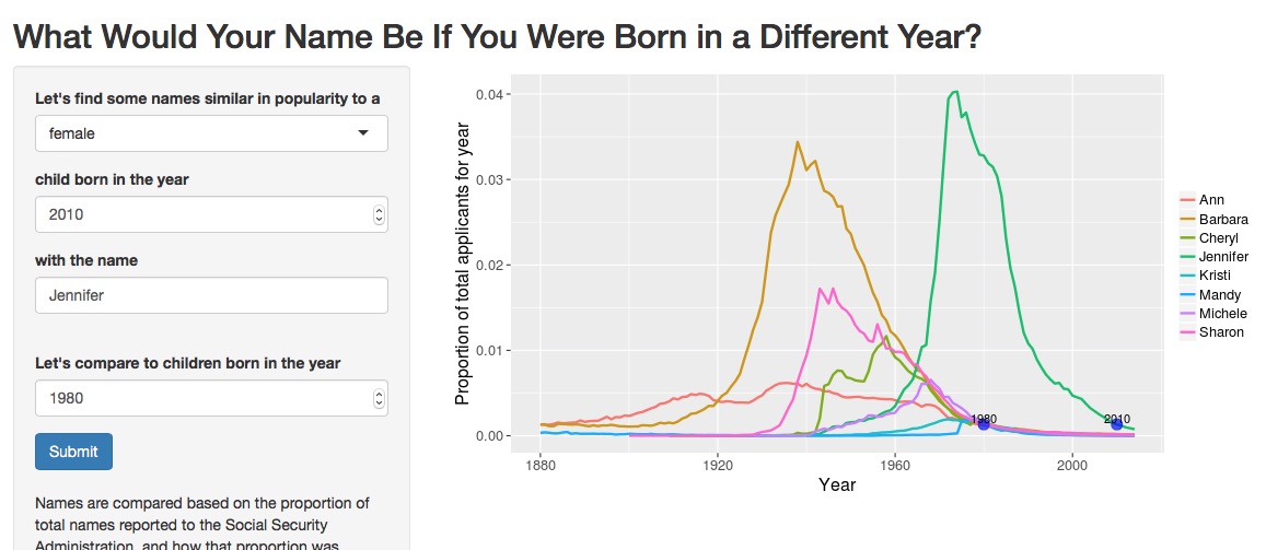
By 2010, Jennifer is on the decline. Naming one’s daughter Jennifer in 2010 is like someone my age being named Barbara, Sharon, or Cheryl. I do not know many women my age with these names, and I will say they sound significantly older to me. (Probably my children or grandchildren will revive these names as adorably retro.)
What happens if you choose a name that is rare in your chosen year? Like, say, Leonard in 1990?
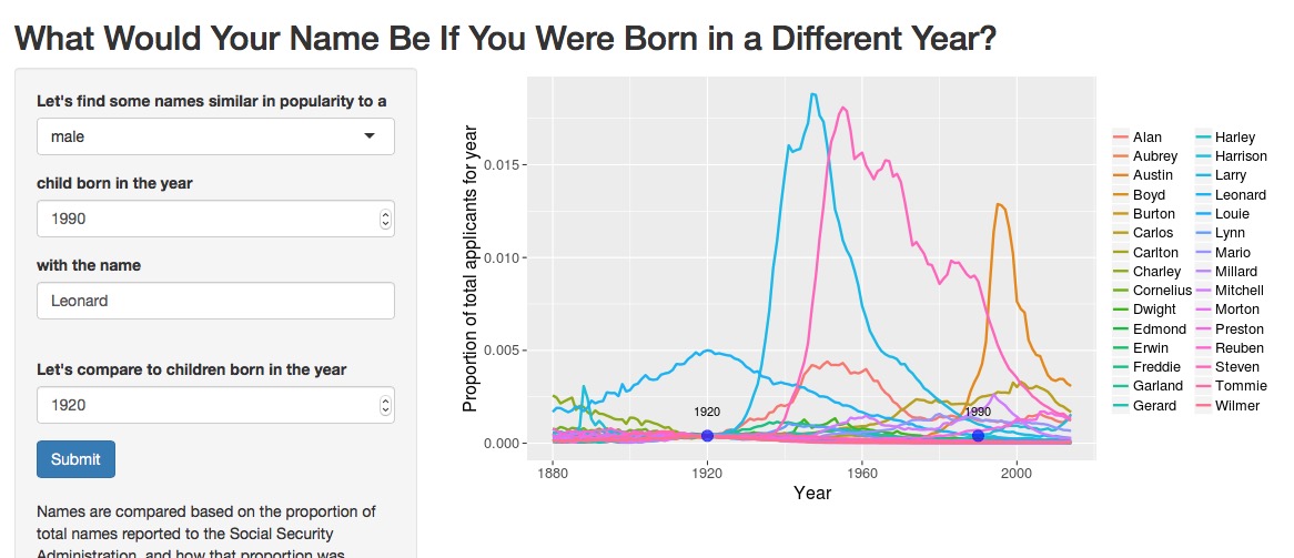
There are many more rare names than common names ( everything’s a power law?). In fact, I ended up adding a ceiling to how many names the app will display because it would just get too overwhelming. The matches to display for the rare names are chosen randomly so you might get different names if you put in the same rare name twice.
Looking at the rare names can be pretty entertaining, though. Notice how a few of the extremely rare names in 1920 (Austin, Steven, Larry) went on to significant popularity. Some, of course, stayed rare and sound rather hilariously antique (Cornelius, Millard, Gerard), and we can see the rise of Hispanic names like Carlos throughout this app. After playing with the app for a while, I’ve come to the conclusion that this matching process is the least meaningful for very rare names with flat slopes; it’s just a slush of super rare names not changing in popularity down there.
The End
There are a
couple of
other Shiny
apps out there for exploring the babynames data set in different ways, if you just can’t get enough. The R Markdown file used to make this blog post is available
here. I am very happy to hear feedback or questions!