Understanding PCA using Stack Overflow data
By Julia Silge
May 18, 2018
This year, I have given some talks about understanding principal component analysis using what I spend day in and day out with, Stack Overflow data. You can see a recording of one of these talks from rstudio::conf 2018. When I have given these talks, I’ve focused a lot on understanding PCA. This blog post walks through how I implemented PCA and how I made the plots I used in my talk.
Some high dimensional data
This analysis uses traffic from the past year for registered users to about 500 of the top tags on Stack Overflow. The analysis here uses 10% of registered traffic for convenience/speed but I have implemented similar analysis with all traffic and gotten about the same results.
Think of each person as a point in a high dimensional space with axes that correspond to technologies like R or JavaScript or C++. People who do similar kinds of work are close to each other in this high dimensional space. Principal component analysis will transform this high dimensional to a new ✨special✨ high dimensional space with special characteristics.
The data that I start with, after constructing an appropriate query to our databases, looks like this.
library(tidyverse)
library(scales)

tag_percents
## # A tibble: 28,791,663 x 3
## User Tag Value
## <int> <chr> <dbl>
## 1 1 exception-handling 0.000948
## 2 1 jsp 0.000948
## 3 1 merge 0.00284
## 4 1 casting 0.00569
## 5 1 io 0.000948
## 6 1 twitter-bootstrap-3 0.00569
## 7 1 sorting 0.00474
## 8 1 mysql 0.000948
## 9 1 svg 0.000948
## 10 1 model-view-controller 0.000948
## # ... with 28,791,653 more rowsNotice that this is in a tidy format, with one row per user and technology. The User column here is a randomized ID, not a Stack Overflow identifier. At Stack Overflow, we make a lot of data public, but traffic data, i.e. which users visit which questions, is not part of that. True anonymization of high dimensional data is extremely difficult; what I have done here is randomize the order of the data and replace Stack Overflow identifiers with numbers. The Value column tells us what percentage of that user’s traffic for the past year goes to that tag.
Anonymization-ish issues aside, what technologies are dominating in users’ traffic?
tag_percents %>%
    group_by(Tag) %>%
    summarise(Value = mean(Value)) %>%
    arrange(desc(Value)) %>%
    top_n(15) %>%
    mutate(Tag = reorder(Tag, Value)) %>%
    ggplot(aes(Tag, Value, label = Tag, fill = Tag)) +
    geom_col(alpha = 0.9, show.legend = FALSE) +
    geom_text(aes(Tag, 0.001), hjust = 0,
              color = "white", size = 4, family = "IBMPlexSans-Bold") +
    coord_flip() +
    labs(x = NULL, y = "Average % of a user's traffic") +
    scale_y_continuous(labels = percent_format(), expand = c(0.015,0)) +
    theme(axis.text.y=element_blank())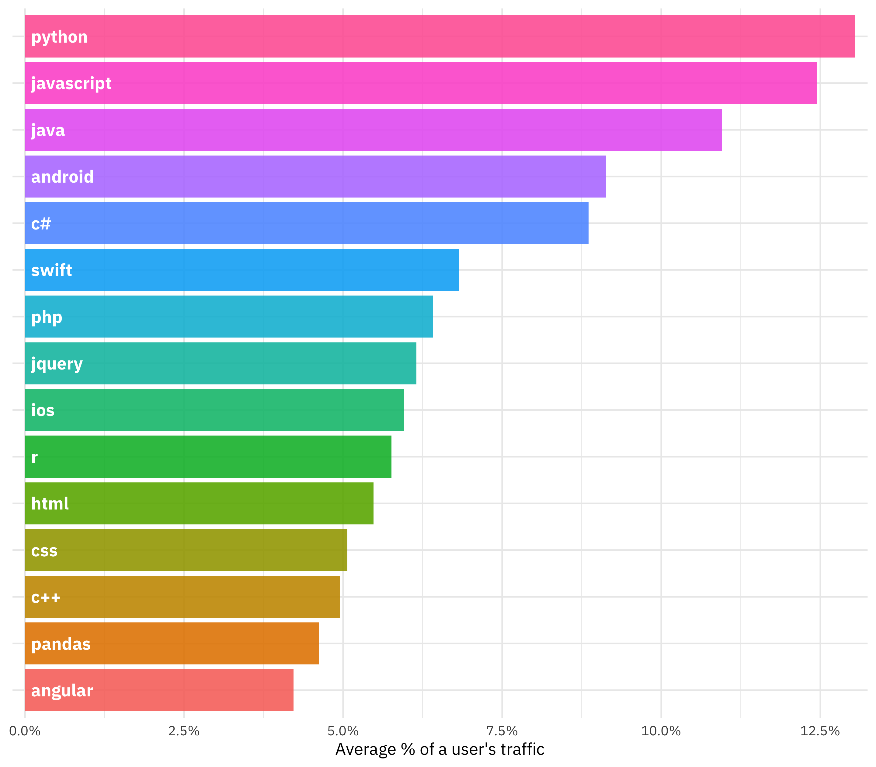
Implementing PCA
We have tidy data, both because that’s what I get when querying our databases and because it is useful for exploratory data analysis when preparing for a machine learning algorithm like PCA. To implement PCA, we need a matrix, and in this case a sparse matrix makes most sense. Most developers do not visit most technologies so there are lots of zeroes in our matrix. The tidytext package has a function cast_sparse() that takes tidy data and casts it to a sparse matrix.
sparse_tag_matrix <- tag_percents %>%
    tidytext::cast_sparse(User, Tag, Value)
Several of the implementations for PCA in R are not sparse matrix aware, such as prcomp(); the first thing it will do is coerce the BEAUTIFUL SPARSE MATRIX you just made into a regular matrix, and then you will be sitting there for one zillion years with no RAM left. (That is a precise and accurate estimate from my benchmarking, obviously.) One option that does take advantage of sparse matrices is the irlba package.
Also, don’t forget to use scale. = TRUE for this matrix; scaling is very important for PCA.
tags_pca <- irlba::prcomp_irlba(sparse_tag_matrix, n = 64, scale. = TRUE)The value for n going into prcomp_irlba() is how many components we want the function to fit.
What is this thing we have created?
class(tags_pca)## [1] "irlba_prcomp" "prcomp"names(tags_pca)## [1] "scale" "totalvar" "sdev" "rotation" "center" "x"🎉
Analyzing the PCA output
I like to deal with dataframes, so the next for me is to tidy() the output of my principal component analysis. This makes it easy for me to handle the output with dplyr and make any kind of plot I can dream up with ggplot2. The output for irlba isn’t handled perfectly by broom so I will put together my own dataframe here, with just a bit of munging.
library(broom)

tidied_pca <- bind_cols(Tag = colnames(tags_scaled),
                        tidy(tags_pca$rotation)) %>%
    gather(PC, Contribution, PC1:PC64)

tidied_pca
## # A tibble: 39,232 x 3
## Tag PC Contribution
## <chr> <chr> <dbl>
## 1 exception-handling PC1 -0.0512
## 2 jsp PC1 0.00767
## 3 merge PC1 -0.0343
## 4 casting PC1 -0.0609
## 5 io PC1 -0.0804
## 6 twitter-bootstrap-3 PC1 0.0855
## 7 sorting PC1 -0.0491
## 8 mysql PC1 0.0444
## 9 svg PC1 0.0409
## 10 model-view-controller PC1 0.0398
## # ... with 39,222 more rowsNotice here I made a dataframe with one row for each tag and component.
What do these results look like, from a birds eye level?
tidied_pca %>%
    filter(PC %in% paste0("PC", 1:6)) %>%
    ggplot(aes(Tag, Contribution, fill = Tag)) +
    geom_col(show.legend = FALSE, alpha = 0.8) +
    theme(axis.text.x = element_blank(),
          axis.ticks.x = element_blank(),
          panel.grid.major = element_blank(),
          panel.grid.minor = element_blank()) +
    labs(x = "Stack Overflow tags",
         y = "Relative importance in each principal component") +
    facet_wrap(~ PC, ncol = 2)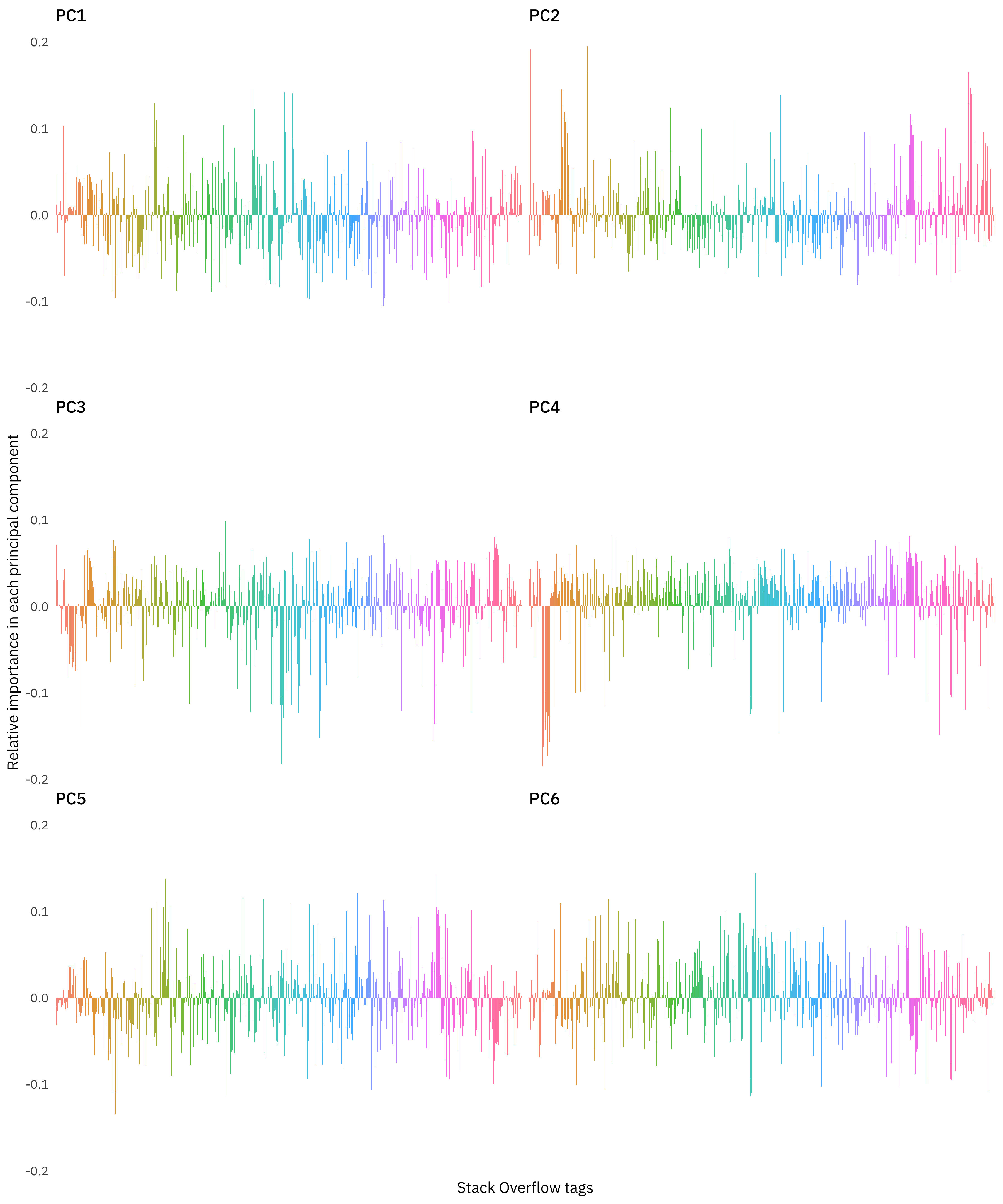
This is very beautiful if not maximally informative. What we are looking at is the first six components, and how much individual Stack Overflow tags, alphabetized on the x-axis, contribute to them. We can see where related technologies probably all start with the same couple of letters, say in the orange in PC4 and similar.
Let’s zoom in and look at just the first component.
tidied_pca %>%
    filter(PC == "PC1") %>%
    top_n(40, abs(Contribution)) %>%
    mutate(Tag = reorder(Tag, Contribution)) %>%
    ggplot(aes(Tag, Contribution, fill = Tag)) +
    geom_col(show.legend = FALSE, alpha = 0.8) +
    theme(axis.text.x = element_text(angle = 90, hjust = 1, vjust = 0.5),
          axis.ticks.x = element_blank()) +
    labs(x = "Stack Overflow tags",
         y = "Relative importance in principle component")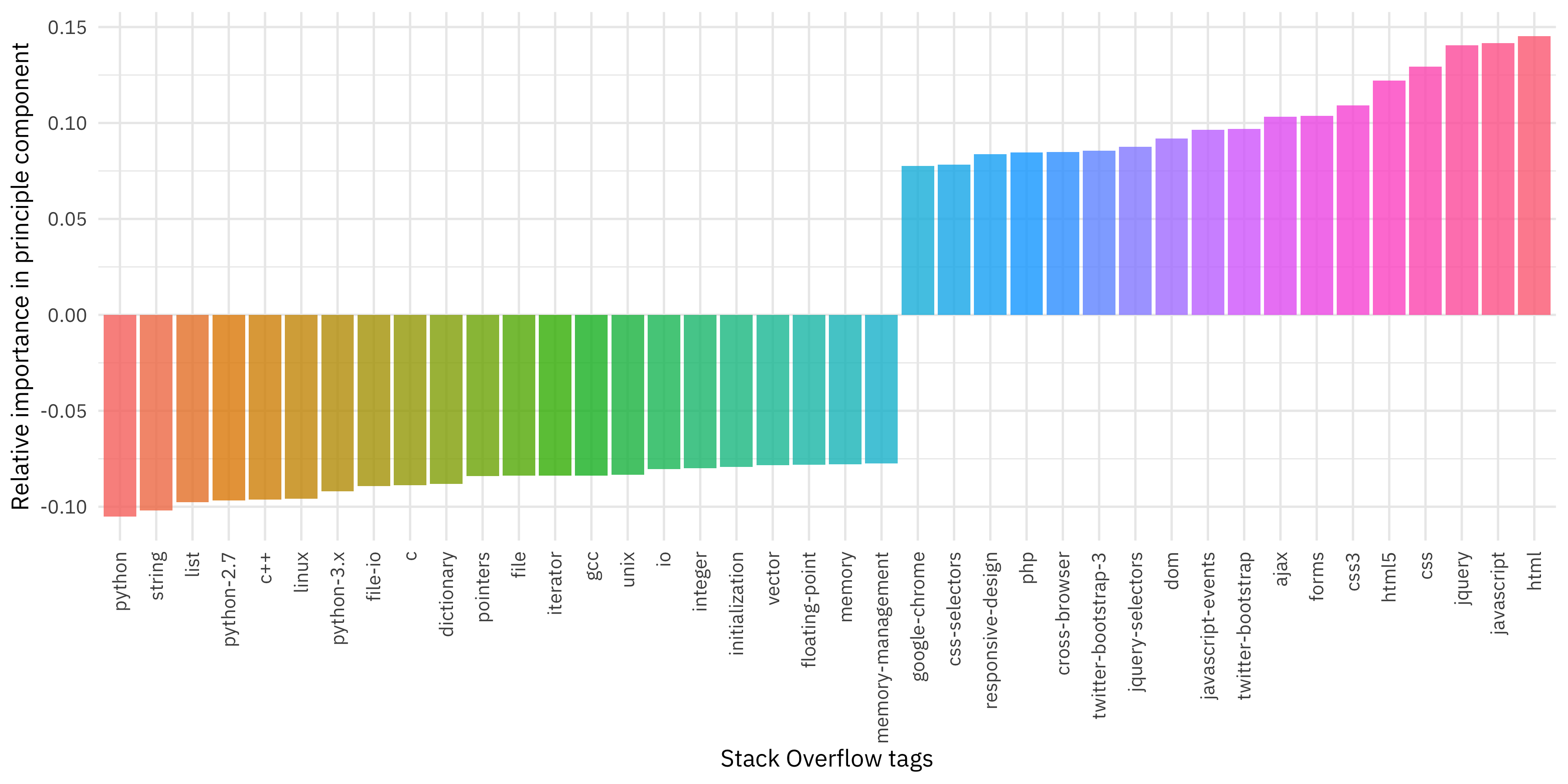
Now we can see which tags contribute to this component. On the positive side, we see front end web development technologies like HTML, JavaScript, jQuery, CSS, and such. On the negative side, we see Python and low level technologies like strings, lists, and C++. What does this mean? It means that what accounts for the most variation in Stack Overflow users is whether they do work more with front end web technologies or Python and low level technologies.
What about the second principal component?
tidied_pca %>%
    filter(PC == "PC2") %>%
    top_n(40, abs(Contribution)) %>%
    mutate(Tag = reorder(Tag, Contribution)) %>%
    ggplot(aes(Tag, Contribution, fill = Tag)) +
    geom_col(show.legend = FALSE, alpha = 0.8) +
    theme(axis.text.x = element_text(angle = 90, hjust = 1, vjust = 0.5),
          axis.ticks.x = element_blank()) +
    labs(x = "Stack Overflow tags",
         y = "Relative importance in principle component")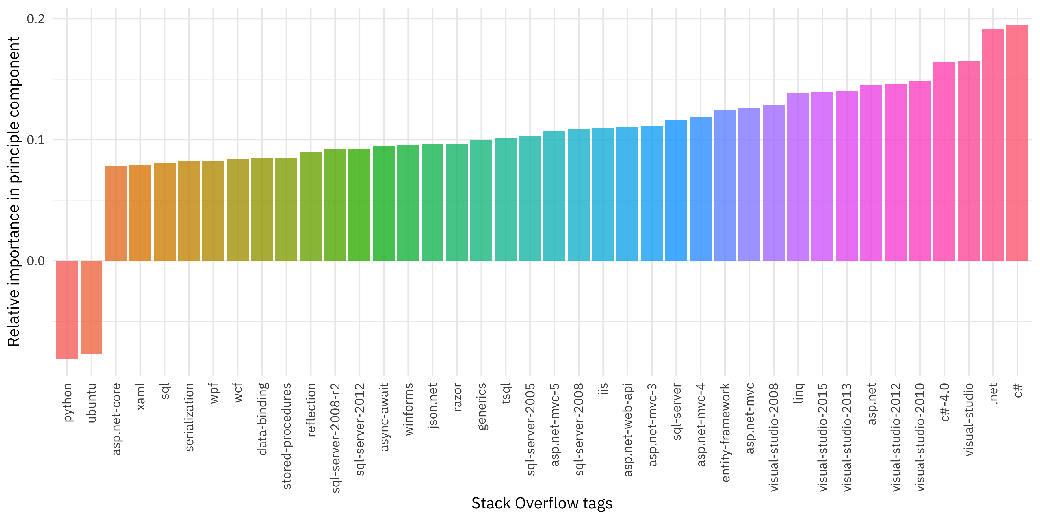
The first principal component was a contrast between two kinds of software engineering, but the second principal component is different. It is more like a binary, yes/no component and is all about whether a developer works with C#, .NET, Visual Studio, and the rest of the Microsoft tech stack. What does this mean? It is means that what explains the second most variation in visitors to Stack Overflow is whether or not they visit these kinds of Microsoft technology questions.
We could keep going on through the components, learning more about the Stack Overflow technology ecosystem, but I go over through a fair amount of that in the video, including technologies relevant to us data science folks. I also made a Shiny app that allows you to interactively choose which component you are looking at. I bet if you have a bit of Shiny experience, you can imagine how I got started with that!
Projecting the high dimensional plane
One really cool thing I ❤️ about PCA is being able to think and reason about high dimensional data. Part of that is projecting the many, many dimensions down onto a more plottable two dimensions. Let’s walk through how to do that.
What we want now is the equivalent of broom::augment(), and let’s also calculate the percent deviation explained by each component.
percent_variation <- tags_pca$sdev^2 / sum(tags_pca$sdev^2)

augmented_pca <- bind_cols(User = rownames(tags_scaled),
                           tidy(tags_pca$x))

augmented_pca
## # A tibble: 164,915 x 65
## User PC1 PC2 PC3 PC4 PC5 PC6 PC7 PC8 PC9
## <chr> <dbl> <dbl> <dbl> <dbl> <dbl> <dbl> <dbl> <dbl> <dbl>
## 1 1 2.16 5.70 1.63 0.967 0.0214 -1.37 -1.98 -2.94 -0.860
## 2 2 0.350 3.38 -6.12 -10.0 1.39 0.882 5.35 -3.30 -2.73
## 3 3 2.75 -3.91 0.801 1.73 1.24 -0.837 2.03 2.76 0.300
## 4 4 3.27 -3.37 -1.00 2.39 -3.59 -2.68 0.449 -2.82 -1.25
## 5 5 9.44 -4.24 3.88 -1.62 -2.96 4.01 -1.32 -3.54 3.25
## 6 6 5.47 -5.13 1.57 2.94 -0.170 0.342 3.34 6.09 1.72
## 7 7 4.30 -0.442 -1.52 0.329 -2.13 0.908 -3.30 -5.02 -1.39
## 8 8 -0.691 0.668 -1.76 -7.74 -2.94 -5.28 -9.71 5.28 0.732
## 9 9 3.84 -2.65 0.760 1.34 2.06 -0.927 1.35 5.11 -2.69
## 10 10 3.23 4.13 2.81 2.68 -1.12 -1.30 -0.319 -1.23 -0.723
## # ... with 164,905 more rows, and 55 more variables: PC10 <dbl>,
## # PC11 <dbl>, PC12 <dbl>, PC13 <dbl>, PC14 <dbl>, PC15 <dbl>,
## # PC16 <dbl>, PC17 <dbl>, PC18 <dbl>, PC19 <dbl>, PC20 <dbl>,
## # PC21 <dbl>, PC22 <dbl>, PC23 <dbl>, PC24 <dbl>, PC25 <dbl>,
## # PC26 <dbl>, PC27 <dbl>, PC28 <dbl>, PC29 <dbl>, PC30 <dbl>,
## # PC31 <dbl>, PC32 <dbl>, PC33 <dbl>, PC34 <dbl>, PC35 <dbl>,
## # PC36 <dbl>, PC37 <dbl>, PC38 <dbl>, PC39 <dbl>, PC40 <dbl>,
## # PC41 <dbl>, PC42 <dbl>, PC43 <dbl>, PC44 <dbl>, PC45 <dbl>,
## # PC46 <dbl>, PC47 <dbl>, PC48 <dbl>, PC49 <dbl>, PC50 <dbl>,
## # PC51 <dbl>, PC52 <dbl>, PC53 <dbl>, PC54 <dbl>, PC55 <dbl>,
## # PC56 <dbl>, PC57 <dbl>, PC58 <dbl>, PC59 <dbl>, PC60 <dbl>,
## # PC61 <dbl>, PC62 <dbl>, PC63 <dbl>, PC64 <dbl>Notice that I have a wider dataframe here and I haven’t used gather() on it; I’m going to keep it that way for plotting. The object percent_variation is a vector that contains how much of the variation of the dataset as a whole is explained by each component.
augmented_pca %>%
    mutate(User = as.integer(User)) %>%
    filter(User %% 2 == 0) %>%
    ggplot(aes(PC1, PC2)) +
    geom_point(size = 1.3, color = "midnightblue", alpha = 0.1) +
    labs(x = paste0("Principal component 1 (",  percent(percent_variation[1]), ")"),
         y = paste0("Principal component 2 (",  percent(percent_variation[2]),")"),
         title = "Projection of Stack Overflow traffic on to the first two principal components",
         subtitle = "The very high dimensional space can be projected down onto components we have explored")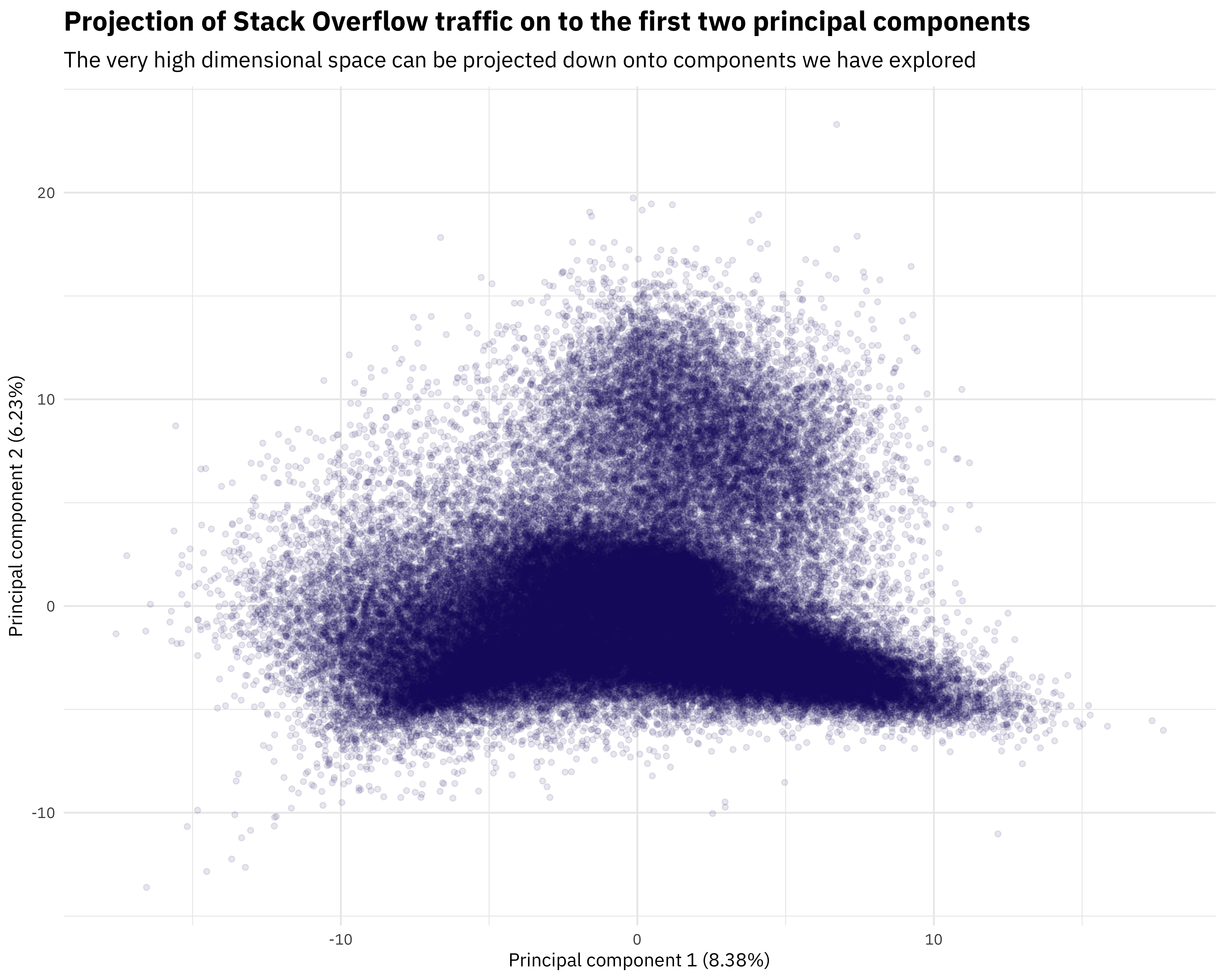
You can see I’m plotting every other person in this plot, just to make something nicer to look at without so much overplotting. Remember that PC1 stretchs from front end developers to Python and low level technology folks, and PC2 is all about the Microsoft tech stack. We see how the very high dimensional space of Stack Overflow tags here projects down to the first two components. Notice that I have added the percent variation to each axis. These numbers are not enormously high, which is just real life for you. There is a lot of variation in Stack Overflow users, and if I were to try to use any of these components for dimensionality reduction or as predictors in a model, I would need to reckon with that.
Applications
Speaking of real life, I find that PCA is great for understanding a high dimensional dataset, what contributes to variation, and how much success I might be able to have in other analyses. Another way I recently used PCA was to explore which cities Amazon might be considering for their second headquarters, based on exactly the same data I used here. The exact results for the components and which technologies contribute to them have shifted a bit since several months have passed, and that high dimensional space with all those users in it is not perfectly static! Let me know if you have any questions or feedback.