A Tall Drink of Water
By Julia Silge
February 11, 2016
In a previous post, I used water consumption data from Utah’s Open Data Catalog to explore what kind of users consume the most water in my home here in Salt Lake City, what the annual pattern of water use is, and how the drought of the past few years has affected water use. I made a predictive model for the total aggregate water use of the city and tested how drought affected the accuracy of such a model. The data set I used for all of this also contains spatial information that I basically ignored in that first post; today let’s dig in to the spatial information and map water use in my fair city!
Salt Lake City makes water consumption data publicly available at both the census tract and block level; I am going to use the census tract level information here today. The data set includes information on the type of water user (single residence, apartment, hospital, business, etc.) and amount of water used from 2000 into 2015. The data at the census tract level is available here via Utah’s Open Data Catalog and can be accessed via Socrata Open Data API.
library(RSocrata)
water <- read.socrata("https://opendata.utah.gov/resource/j4aa-ce7s.csv")
After loading the data, we need to do the same cleaning up as last time. There is one nonsensical row that needs removing with a non-year value in the year column. Then, let’s adjust the data types.
water <- water[grep("[0-9]{4}", water$YEAR),]
water[,1:4] <- lapply(water[,1:4], as.factor)
water[,5:6] <- lapply(water[,5:6], as.numeric)
Now let’s use dplyr to group these observations of water use by each tract and month. I use the median for the consumption because it is less sensitive to outliers than the mean; if you remember from the last post, there are some very high outliers in water use during the drought years and my main goal here is to see which parts of the city use more water over the years in this data set, not to be overwhelmed by the outliers from the drought years.
library(dplyr)
library(lubridate)
tidytracts <- water %>%
        group_by(TRACT, YEAR, month = month(as.integer(MONTH), label = TRUE)) %>%
        summarise(consumption = sum(CONSUMPTION)) %>%
        group_by(TRACT, month) %>%
        summarise(consumption = median(consumption))
colnames(tidytracts) <- c("tract", "month", "consumption")
The data frame we just made here is in “long” format, otherwise known as “tidy” data. It looks like this.
head(tidytracts)
## Source: local data frame [6 x 3]
##
##    tract  month consumption
##   (fctr) (fctr)       (dbl)
## 1 100100    Jan    117482.5
## 2 100100    Feb    117777.0
## 3 100100    Mar    112781.0
## 4 100100    Apr    124734.0
## 5 100100    May    127651.5
## 6 100100    Jun    134108.0
Keeping one’s data in a tidy format has many benefits and don’t worry – I AM A BELIEVER. However, for the maps we want to make here, the data needs to be in “wide” format. To do this, we will use dcast from the reshape2 library. Let’s do that and see what this data frame looks like.
library(reshape2)
maptracts <- dcast(tidytracts, tract ~ month)
head(maptracts)
##    tract      Jan      Feb    Mar      Apr      May    Jun    Jul    Aug    Sep
## 1 100100 117482.5 117777.0 112781 124734.0 127651.5 134108 157652 153996 166824
## 2 100200   9141.5   8441.5   6866  13054.0  22072.5  47248  56834  61421  59213
## 3 100306  16381.0  17087.0  14630  17287.0  23605.5  41870  49378  50181  48044
## 4 100307  11448.0  12392.5   9884  12392.5  17072.5  40090  48997  51948  47106
## 5 100308  12446.0  12877.0  11211  13826.0  20653.0  37422  52364  56884  53472
## 6 100500  16246.0  16405.5  13775  16933.5  23024.5  47852  59249  63577  58952
##      Oct    Nov    Dec
## 1 137633 123407 111612
## 2  40763  19941  12631
## 3  29296  17991  16465
## 4  25265  13117  11216
## 5  29720  18437  12462
## 6  33463  18569  15977
So there we go! Water use data ready for some map making! Now we… uh…
Now what?
What exactly is a census tract? The U.S. Census Bureau divides up each county in the United States into these tracts; the idea is that they are supposed to be relatively small and relatively permanent. According to the Census, they provide a stable set of geographic units for the presentation of statistical data.
To map the census tracts in Utah, there are a couple of options we could go with. One option would be to combine the acs package for getting U.S. Census data with the tigris
package by Kyle Walker, which already includes all the U.S. census tracts. I’ve played around with tigris a bit and it is great; you can make line maps or choropleth maps or an htmlwidget or pretty much any of the other things you might like. Another option is to combine ACS data together with the census tract shape information into an R package with the functionality of Ari Lamstein’s choroplethr packages. For a variety of reasons, I decided to go with the second option.
The issue with that choice is that it involves making a new R package! The Utah census tract maps are not automatically built in to any of the choroplethr packages. I forked
Ari’s repository for his choroplethrCaCensusTract package and modified it for Utah census tracts. This involved changing the names of things, getting the right ACS data, and using the appropriate shapefile for the census tracts. Dealing with the shapefile was the most difficult part. I found
several
posts helpful during that process, and also I’d like to thank Ari for some debugging he helped me with. I know that Ari is working on a paid course for working with shapefiles in R and I can see why; it is, as they like to say in my academic fields, not trivial.
This was a great first experience building an R package. There wasn’t an overwhelming amount of work to be done in the actual code and I was able to get a grasp on how the documentation works, how to add data to an R package, and so forth. I found Hilary Parker’s post on the basics of making an R package all I really needed to get going. If you too are interested in census tracts in Utah,
- say hello for goodness sake! We are probably neighbors or something
- download the package from Github
library(devtools)
install_github("juliasilge/choroplethrUTCensusTract")
library(choroplethrUTCensusTract)
It’s Map Time (Like Nap Time But Not As Restful)
The water use data from this data set doesn’t cover all of Salt Lake County so let’s make a vector of the census tracts for mapping purposes. For the choroplethr packages mapping regions, we need to add the Salt Lake County FIPS code (49035) to the beginning of each census tract number.
library(stringr)
myTracts <- as.character(maptracts$tract)
myTracts <- str_c("49035", myTracts)
Now let’s do the actual mapping.
library(choroplethrUTCensusTract)
library(ggplot2)
library(RColorBrewer)
data(df_pop_ut_tract)
choro = UtTractChoropleth$new(df_pop_ut_tract)
choro$title = "Population in Salt Lake Census Tracts"
choro$set_num_colors(1)
choro$ggplot_polygon = geom_polygon(aes(fill = value), color = NA)
choro$set_zoom_tract(tract_zoom = myTracts, county_zoom = NULL)
choro$ggplot_scale = scale_fill_gradientn(name = "Population", colours = brewer.pal(8, "PuRd"))
choro$render()
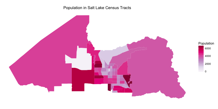
Nice! I think I have a good idea of what is what with this map, but let’s map it over a reference map for clarity.
choro$render_with_reference_map()
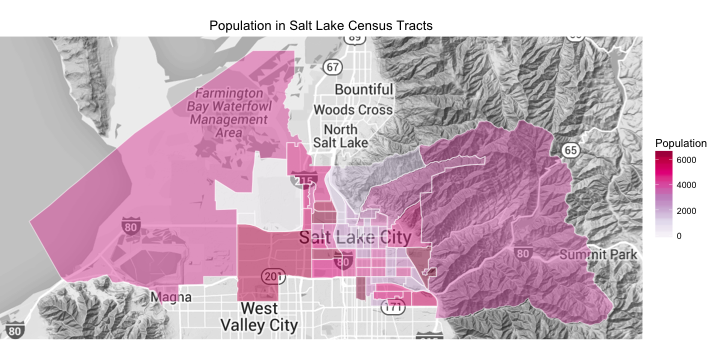
See that large census tract on the west side of town with no one living in it? That is the airport.
One important thing to keep in mind when looking at a choropleth map like this that maps a number measured in counts into areas that are not equal is that the color intensities don’t represent density, i.e. population density in this case. The color intensity represents population number, not population density, here. Depending on the numerical sophicastication of one’s audience, it may be worth doing some work to change that? Anyway, keep in mind that the very large tracts that have the same color as very small tracts have much lower population densities.
The relative sizes of the census tracts make less difference when we look at a quantity that is measured in a percentage, rather than in counts. Salt Lake City has a significant Hispanic population. Where do they live here?
data(df_ut_tract_demographics)
df_ut_tract_demographics$value <- df_ut_tract_demographics$percent_hispanic
choro = UtTractChoropleth$new(df_ut_tract_demographics)
choro$title = "Hispanic Population in Salt Lake Census Tracts"
choro$set_num_colors(1)
choro$ggplot_polygon = geom_polygon(aes(fill = value), color = NA)
choro$set_zoom_tract(tract_zoom = myTracts, county_zoom = NULL)
choro$ggplot_scale = scale_fill_gradientn(name = "Percent", colours = brewer.pal(8, "PuRd"))
choro$render()
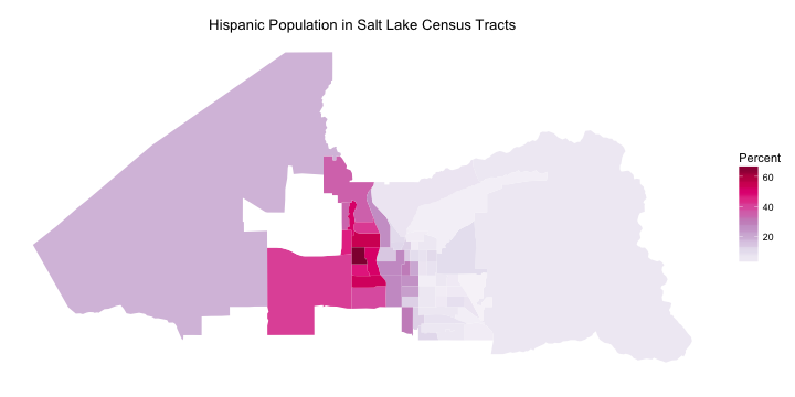
Salt Lake’s Hispanic population is concentrated on the west side of the city.
Water Use Across the City
Now that our ability to map census tracts in Salt Lake City is all set up and we have an idea of where people live, let’s look at water use. Which census tracts use the most water at which times of year? As a reminder, in my first post on water use in Salt Lake City, we saw that business and single residence users consumed the most water in Salt Lake City, and that water consumption in the city is highest in August and lowest in March. Let’s first look at water consumption across the city in August.
maptracts$region <- str_c("49035", as.character(maptracts$tract))
maptracts$value <- maptracts$Aug
choro = UtTractChoropleth$new(maptracts)
choro$title = "August Water Use in Salt Lake Census Tracts"
choro$set_num_colors(1)
choro$ggplot_polygon = geom_polygon(aes(fill = value), color = NA)
choro$set_zoom_tract(tract_zoom = maptracts$region, county_zoom = NULL)
choro$ggplot_scale = scale_fill_gradientn(name = "Water Use\n(100 cubic ft)",
                                          colours = brewer.pal(8, "PuRd"))
choro$render()
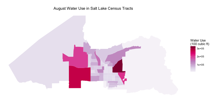
This is distributed very differently than population. I mean, look at where the airport is! It is one of the highest water use census tracts in the whole city. I was definitely not expecting to see that. The highest water use census tract for August is on the east side of the city and contains the University of Utah. The university isn’t the only thing in that census tract; there is a part of the city called “Research Park” there where there are a lot of research-oriented businesses and labs and such. It is not a highly residential area. In fact, the census tracts that have the most people living in them are not the ones with the highest water use.
If you really want to look in detail at the areas of the city that these census tracts represent (i.e. even more than the choroplethr reference map shows), go
over here to the Census Bureau and see their big, detailed map of Salt Lake City census tracts.
Let’s look at March, the lowest water use month for Salt Lake City.
maptracts$value <- maptracts$Mar
choro = UtTractChoropleth$new(maptracts)
choro$title = "March Water Use in Salt Lake Census Tracts"
choro$set_num_colors(1)
choro$ggplot_polygon = geom_polygon(aes(fill = value), color = NA)
choro$set_zoom_tract(tract_zoom = maptracts$region, county_zoom = NULL)
choro$ggplot_scale = scale_fill_gradientn(name = "Water Use\n(100 cubic ft)",
                                          colours = brewer.pal(8, "PuRd"))
choro$render()
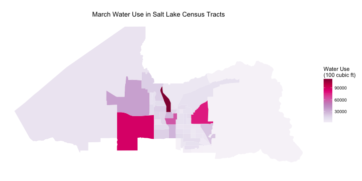
First of all, notice that the overall levels are much lower by looking at the legend. The relative level of water use is down at the airport compared to August, making me question what they are doing using so much water in the summer. Are they irrigating a lot of landscaping? Washing a lot of rental cars that don’t get washed in the winter? I did a bit of research on water use at airports but I must admit I don’t have a super satisfying answer for this one. It is also possible that this water use is due to the airport plus other businesses near the airport. Further exploration of this would be interesting.
Water use in and near the university is still high compared to the rest of the city, as is that sliver-shaped census tract downtown. That area near downtown is mostly business/industrial with very few people living in it. The large census tract just south of the airport also has a pretty high level of water use. That census tract does have a fairly high number of people living in it, but it is a more mixed area of town with business and industrial areas. All of the census tracts that have high levels of water use during March are ones that are host to significant industrial and business activity.
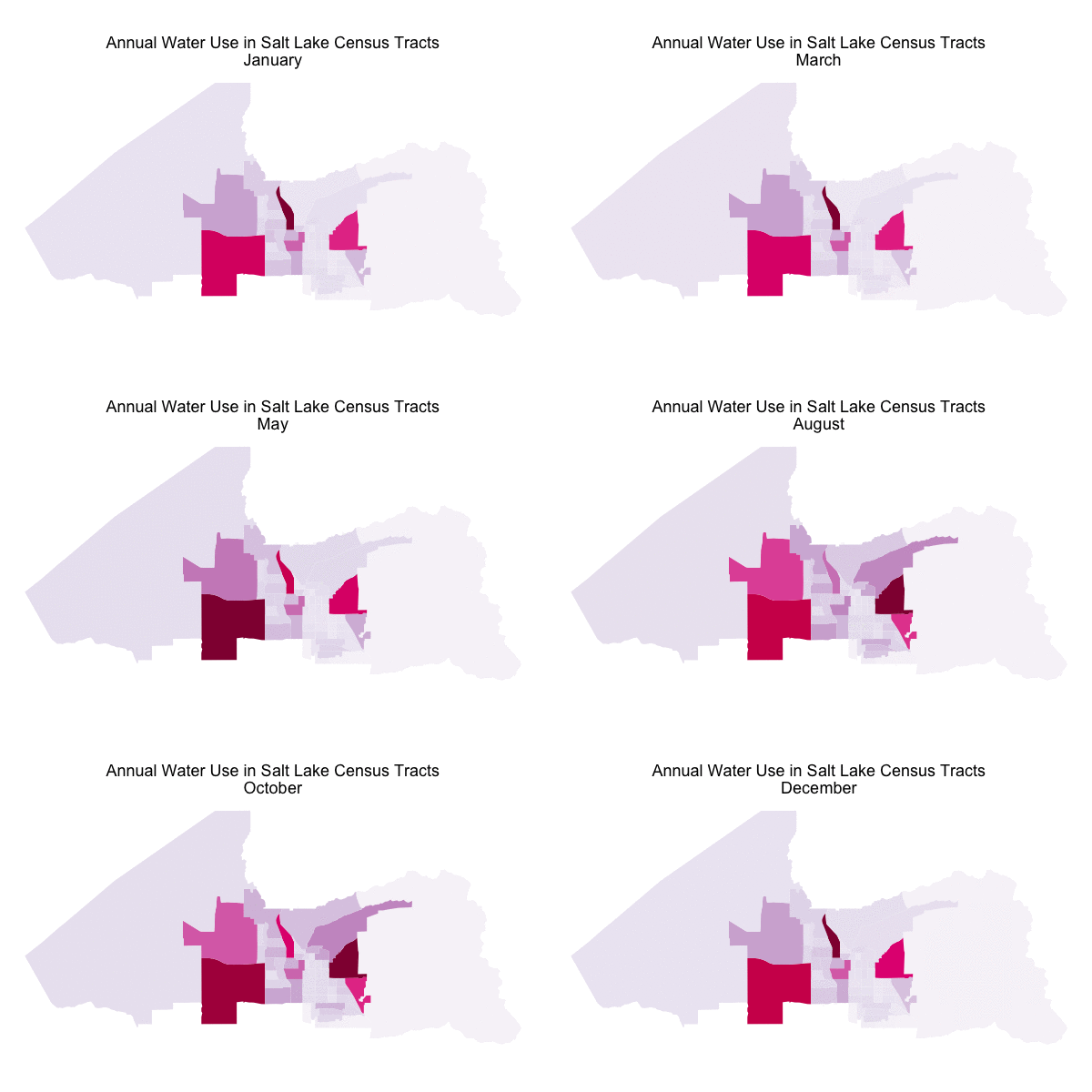
I opened this blog post with an animated GIF showing water use in Salt Lake’s census through all the months of the year. I did not use gganimate to make this GIF the way I did with the GIFs
in my most recent post. The code I used to make that GIF is available
on Github; I used R to make each of the files and then ImageMagick, a command line tool, to combine the files into a GIF. Here, you probably want to see the GIF again, don’t you?

For the sake of minimalism on the GIF, I removed the legend. The overall levels in August are about 4 times higher than the overall levels in March.
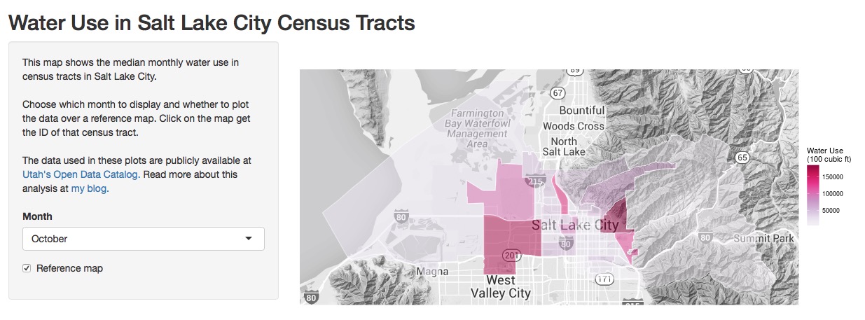
I also developed a Shiny App to explore how water use changes through the year across Salt Lake City. The app user can choose which month to display and whether to plot the data over a reference map. Check out the code for the app here and explore the app itself here.
I used the built-in interactivity in Shiny to allow the user to click on the map and find the census tract. This is not screaming fast as implemented right now; the click gets the latitude and longitude and then the code finds which polygon (i.e., census tract) that point is in. If anybody has suggestions on how to implement this more efficiently, I’d be happy to hear them.
The End
Single residence users are one of the top two consumers of the most water in Salt Lake City, but they (we? that includes me, I suppose!) are spread out throughout the city in many census tracts. Business and industrial users of water also use a large amount of water in Salt Lake City, but they are concentrated in just a few areas of the city so those census tracts have exceptionally high levels of water use. The airport, or perhaps the airport plus businesses near the airport, use a lot more water than I expected. I really enjoyed working on this whole project; learning about maps and how to make them is very rewarding. The R Markdown file used to make this blog post is available here. I am very happy to hear feedback or questions!
