Ten Thousand Tweets
Visualizing My Twitter Archive with ggplot2
By Julia Silge in rstats
December 8, 2015
I started learning the statistical programming language R this past summer, and discovering Hadley Wickham’s data visualization package ggplot2 has been a joy and a revelation. When I think back to how I made all the plots for my astronomy dissertation in the early 2000s (COUGH
SUPERMONGO COUGH), I feel a bit in awe of what ggplot2 can do and how easy and, might I even say, delightful it is to use. I recently passed the 10,000 tweet mark at
my personal Twitter account, so in this blog post I am going to use ggplot2 to analyze my Twitter archive. You can download your own Twitter archive by following
these directions. When I planned this project, I was mentally prepared to parse JSON and such, but it turns out that when you download your own Twitter archive, one of the files is a lovely, neat CSV file with every tweet you’ve ever tweeted. Handy!
First, I’ll load the libraries that I need to make my plots and read in the data from the CSV file.
library(ggplot2)
library(lubridate)
library(scales)

tweets <- read.csv("./tweets.csv", stringsAsFactors = FALSE)
The timestamp on each tweet is a string at this point, so let’s use a function from the lubridate package to convert the timestamp to a date-time object. The timestamps are recorded in UTC, so to make more interpretable plots, we need to convert to a different time zone. I joined Twitter in 2008 when I lived in Connecticut, and in the intervening years I lived in Texas, and now in Utah. Not to mention all the times I traveled elsewhere! I don’t have geotagging turned on for my tweets because that freaks me out somewhat, so I don’t have any information for individual tweets to assign time zones to them on a case-by-case basis. For a rough estimate, let’s just assign all tweets to the Central Time Zone, using another function from lubridate. If we needed to do a better job on this, we could divide my tweets up by when I moved between various time zones; this still wouldn’t be perfect because of tweeting while traveling.
tweets$timestamp <- ymd_hms(tweets$timestamp)
tweets$timestamp <- with_tz(tweets$timestamp, "America/Chicago")
Now for some graphs!
Tweets by Year, Month, and Day
First let’s make a basic histogram showing the distribution of my tweets over time.
ggplot(data = tweets, aes(x = timestamp)) +
        geom_histogram(aes(fill = ..count..)) +
        theme(legend.position = "none") +
        xlab("Time") + ylab("Number of tweets") +
        scale_fill_gradient(low = "midnightblue", high = "aquamarine4")
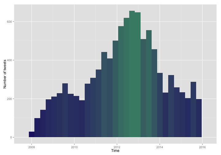
This is obvious to more experienced users, but it took me a while to figure out that when writing out code for a plot over multiple lines, the + needs to go on the end of the previous line, not at the beginning of the new line. Use an aesthetic with fill = ..count.. in the call to geom_histogram to make the fill color of each histogram bin reflect that bin’s height. You can see I hit my own personal peak Twitter sometime in late 2012.
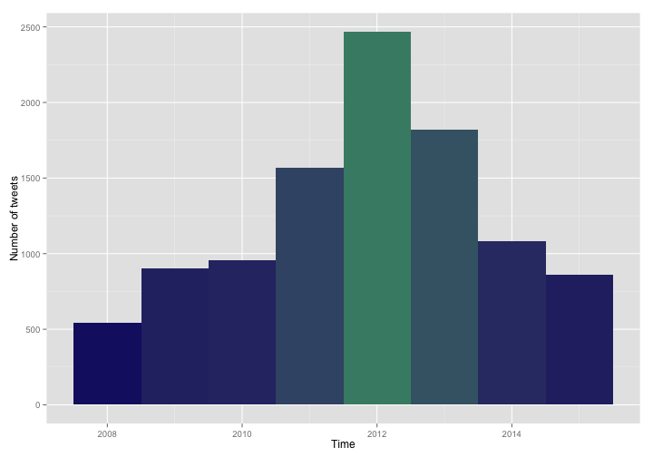
Perhaps we’d like to see how many tweets I’ve tweeted each year. Use the year() function from lubridate on the x-axis of the histogram and specify the breaks of the histogram in the call to geom_histogram.
ggplot(data = tweets, aes(x = year(timestamp))) +
        geom_histogram(breaks = seq(2007.5, 2015.5, by =1), aes(fill = ..count..)) +
        theme(legend.position = "none") +
        xlab("Time") + ylab("Number of tweets") +
        scale_fill_gradient(low = "midnightblue", high = "aquamarine4")
What does my tweeting pattern look like over the days of the week? We can take a similar approach and use the wday() function from lubridate and specify the breaks for the histogram.
ggplot(data = tweets, aes(x = wday(timestamp, label = TRUE))) +
        geom_histogram(breaks = seq(0.5, 7.5, by =1), aes(fill = ..count..)) +
        theme(legend.position = "none") +
        xlab("Day of the Week") + ylab("Number of tweets") +
        scale_fill_gradient(low = "midnightblue", high = "aquamarine4")
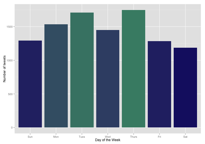
I’ve seen other analyses showing that people tweet less on the weekends. Also, what a big difference between Wednesday and Tuesday/Thursday! I want to do a statistical test and see if these are real effects. The appropriate test is a single sample chi-squared test (or goodness of fit test); this test will take the distribution of tweets by weekday and see if the distribution we have is consistent with a given hypothesis, to within random sampling error. For example, could we have gotten this distribution of tweets just by chance, or do I really tweet less on the weekends? This kind of test can be done with any kind of expected frequencies, but first let’s compare against the hypothesis of equal expected frequencies, i.e. the hypothesis that I tweet at the same rate on all days and I got this distribution of tweets just by chance and random sampling.
chisq.test(table(wday(tweets$timestamp, label = TRUE)))
##
## 	Chi-squared test for given probabilities
##
## data:  table(wday(tweets$timestamp, label = TRUE))
## X-squared = 193.77, df = 6, p-value < 2.2e-16
The chi-squared test indicates that the distribution of my tweets is highly unlikely to be uniform; we can reject the null hypothesis (the hypothesis that I tweet at the same rate on all days) with a high degree of confidence. Can the distribution in tweets be explained only as a difference between weekday and weekend behavior? It looks like Monday through Thursday are higher than Friday through Sunday.
myTable <- table(wday(tweets$timestamp, label = TRUE))
mean(myTable[c(2:5)])/mean(myTable[c(1,6,7)])
## [1] 1.283351
The values for Monday through Thursday are 1.283 higher than the other days, on average, close to 5/4. Let’s see if the chi-squared test says that my pattern of tweets is consistent with tweeting 1.25 times as often (5/4) on Monday through Thursday as on Friday through Sunday.
chisq.test(table(wday(tweets$timestamp, label = TRUE)), p = c(4, 5, 5, 5, 5, 4, 4)/32)
##
## 	Chi-squared test for given probabilities
##
## data:  table(wday(tweets$timestamp, label = TRUE))
## X-squared = 44.001, df = 6, p-value = 7.388e-08
The p-value here is still very low, so we can reject this simple hypothesis too. I would not have guessed that there was such a strong association between the days of the week and my tweeting patterns.
For the months of the year, there is yet another convenient function in lubridate, the month() function, to put into the histogram.
ggplot(data = tweets, aes(x = month(timestamp, label = TRUE))) +
        geom_histogram(aes(fill = ..count..)) +
        theme(legend.position = "none") +
        xlab("Month") + ylab("Number of tweets") +
        scale_fill_gradient(low = "midnightblue", high = "aquamarine4")
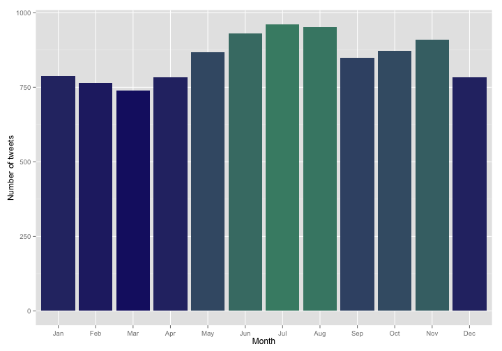
This is a pretty interesting annual pattern; I would not have predicted all of this before looking at this histogram. The decrease in August and September makes sense as this is generally a very busy time of year both in the various jobs I’ve had since 2008 and for my family. The decrease going into spring? I’m not really sure. Let’s do the chi-squared test again, just to make sure these are not due to random sampling.
chisq.test(table(month(tweets$timestamp, label = TRUE)))
##
## 	Chi-squared test for given probabilities
##
## data:  table(month(tweets$timestamp, label = TRUE))
## X-squared = 77.42, df = 11, p-value = 4.645e-12
Again, the chi-squared test indicates that the distribution of tweets by month is highly unlikely to be uniform and we can reject the null hypothesis (the hypothesis that I tweet the same amount in each month) with a high degree of confidence.
Tweets by Time of Day: Time to Put the Phone Down?
To see what time of day I tweet, we need to take the timestamp date-time objects and strip out all the year, month, etc. information and leave only the time information. After fiddling about with this for quite a while, I got this to work using the trunc function in base R. This next line of code was the most difficult part of this analysis for me.
tweets$timeonly <- as.numeric(tweets$timestamp - trunc(tweets$timestamp, "days"))
I also found that for my earliest tweets, there was no meaningful time information recorded. A good number of my earliest tweets have real dates recorded but 00:00:00 UTC for the time. Let’s find these tweets and set the new timeonly column to NA for them. How many of my tweets don’t have real time information?
tweets[(minute(tweets$timestamp) == 0 & second(tweets$timestamp) == 0),11] <- NA
mean(is.na(tweets$timeonly))
## [1] 0.2165262
It turns out it’s about 21.7%, so for my tweets vs. time graph, we will actually have not-quite-10,000 tweets. To make the graph, let’s convert the new timeonly column to a date-time object and make a histogram. We can use a scaling function from the scales library to scale and label the x-axis.
class(tweets$timeonly) <- "POSIXct"
ggplot(data = tweets, aes(x = timeonly)) +
        geom_histogram(aes(fill = ..count..)) +
        theme(legend.position = "none") +
        xlab("Time") + ylab("Number of tweets") +
        scale_x_datetime(breaks = date_breaks("3 hours"),
                         labels = date_format("%H:00")) +
        scale_fill_gradient(low = "midnightblue", high = "aquamarine4")
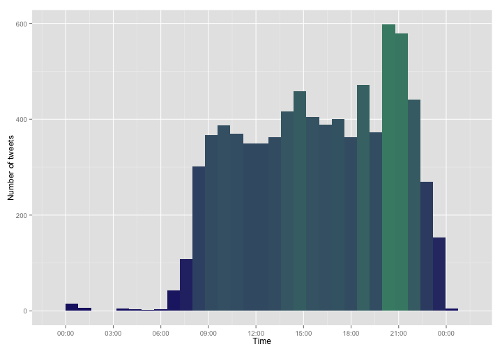
So there is when I tweet. I see mid-morning and mid-afternoon peaks, and a major peak after my kids go to bed. I was actually surprised to see any overnight tweets at all; I am far from an night owl. What might be going on there?
latenighttweets <- tweets[(hour(tweets$timestamp) < 6),]
ggplot(data = latenighttweets, aes(x = timestamp)) +
        geom_histogram(aes(fill = ..count..)) +
        theme(legend.position = "none") +
        xlab("Time") + ylab("Number of tweets") + ggtitle("Late Night Tweets") +
        scale_fill_gradient(low = "midnightblue", high = "aquamarine4")
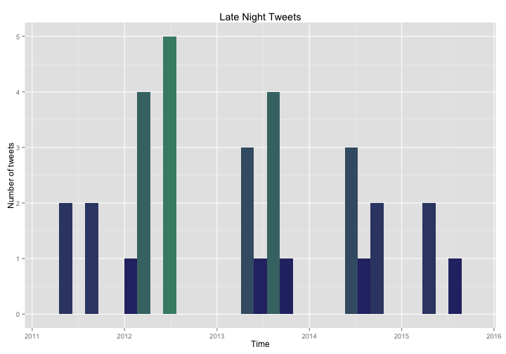
What are these tweets? I am never awake in the middle of the night!
So it turns out that I have occasionally been up in the middle of the night. Not all these overnight tweets were related to small children and illness. Some were from times when I was traveling west to the Pacific Time Zone and were not actually as late as they appeared because of the way I assigned the time zone. And some were just from when I stayed up a bit late, of course! The tweets that came in peaks that you can see in the histogram were more likely to be episodes of sick little ones. I am so glad that my kids are older now and we are mostly past this stage of parenthood! You can see how the number of late night tweets (never large to start with) has decreased over the years I have been on Twitter.
HASHTAG RETWEET ME, BRO
Let’s look at my usage of hashtags, retweets, and replies.
I can use regex and grep to find all the hashtags in my tweets. Let’s see what fractions of my tweets have hashtags and look at that visually.
ggplot(tweets, aes(factor(grepl("#", tweets$text)))) +
        geom_bar(fill = "midnightblue") +
        theme(legend.position="none", axis.title.x = element_blank()) +
        ylab("Number of tweets") +
        ggtitle("Tweets with Hashtags") +
        scale_x_discrete(labels=c("No hashtags", "Tweets with hashtags"))
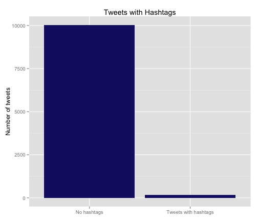
As I would have guessed, I am not a big user of hashtags; only 1.7% of my tweet have hashtags. Maybe #rstats and/or the process of trying to spread the word of my new professional blog will change my mind, but it is not very “me”. In fact, most of the tweets that do have hashtags and fall in the right bin in this graph are actually retweets of other people’s tweets with whatever hashtags they used.
Speaking of retweets, one of the columns in the CSV file from Twitter codes whether the tweet is a retweet or not, so it is not tough to see how many tweets are retweeted vs. original content.
ggplot(tweets, aes(factor(!is.na(retweeted_status_id)))) +
        geom_bar(fill = "midnightblue") +
        theme(legend.position="none", axis.title.x = element_blank()) +
        ylab("Number of tweets") +
        ggtitle("Retweeted Tweets") +
        scale_x_discrete(labels=c("Not retweeted", "Retweeted tweets"))
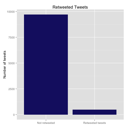
Only 4.8% of my tweets are retweets of others. The scale_x_discrete function is a nice, useful thing for relabeling the levels of a categorical variable for plotting. Before I applied this function, the labels just said “FALSE” and “TRUE”.
I am not a huge user of hashtags or retweets; now let’s look at my replying habits. There is another column in the CSV file that codes whether the tweet is in reply to another tweet.
ggplot(tweets, aes(factor(!is.na(in_reply_to_status_id)))) +
        geom_bar(fill = "midnightblue") +
        theme(legend.position="none", axis.title.x = element_blank()) +
        ylab("Number of tweets") +
        ggtitle("Replied Tweets") +
        scale_x_discrete(labels=c("Not in reply", "Replied tweets"))
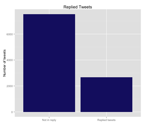
So 26.1% of my tweets are in reply to another person’s tweets, quite a bit higher than the other categories we’ve looked at. I am a fairly social user of the social media, it appears.
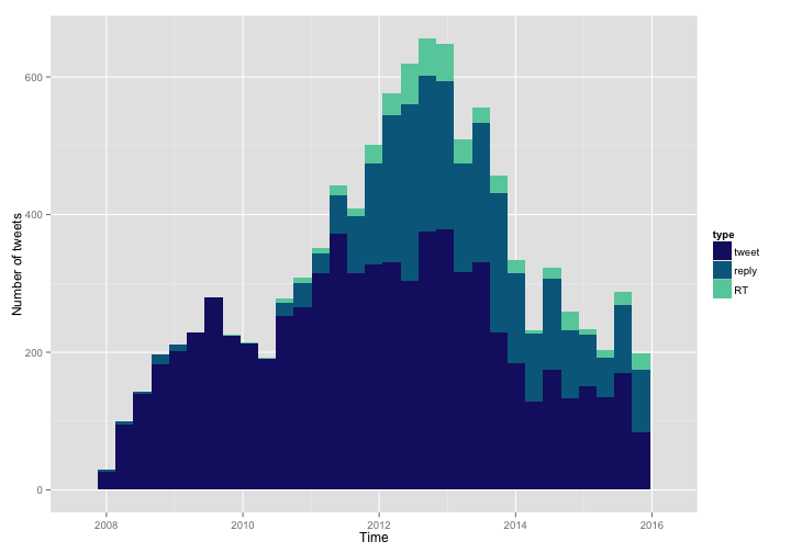
Let’s put these categories together and see if there have been changes in my patterns of tweeting over time. I’ll make a new column that codes the “type” of the tweet: regular, RT, or reply. My approach here is to first assign all the tweets to the regular category, then go through and overwrite this type with RT or reply if appropriate. I want this to be a factor variable, and lastly I reorder the factor variable in the order I want.
tweets$type <- "tweet"
tweets[(!is.na(tweets$retweeted_status_id)),12] <- "RT"
tweets[(!is.na(tweets$in_reply_to_status_id)),12] <- "reply"
tweets$type <- as.factor(tweets$type)
tweets$type = factor(tweets$type,levels(tweets$type)[c(3,1,2)])
Let’s look at how my habits in original tweeting, retweeting, and replying have changed over time.
ggplot(data = tweets, aes(x = timestamp, fill = type)) +
        geom_histogram() +
        xlab("Time") + ylab("Number of tweets") +
        scale_fill_manual(values = c("midnightblue", "deepskyblue4", "aquamarine3"))
Hmmmm, that is good, but it might be better to see this as a proportion of the total.
ggplot(data = tweets, aes(x = timestamp, fill = type)) +
        geom_bar(position = "fill") +
        xlab("Time") + ylab("Proportion of tweets") +
        scale_fill_manual(values = c("midnightblue", "deepskyblue4", "aquamarine3"))
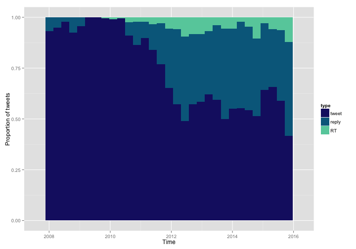
By changing to position = "fill" in a call to geom_bar we can see how the proportion of these categories has changed. This is not entirely a great measure here, because Twitter did not keep track of which tweets were retweeted or replied before sometime in 2010. Undoubtedly, some of my tweets in 2008 and 2009 were RTs and replies, but Twitter did not keep track of this officially for each tweet. Looking at the more recent years when these data were tracked, my proportion of retweets, replies, and original tweets looks mostly stable. This does mean that the estimates in the bar graphs above for reply and RT are biased low; estimating from the graph, those numbers may be up to twice as high.
No More Characters For You
Lastly, let’s look at the distribution of the number of characters in my tweets. I can use one of the functions from the apply family of functions to count up the characters in each tweet in my archive.
tweets$charsintweet <- sapply(tweets$text, function(x) nchar(x))
Let’s see what the distribution of character count looks like for my tweets.
ggplot(data = tweets, aes(x = charsintweet)) +
        geom_histogram(aes(fill = ..count..), binwidth = 8) +
        theme(legend.position = "none") +
        xlab("Characters per Tweet") + ylab("Number of tweets") +
        scale_fill_gradient(low = "midnightblue", high = "aquamarine4")
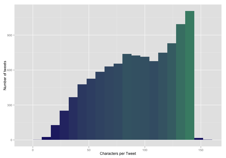
So that is fairly interesting. I am more likely to use many or most of those precious 140 characters allowed on Twitter than to go for brevity. BUT WAIT! What are those tweets with MORE than 140 characters?!? What magic have I worked? I can find these tweets by indexing the data frame using tweets[(tweets$charsintweet > 140),]. After looking through them, it turns out that they are all tweets that use special characters and certain special punctuation and the like. The CSV file that I downloaded from Twitter uses special extra punctuation to make sure it is clear what is going on in these situations. Here is an example tweet that has a bunch of these special characters:
tweets[(tweets$tweet_id == 182267407480528896),'text']
## [1] "Gave 6mo baby soft-cooked egg yolk & sweet potato tonight. \"He looks good in orange,\" says @DoctorMac. \"Brings out the blue in his eyes.\""
This means that my histogram above is biased high a little bit; the number of characters per tweet is actually slightly lower than shown there. If I needed to, I could use regex and count each & only once and so forth. Or I could use the number of tweets that have greater than 140 characters to correct for this effect, or the number of tweets that contain special characters at a given character count, or some similar strategy, if it was important that I know the number of characters per tweet to this level of precision. I am happy with this current estimate of my character usage for my purposes right now.
The tweets with really low numbers of characters made me a bit suspicious too, but it turns out they are all real and normal tweets. Many were just very short replies to other people, but sometimes it turns out you don’t need many characters to say what you want to say.
The End
So there are some examples of how to make histograms and bar charts using ggplot2, and do a bit of related analysis. The R Markdown file used to make this blog post is available
here. I am happy to hear feedback and suggestions as I am very much still learning about how to use R!