Bootstrap resampling with #TidyTuesday beer production data
By Julia Silge in rstats tidymodels
April 2, 2020
I’ve been publishing
screencasts demonstrating how to use the tidymodels framework, from first steps in modeling to how to tune more complex models. Today, I’m using this week’s
#TidyTuesday dataset on beer production to show how to use bootstrap resampling to estimate model parameters.
Here is the code I used in the video, for those who prefer reading instead of or in addition to video.
Explore the data
Our modeling goal here is to estimate how much sugar beer producers use relative to malt according to the #TidyTuesday dataset. We’ll use bootstrap resampling to do this! 🍻
First, let’s look at the data on brewing materials.
library(tidyverse)

brewing_materials_raw <- read_csv("https://raw.githubusercontent.com/rfordatascience/tidytuesday/master/data/2020/2020-03-31/brewing_materials.csv")

brewing_materials_raw %>%
  count(type, wt = month_current, sort = TRUE)
## # A tibble: 12 x 2
##    type                                 n
##    <chr>                            <dbl>
##  1 Total Used                 53559516695
##  2 Total Grain products       44734903124
##  3 Malt and malt products     32697313882
##  4 Total Non-Grain products    8824613571
##  5 Sugar and syrups            6653104081
##  6 Rice and rice products      5685742541
##  7 Corn and corn products      5207759409
##  8 Hops (dry)                  1138840132
##  9 Other                        998968470
## 10 Barley and barley products   941444745
## 11 Wheat and wheat products     202642547
## 12 Hops (used as extracts)       33700888
How have some different brewing materials changed over time?
brewing_filtered <- brewing_materials_raw %>%
  filter(
    type %in% c(
      "Malt and malt products",
      "Sugar and syrups",
      "Hops (dry)"
    ),
    year < 2016,
    !(month == 12 & year %in% 2014:2015)
  ) %>%
  mutate(
    date = paste0(year, "-", month, "-01"),
    date = lubridate::ymd(date)
  )

brewing_filtered %>%
  ggplot(aes(date, month_current, color = type)) +
  geom_point()
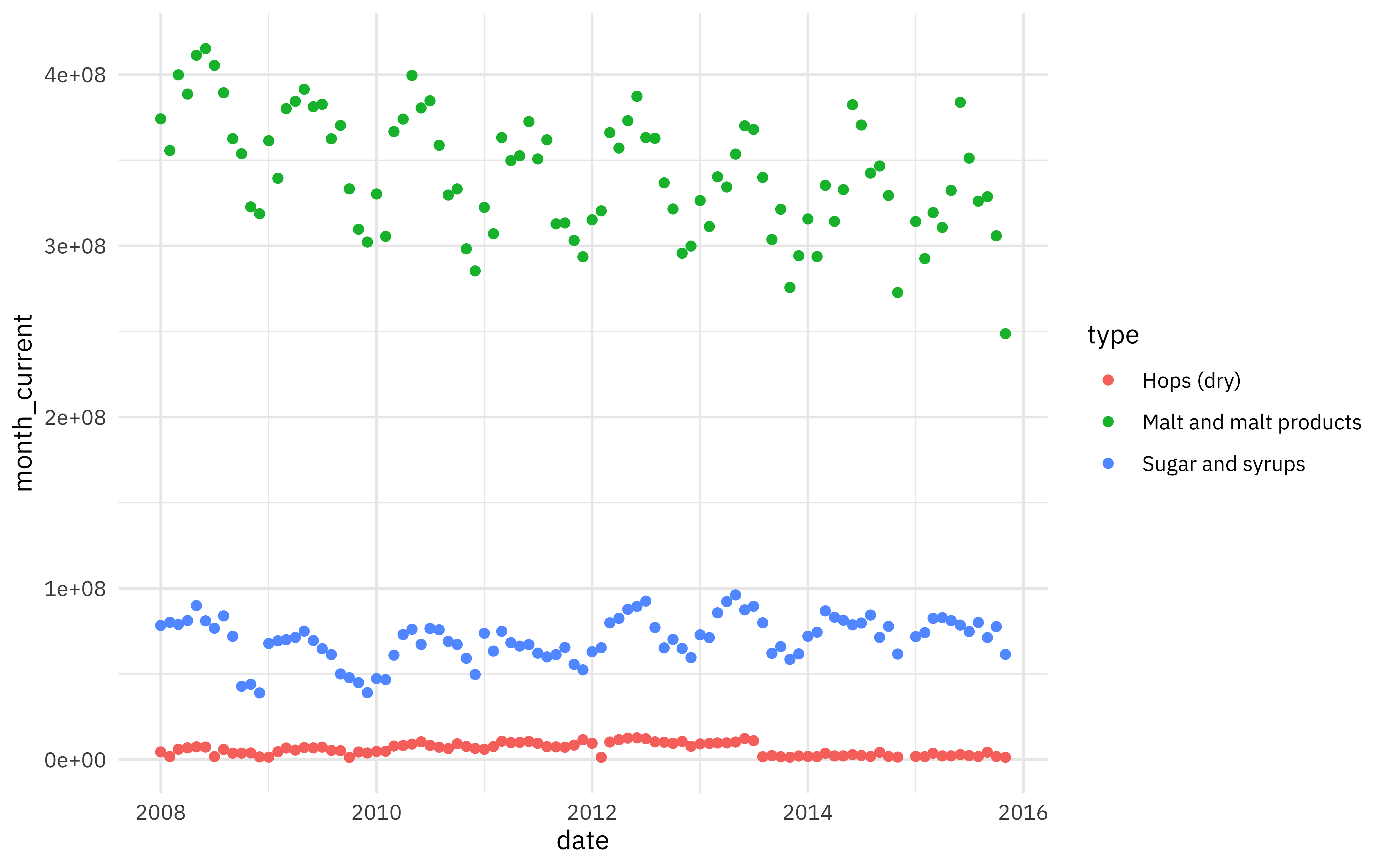
There are strong annual patterns in these materials. We want to measure how much sugar beer producers use relative to malt.
brewing_materials <- brewing_filtered %>%
  select(date, type, month_current) %>%
  pivot_wider(
    names_from = type,
    values_from = month_current
  ) %>%
  janitor::clean_names()

brewing_materials
## # A tibble: 94 x 4
##    date       malt_and_malt_products sugar_and_syrups hops_dry
##    <date>                      <dbl>            <dbl>    <dbl>
##  1 2008-01-01              374165152         78358212  4506546
##  2 2008-02-01              355687578         80188744  1815271
##  3 2008-03-01              399855819         78907213  6067167
##  4 2008-04-01              388639443         81199989  6864440
##  5 2008-05-01              411307544         89946309  7470130
##  6 2008-06-01              415161326         81012422  7361941
##  7 2008-07-01              405393784         76728131  1759452
##  8 2008-08-01              389391266         83928121  5992025
##  9 2008-09-01              362587470         71982604  3788942
## 10 2008-10-01              353803777         42828943  3788949
## # … with 84 more rows
brewing_materials %>%
  ggplot(aes(malt_and_malt_products, sugar_and_syrups)) +
  geom_smooth(method = "lm") +
  geom_point()
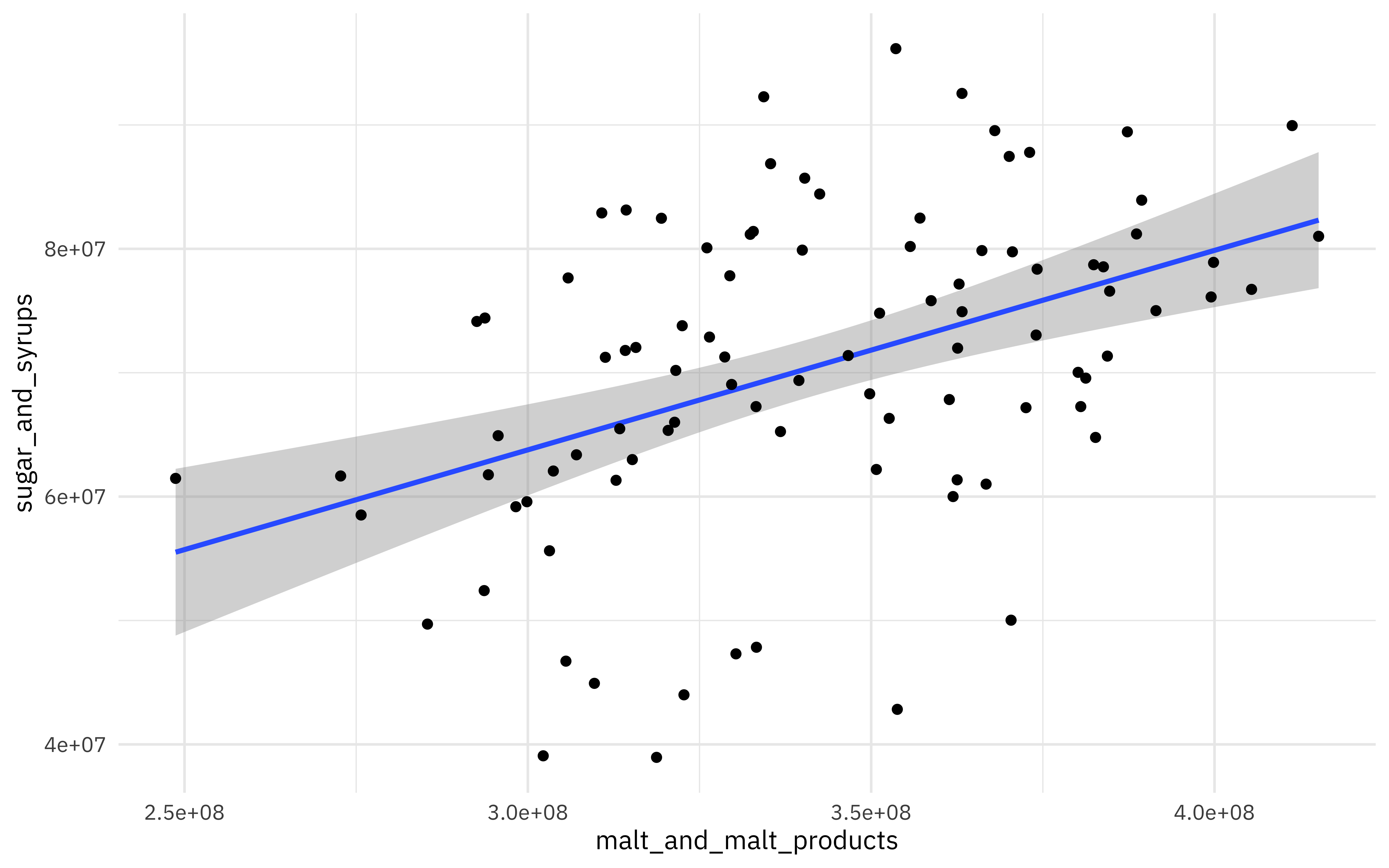
There is a lot of variation in this relationship, but beer reproducers use more sugar when they use more malt. What is the relationship?
library(tidymodels)

beer_fit <- lm(sugar_and_syrups ~ 0 + malt_and_malt_products,
  data = brewing_materials
)

summary(beer_fit)
##
## Call:
## lm(formula = sugar_and_syrups ~ 0 + malt_and_malt_products, data = brewing_materials)
##
## Residuals:
##       Min        1Q    Median        3Q       Max
## -29985291  -6468052    174001   7364462  23462837
##
## Coefficients:
##                        Estimate Std. Error t value Pr(>|t|)
## malt_and_malt_products 0.205804   0.003446   59.72   <2e-16 ***
## ---
## Signif. codes:  0 '***' 0.001 '**' 0.01 '*' 0.05 '.' 0.1 ' ' 1
##
## Residual standard error: 11480000 on 93 degrees of freedom
## Multiple R-squared:  0.9746,	Adjusted R-squared:  0.9743
## F-statistic:  3567 on 1 and 93 DF,  p-value: < 2.2e-16
tidy(beer_fit)
## # A tibble: 1 x 5
##   term                   estimate std.error statistic  p.value
##   <chr>                     <dbl>     <dbl>     <dbl>    <dbl>
## 1 malt_and_malt_products    0.206   0.00345      59.7 5.72e-76
Here I am choosing to set the intercept to zero to take a simplified view of the malt-sugar relationship (i.e., beer producers don’t use any sugar if they aren’t starting with malt). We could leave that off and estimate both an intercept (baseline use of sugar all the time) and slope (increase in use of sugar per barrel of malt).
This model and the visualization above are based on model assumptions that may not hold with our real-world beer production data. Bootstrap resampling provides predictions and confidence intervals that are more robust.
Bootstrap resampling
First, let’s create a set of bootstrap resamples.
set.seed(123)
beer_boot <- bootstraps(brewing_materials, times = 1e3, apparent = TRUE)
beer_boot
## # Bootstrap sampling with apparent sample
## # A tibble: 1,001 x 2
##    splits          id
##    <list>          <chr>
##  1 <split [94/39]> Bootstrap0001
##  2 <split [94/34]> Bootstrap0002
##  3 <split [94/37]> Bootstrap0003
##  4 <split [94/39]> Bootstrap0004
##  5 <split [94/29]> Bootstrap0005
##  6 <split [94/27]> Bootstrap0006
##  7 <split [94/35]> Bootstrap0007
##  8 <split [94/33]> Bootstrap0008
##  9 <split [94/29]> Bootstrap0009
## 10 <split [94/34]> Bootstrap0010
## # … with 991 more rows
Next, let’s train a model to each of these bootstrap resamples. We can use tidy() with map() to create a dataframe of model results.
beer_models <- beer_boot %>%
  mutate(
    model = map(splits, ~ lm(sugar_and_syrups ~ 0 + malt_and_malt_products, data = .)),
    coef_info = map(model, tidy)
  )

beer_coefs <- beer_models %>%
  unnest(coef_info)

beer_coefs
## # A tibble: 1,001 x 8
##    splits     id        model term         estimate std.error statistic  p.value
##    <list>     <chr>     <lis> <chr>           <dbl>     <dbl>     <dbl>    <dbl>
##  1 <split [9… Bootstra… <lm>  malt_and_ma…    0.203   0.00326      62.3 1.31e-77
##  2 <split [9… Bootstra… <lm>  malt_and_ma…    0.208   0.00338      61.7 3.17e-77
##  3 <split [9… Bootstra… <lm>  malt_and_ma…    0.205   0.00336      61.1 7.30e-77
##  4 <split [9… Bootstra… <lm>  malt_and_ma…    0.206   0.00361      57.1 3.26e-74
##  5 <split [9… Bootstra… <lm>  malt_and_ma…    0.203   0.00349      58.3 4.77e-75
##  6 <split [9… Bootstra… <lm>  malt_and_ma…    0.209   0.00335      62.2 1.33e-77
##  7 <split [9… Bootstra… <lm>  malt_and_ma…    0.210   0.00330      63.7 1.73e-78
##  8 <split [9… Bootstra… <lm>  malt_and_ma…    0.209   0.00359      58.2 5.52e-75
##  9 <split [9… Bootstra… <lm>  malt_and_ma…    0.207   0.00342      60.5 1.74e-76
## 10 <split [9… Bootstra… <lm>  malt_and_ma…    0.207   0.00378      54.9 1.14e-72
## # … with 991 more rows
Evaluate results
What is the distribution of the relationship between sugar and malt?
beer_coefs %>%
  ggplot(aes(estimate)) +
  geom_histogram(alpha = 0.7, fill = "cyan3")
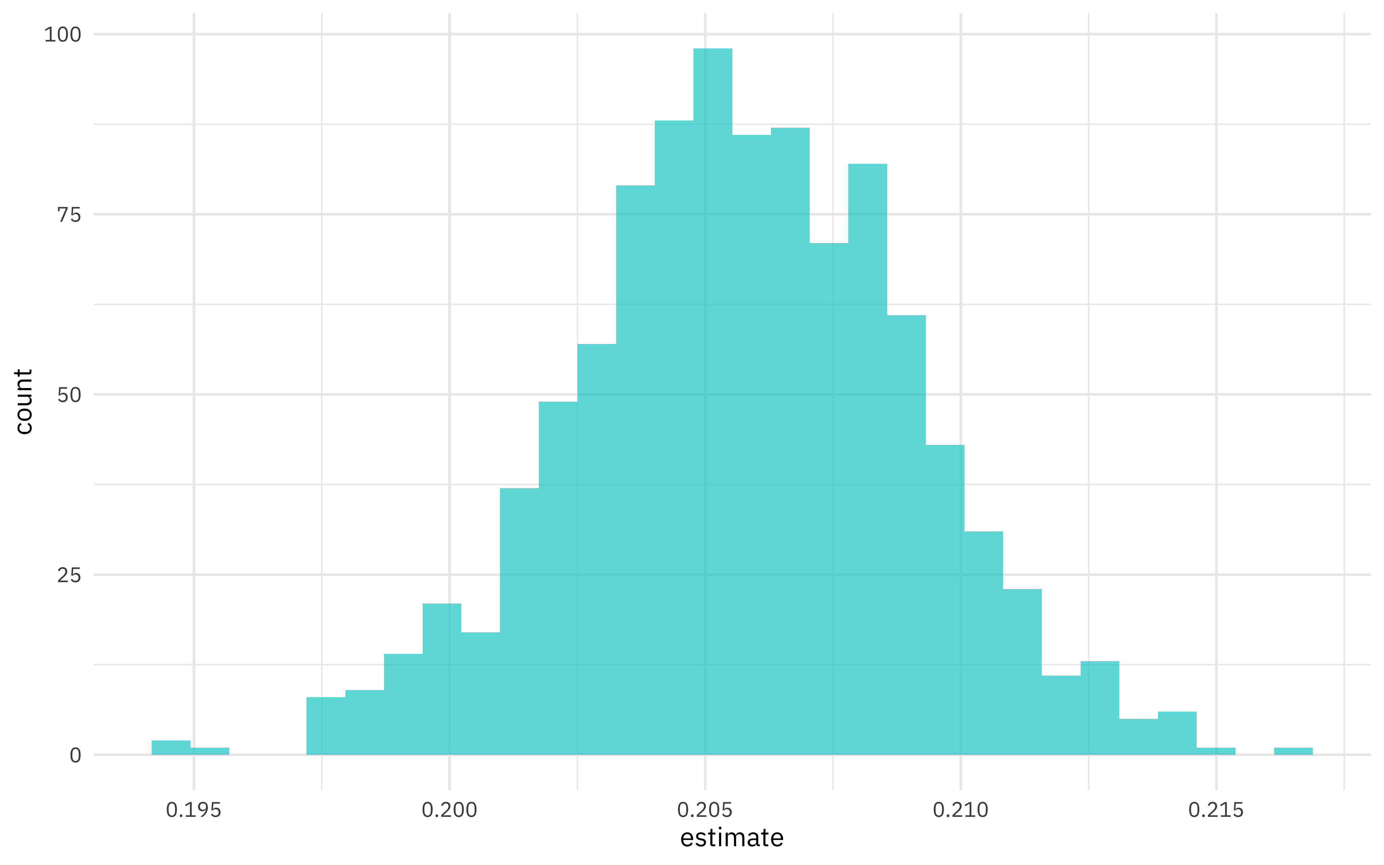
We can see where this distribution is centered and how broad it is from this visualization, and we can estimate these quantities using int_pctl() from the rsample package.
int_pctl(beer_models, coef_info)
## # A tibble: 1 x 6
##   term                   .lower .estimate .upper .alpha .method
##   <chr>                   <dbl>     <dbl>  <dbl>  <dbl> <chr>
## 1 malt_and_malt_products  0.199     0.206  0.212   0.05 percentile
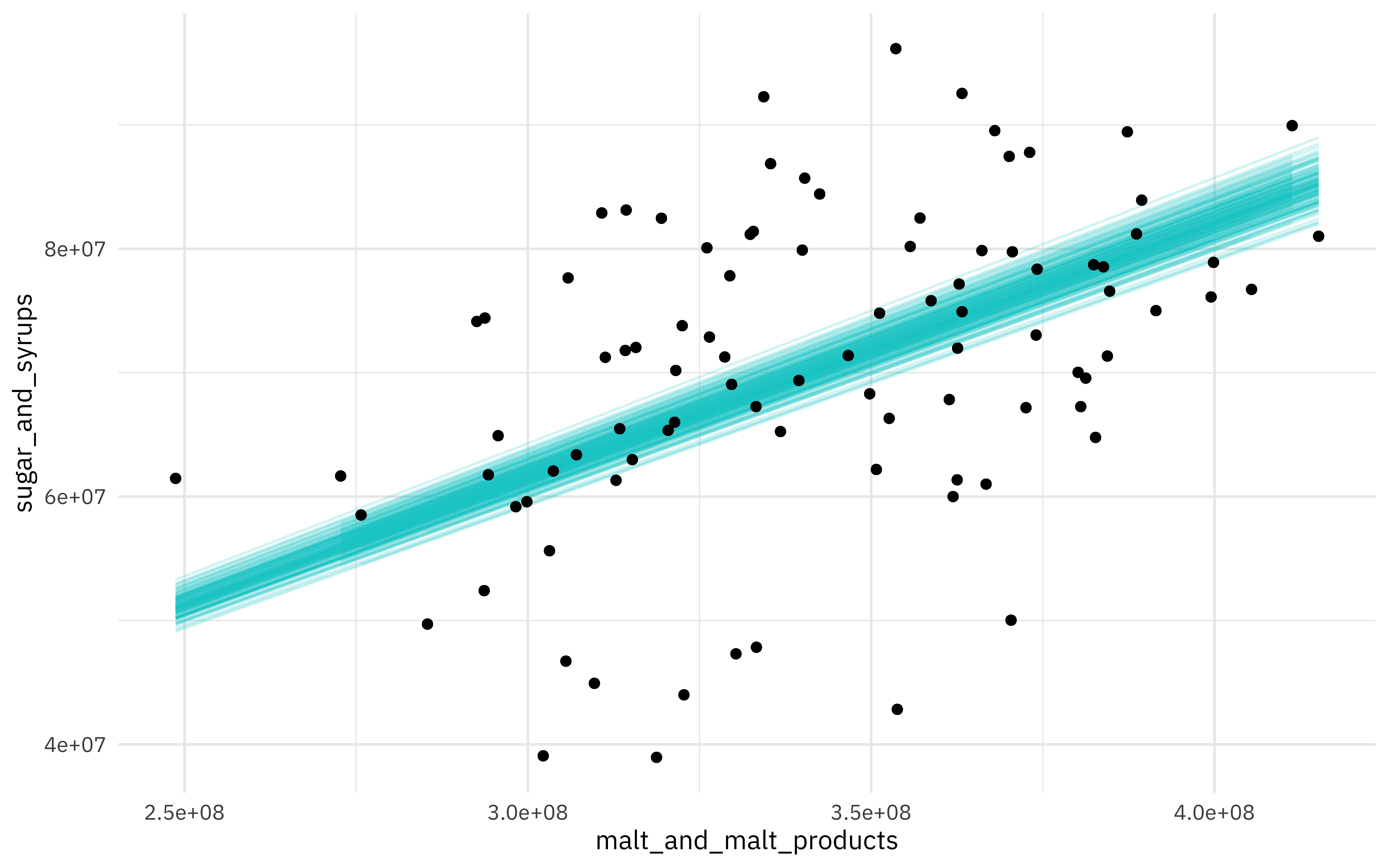
We can also visualize some of these fits to the bootstrap resamples. First, let’s use augment() to get the fitted values for each resampled data point.
beer_aug <- beer_models %>%
  sample_n(200) %>%
  mutate(augmented = map(model, augment)) %>%
  unnest(augmented)

beer_aug
## # A tibble: 18,800 x 13
##    splits id    model coef_info sugar_and_syrups malt_and_malt_p… .fitted
##    <list> <chr> <lis> <list>               <dbl>            <dbl>   <dbl>
##  1 <spli… Boot… <lm>  <tibble …         71341108        384396702  7.78e7
##  2 <spli… Boot… <lm>  <tibble …         76728131        405393784  8.20e7
##  3 <spli… Boot… <lm>  <tibble …         73793509        322480722  6.53e7
##  4 <spli… Boot… <lm>  <tibble …         85703037        340319408  6.89e7
##  5 <spli… Boot… <lm>  <tibble …         67266337        380521275  7.70e7
##  6 <spli… Boot… <lm>  <tibble …         81199989        388639443  7.86e7
##  7 <spli… Boot… <lm>  <tibble …         76115769        399504457  8.08e7
##  8 <spli… Boot… <lm>  <tibble …         66002563        321371392  6.50e7
##  9 <spli… Boot… <lm>  <tibble …         85703037        340319408  6.89e7
## 10 <spli… Boot… <lm>  <tibble …         74805384        351222725  7.11e7
## # … with 18,790 more rows, and 6 more variables: .se.fit <dbl>, .resid <dbl>,
## #   .hat <dbl>, .sigma <dbl>, .cooksd <dbl>, .std.resid <dbl>
Then, let’s create a visualization.
ggplot(beer_aug, aes(malt_and_malt_products, sugar_and_syrups)) +
  geom_line(aes(y = .fitted, group = id), alpha = .2, col = "cyan3") +
  geom_point()
- Posted on:
- April 2, 2020
- Length:
- 6 minute read, 1231 words
- Categories:
- rstats tidymodels
- Tags:
- rstats tidymodels