Getting started with k-means and #TidyTuesday employment status
By Julia Silge in rstats tidymodels
February 24, 2021
This is the latest in my series of screencasts demonstrating how to use the tidymodels packages, from starting out with first modeling steps to tuning more complex models. Today’s screencast uses the broom package to tidy output from k-means clustering, with this week’s #TidyTuesday dataset on employment and demographics.
Here is the code I used in the video, for those who prefer reading instead of or in addition to video.
Explore the data
Our modeling goal is to use k-means clustering to explore employment by race and gender. This is a good screencast for folks who are more new to k-means and want to understand how to apply it to a real-world data set.
library(tidyverse)

employed <- read_csv("https://raw.githubusercontent.com/rfordatascience/tidytuesday/master/data/2021/2021-02-23/employed.csv")
Let’s start by focusing on the industry and occupation combinations available in this data, and average over the years available. We aren’t looking at any time trends, but instead at the demographic relationships.
employed_tidy <- employed %>%
  filter(!is.na(employ_n)) %>%
  group_by(occupation = paste(industry, minor_occupation), race_gender) %>%
  summarise(n = mean(employ_n)) %>%
  ungroup()
Let’s create a dataframe read for k-means. We need to center and scale the variables we are going to use, since they are on such different scales: the proportions of each category who are Asian, Black, or women and the total number of people in each category.
employment_demo <- employed_tidy %>%
  filter(race_gender %in% c("Women", "Black or African American", "Asian")) %>%
  pivot_wider(names_from = race_gender, values_from = n, values_fill = 0) %>%
  janitor::clean_names() %>%
  left_join(employed_tidy %>%
    filter(race_gender == "TOTAL") %>%
    select(-race_gender) %>%
    rename(total = n)) %>%
  filter(total > 1e3) %>%
  mutate(across(c(asian, black_or_african_american, women), ~ . / (total)),
    total = log(total),
    across(where(is.numeric), ~ as.numeric(scale(.)))
  ) %>%
  mutate(occupation = snakecase::to_snake_case(occupation))

employment_demo
## # A tibble: 230 x 5
## occupation asian black_or_african_a… women total
## <chr> <dbl> <dbl> <dbl> <dbl>
## 1 agriculture_and_related_construct… -0.553 -0.410 -1.31 -1.48
## 2 agriculture_and_related_farming_f… -0.943 -1.22 -0.509 0.706
## 3 agriculture_and_related_installat… -0.898 -1.28 -1.38 -0.992
## 4 agriculture_and_related_manage_me… -1.06 -1.66 -0.291 0.733
## 5 agriculture_and_related_managemen… -1.06 -1.65 -0.300 0.750
## 6 agriculture_and_related_office_an… -0.671 -1.54 2.23 -0.503
## 7 agriculture_and_related_productio… -0.385 -0.0372 -0.622 -0.950
## 8 agriculture_and_related_professio… -0.364 -1.17 0.00410 -0.782
## 9 agriculture_and_related_protectiv… -1.35 -0.647 -0.833 -1.39
## 10 agriculture_and_related_sales_and… -1.35 -1.44 0.425 -1.36
## # … with 220 more rowsImplement k-means clustering
Now we can implement k-means clustering, starting out with three centers. What does the output look like?
employment_clust <- kmeans(select(employment_demo, -occupation), centers = 3)
summary(employment_clust)
## Length Class Mode
## cluster 230 -none- numeric
## centers 12 -none- numeric
## totss 1 -none- numeric
## withinss 3 -none- numeric
## tot.withinss 1 -none- numeric
## betweenss 1 -none- numeric
## size 3 -none- numeric
## iter 1 -none- numeric
## ifault 1 -none- numericThe original format of the output isn’t as practical to deal with in many circumstances, so we can load the broom package (part of tidymodels) and use verbs like tidy(). This will give us the centers of the clusters we found:
library(broom)
tidy(employment_clust)
## # A tibble: 3 x 7
## asian black_or_african_american women total size withinss cluster
## <dbl> <dbl> <dbl> <dbl> <int> <dbl> <fct>
## 1 1.46 -0.551 0.385 0.503 45 125. 1
## 2 -0.732 -0.454 -0.820 -0.655 91 189. 2
## 3 0.00978 0.704 0.610 0.393 94 211. 3If we augment() the clustering results with our original data, we can plot any of the dimensions of our space, such as total employed vs. proportion who are Black. We can see here that there are really separable clusters but instead a smooth, continuous distribution from low to high along both dimensions. Switch out another dimension like asian to see that projection of the space.
augment(employment_clust, employment_demo) %>%
  ggplot(aes(total, black_or_african_american, color = .cluster)) +
  geom_point()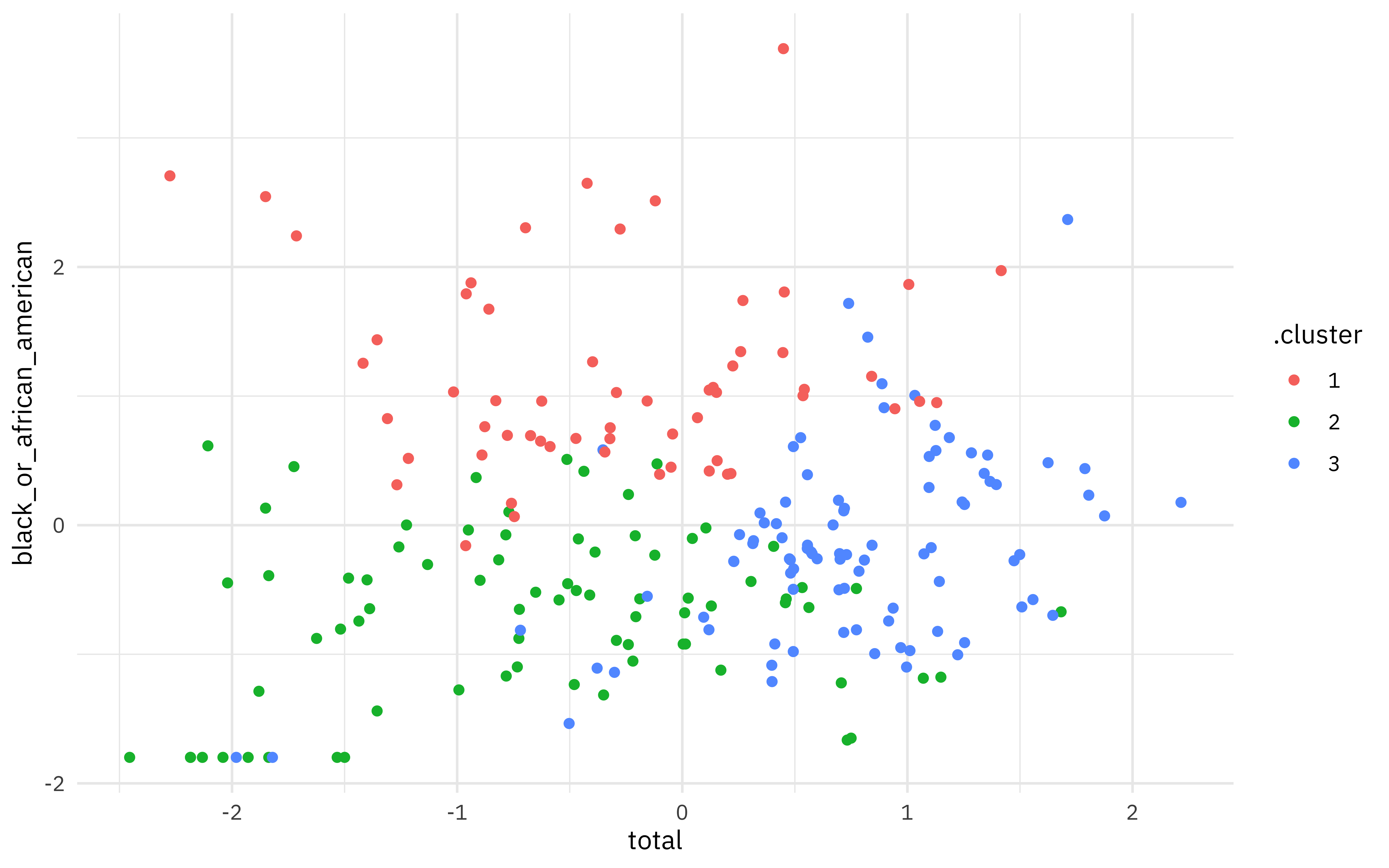
Choosing k
We used k = 3 but how do we know that’s right? There are lots of complicated or “more art than science” ways of choosing k. One way is to look at the total within-cluster sum of squares and see if it stops dropping off so quickly at some value for k. We can get that from another verb from broom, glance(); let’s try lots of values for k and see what happens to the total sum of squares.
kclusts <-
  tibble(k = 1:9) %>%
  mutate(
    kclust = map(k, ~ kmeans(select(employment_demo, -occupation), .x)),
    glanced = map(kclust, glance)
  )

kclusts %>%
  unnest(cols = c(glanced)) %>%
  ggplot(aes(k, tot.withinss)) +
  geom_line(alpha = 0.5, size = 1.2, color = "midnightblue") +
  geom_point(size = 2, color = "midnightblue")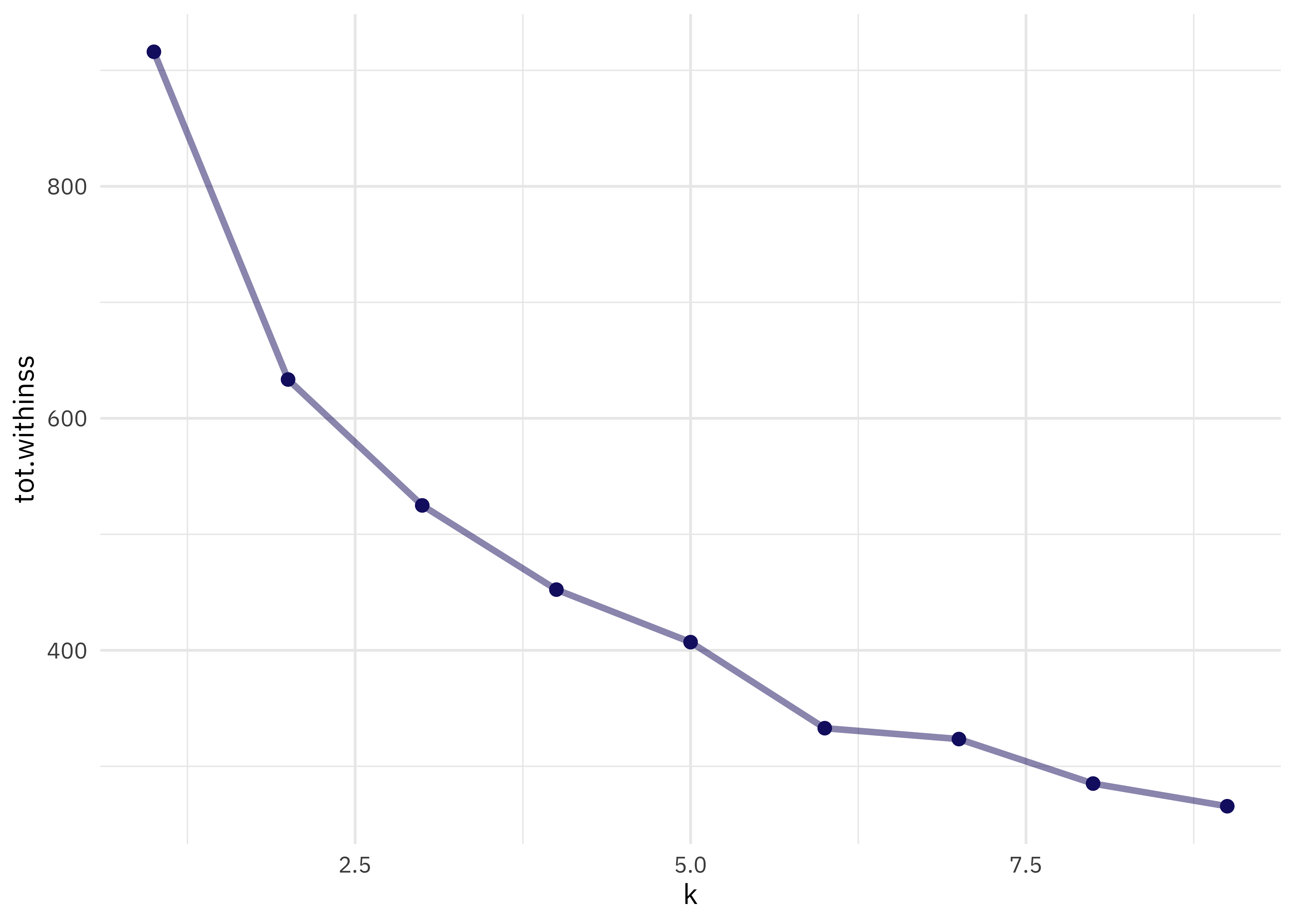
I don’t see a major “elbow” 💪 but I’d say that k = 5 looks pretty reasonable. Let’s fit k-means again.
final_clust <- kmeans(select(employment_demo, -occupation), centers = 5)To visualize this final result, let’s use plotly and add the occupation name to the hover so we can mouse around and see which occupations are more similar.
library(plotly)

p <- augment(final_clust, employment_demo) %>%
  ggplot(aes(total, women, color = .cluster, name = occupation)) +
  geom_point()

ggplotly(p, height = 500)
Remember that you can switch out the axes for asian or black_or_african_american to explore dimensions.
- Posted on:
- February 24, 2021
- Length:
- 4 minute read, 833 words
- Categories:
- rstats tidymodels
- Tags:
- rstats tidymodels