Practice using lubridate... THEATRICALLY
By Julia Silge
August 26, 2019
I am so pleased to now be an RStudio-certified tidyverse trainer! 🎉 I have been teaching technical content for decades, whether in a university classroom, developing online courses, or leading workshops, but I still found this program valuable for my own professonal development. I learned a lot that is going to make my teaching better, and I am happy to have been a participant. If you are looking for someone to lead trainings or workshops in your organization, you can check out this list of trainers to see who might be conveniently located to you!
Part of the certification process is delivering a demonstration lesson. I quite like the content of the demonstration lesson I built and I might not use it in an actual workshop anytime soon, so I decided to expand upon it and share it here as a blog post. My demonstration focused on handling dates using lubridate; dates and times are important in data analysis, but they can often be challenging. In this post, we will explore some wild caught date data from the London Stage Database 🎭 and explore how to handle these dates using the lubridate package.
Read in the London Stage Database
Learn more about the London Stage Database, including about the data provenance and code used to build the database. Briefly, it explores the theater scene in London from when playhouses were reopened in 1660 after the English civil wars to the end of the 18th century.
(H/T for this dataset to Data is Plural by Jeremy Singer-Vine, one of the most fun newsletters I subscribe to.)
To start, we are going to download, unzip, and open up the full London Stage Database.
Notes:
- The chunk below downloads the dataset to the working directory.
- This is a pretty sizeable dataset, so if you run this yourself, be patient while it opens up!
library(tidyverse)

json_path <- "https://londonstagedatabase.usu.edu/downloads/LondonStageJSON.zip"
download.file(json_path, "LondonStageJSON.zip")
unzip("LondonStageJSON.zip")
london_stage_raw <- jsonlite::fromJSON("LondonStageFull.json") %>%
    as_tibble()
Finding the dates
There are thirteen columns in this data. Let’s take a moment and look at the column names and content of the first few lines. Which of these columns contains the date informaiton?
london_stage_raw## # A tibble: 52,617 x 13
## EventId EventDate TheatreCode Season Volume Hathi CommentC TheatreId
## <chr> <chr> <chr> <chr> <chr> <chr> <chr> <chr>
## 1 0 16591029 city 1659-… 1 "" The <i>… 63
## 2 1 16591100 mt 1659-… 1 "" On 23 N… 206
## 3 2 16591218 none 1659-… 1 "" Represe… 1
## 4 3 16600200 mt 1659-… 1 "" 6 Feb. … 206
## 5 4 16600204 cockpit 1659-… 1 "" $Thomas… 73
## 6 5 16600328 dh 1659-… 1 "" At <i>D… 90
## 7 6 16600406 none 1659-… 1 "" "" 1
## 8 7 16600412 vh 1659-… 1 "" Edition… 319
## 9 8 16600413 fh 1659-… 1 "" <i>The … 116
## 10 9 16600416 none 1659-… 1 "" "" 1
## # … with 52,607 more rows, and 5 more variables: Phase2 <chr>,
## # Phase1 <chr>, CommentCClean <chr>, BookPDF <chr>, Performances <list>The EventDate column contains the date information, but notice that R does not think it’s a date!
class(london_stage_raw$EventDate)## [1] "character"R thinks this is a character (dates encoded like "16591029"), because of the details of the data and the type guessing used by the process of reading in this data. This is NOT HELPFUL for us, as we need to store this information as a date type 📆 in order to explore the dates of this London stage data. We will use a function ymd() from the lubridate package to convert it. (There are other similar functions in lubridate, like ymd_hms() if you have time information, mdy() if your information is arranged differently, etc.)
library(lubridate)

london_stage <- london_stage_raw %>%
    mutate(EventDate = ymd(EventDate)) %>%
    filter(!is.na(EventDate))
## Warning: 378 failed to parse.Notice that we had some failures here; there were a few hundred dates with a day of 00 that could not be parsed. In the filter() line here, I’ve filtered those out.
What happens now if I check the class of the EventDate column?
class(london_stage$EventDate)## [1] "Date"We now have a column of type Date 🙌 which is just what we need. In this lesson we will explore what we can learn from this kind of date data.
Getting years and months
This dataset on the London stage spans more than a century. How can we look at the distribution of stage events over the years? The lubridate package contains functions like year() that let us get year components of a date.
year(today())## [1] 2019Let’s count up the stage events by year in this dataset.
london_stage %>%
    mutate(EventYear = year(EventDate)) %>%
    count(EventYear)
## # A tibble: 142 x 2
## EventYear n
## <dbl> <int>
## 1 1659 2
## 2 1660 58
## 3 1661 138
## 4 1662 91
## 5 1663 68
## 6 1664 53
## 7 1665 20
## 8 1666 30
## 9 1667 149
## 10 1668 147
## # … with 132 more rowsLooks to me like there are some big differences year-to-year. It would be easier to see this if we made a visualization.
london_stage %>%
    count(EventYear = year(EventDate)) %>%
    ggplot(aes(EventYear, n)) +
    geom_area(fill = "midnightblue", alpha = 0.8) +
    labs(y = "Number of events",
         x = NULL)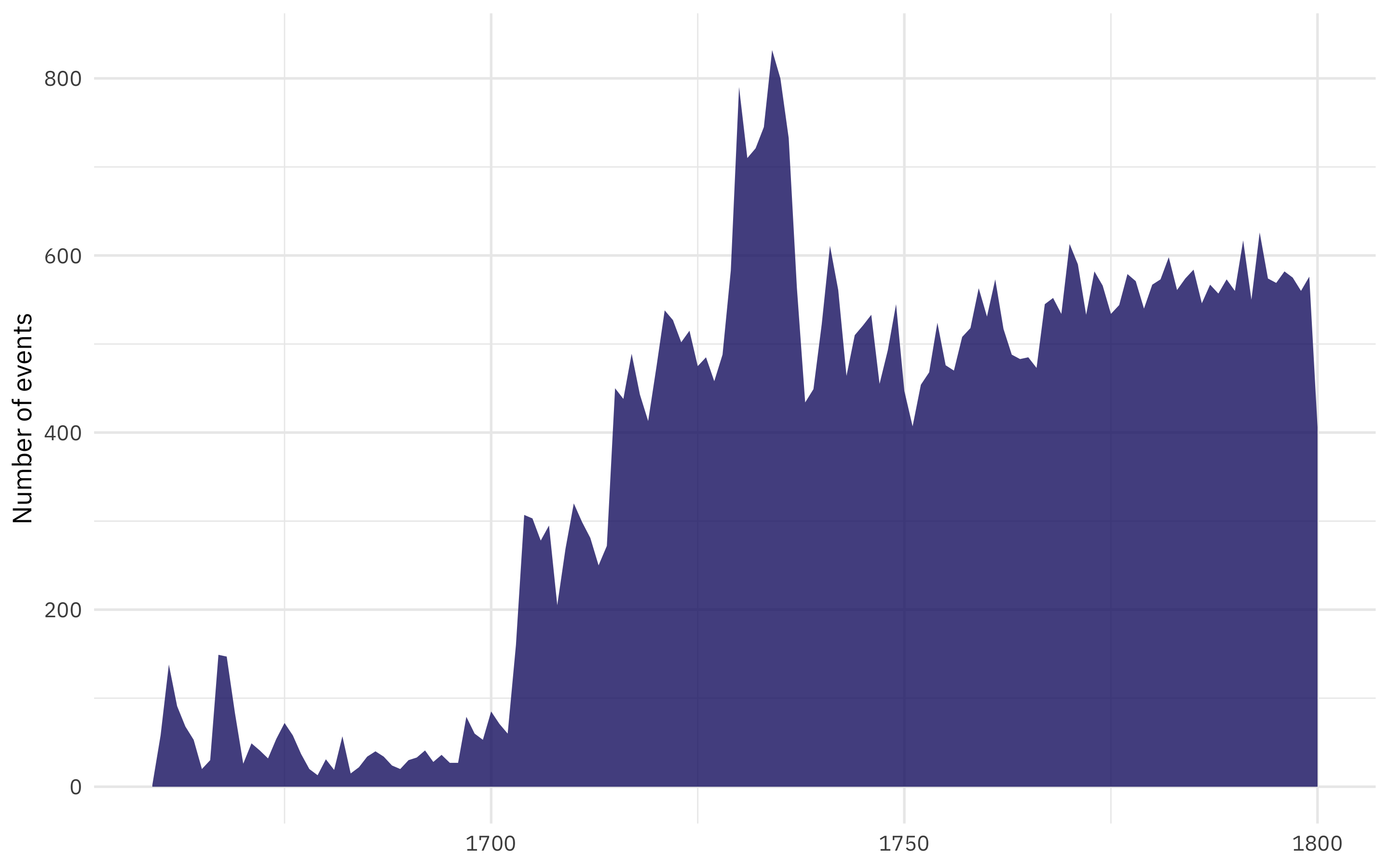
There was a dramatic increase in theater events between about 1710 and 1730. After 1750, the yearly count looks pretty stable.
Do we see month-to-month changes? The lubridate package has a function very similar to year() but instead for finding the month of a date.
london_stage %>%
    ggplot(aes(month(EventDate))) +
    geom_bar(fill = "midnightblue", alpha = 0.8) +
    labs(y = "Number of events")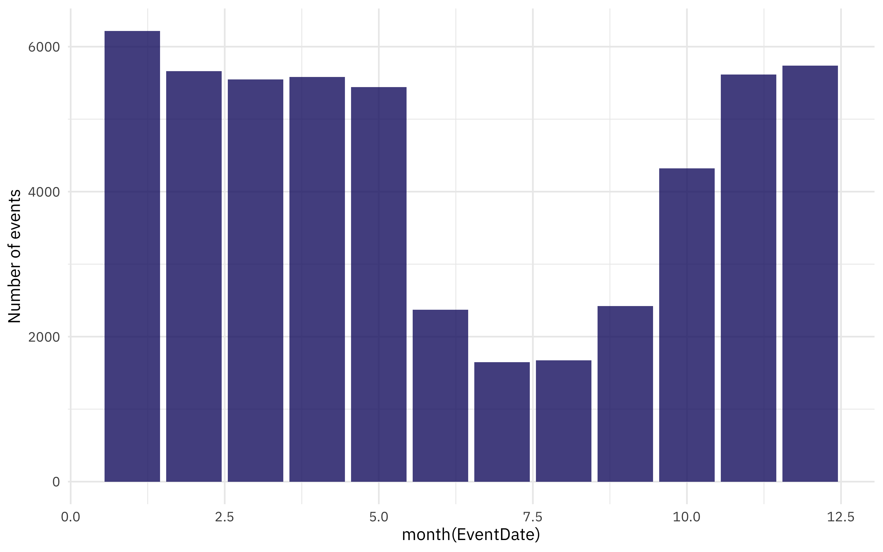
Wow, that is dramatic! There are dramatically fewer events during the summer months than the rest of the year. We can make this plot easier to read by making a change to how we call the month() function, with label = TRUE.
london_stage %>%
    ggplot(aes(month(EventDate, label = TRUE))) +
    geom_bar(fill = "midnightblue", alpha = 0.8) +
    labs(x = NULL,
         y = "Number of events")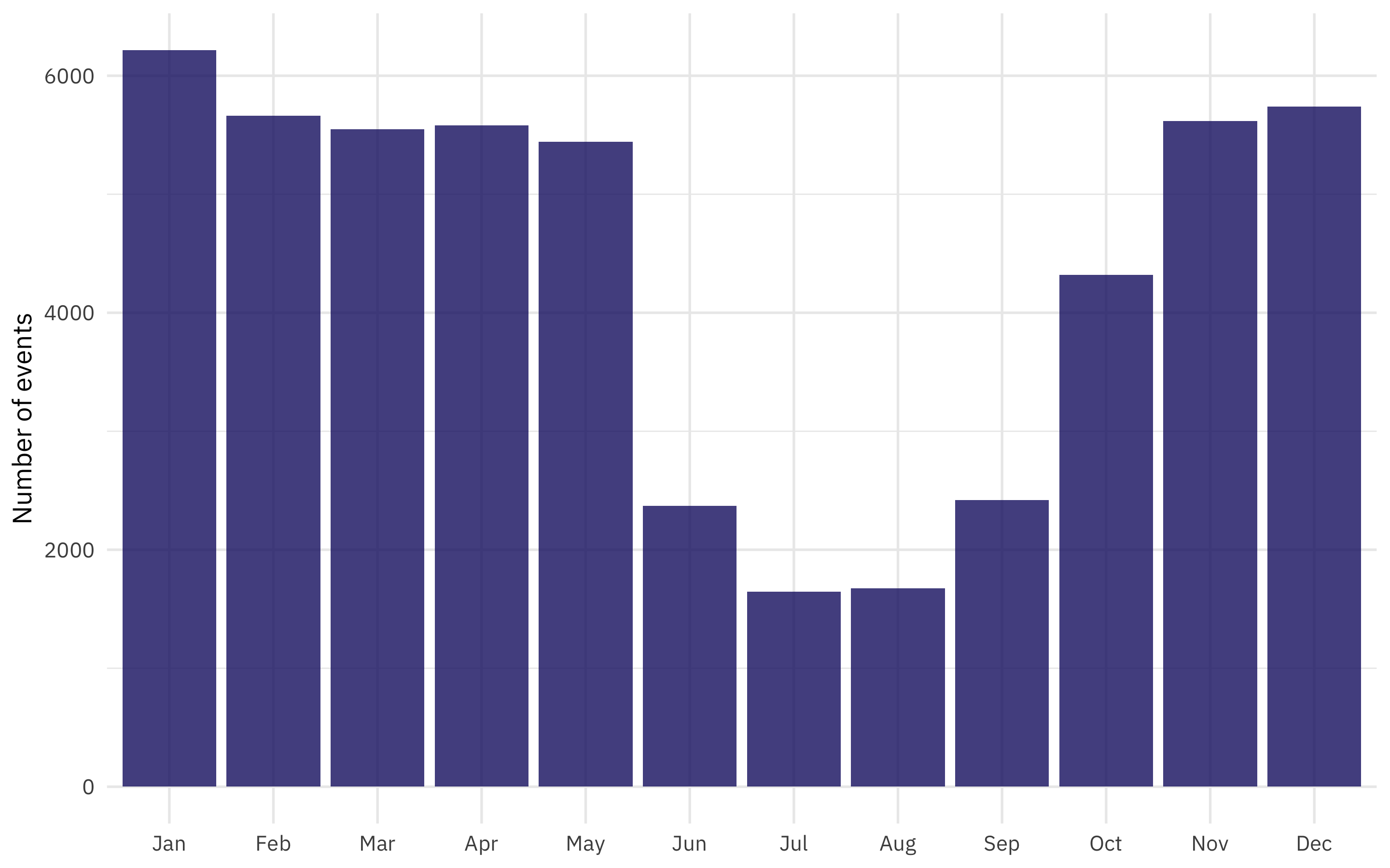
When you use label = TRUE here, the information is being stored as an ordered factor.
In this dataset, London playhouses staged the most events in January.
OK, one more! What day of the week has more theater events? The lubridate package has a function wday() package to get the day of the week for any date. This function also has a label = TRUE argument, like month().
london_stage %>%
    ggplot(aes(wday(EventDate, label = TRUE))) +
    geom_bar(fill = "midnightblue", alpha = 0.8) +
    labs(x = NULL,
         y = "Number of events")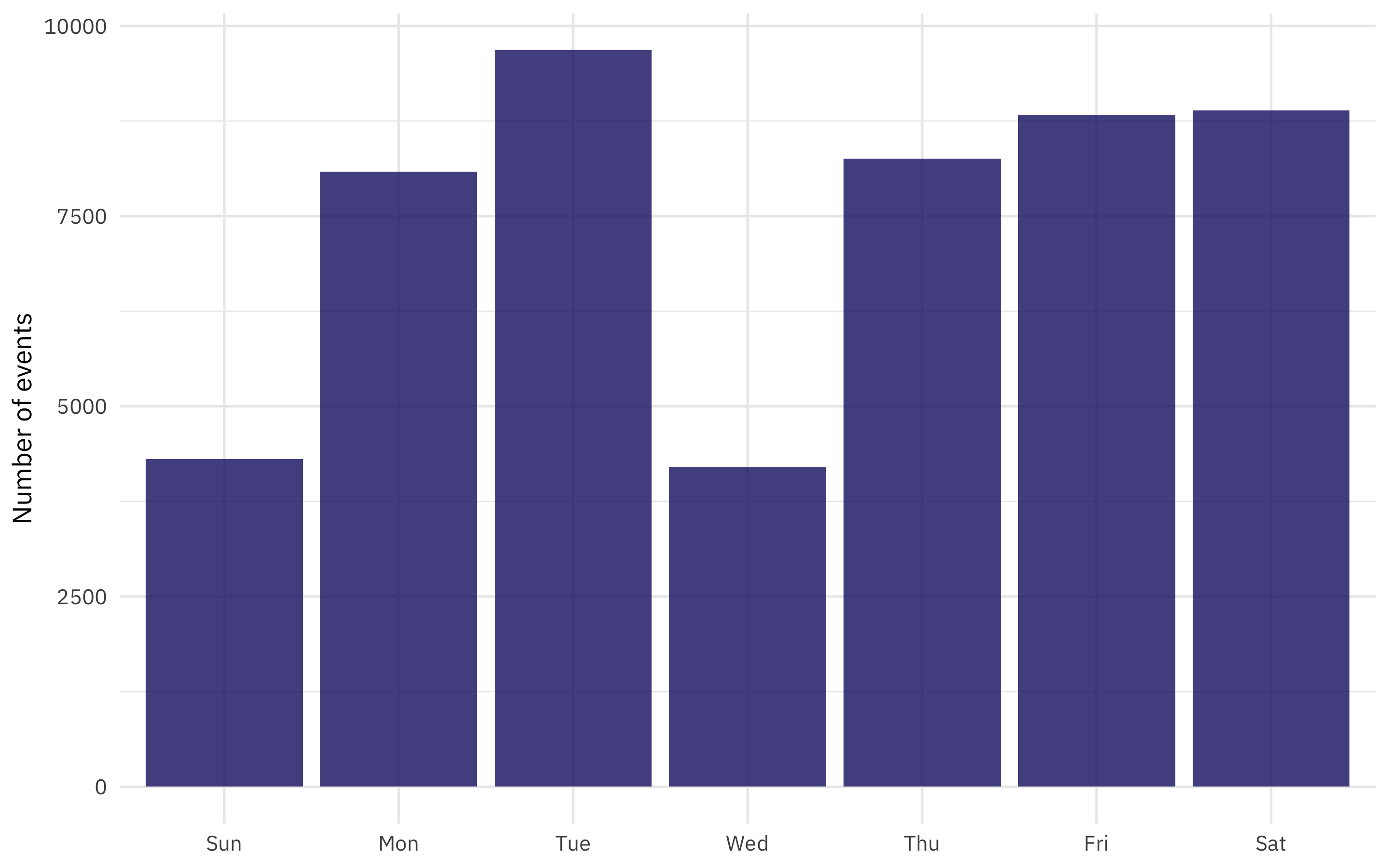
London theaters did not stage events on Sunday or Wednesday. Who knew?!?
Time differences
One of the most challenging parts of handling dates is finding time intervals, and lubridate can help with that!
Let’s look at the individual theaters (tabulated in TheatreId) and see how long individual theaters tend to be in operation.
london_by_theater <- london_stage %>%
    filter(TheatreCode != "none") %>%
    group_by(TheatreCode) %>%
    summarise(TotalEvents = n(),
              MinDate = min(EventDate),
              MaxDate = max(EventDate),
              TimeSpan = as.duration(MaxDate - MinDate)) %>%
    arrange(-TotalEvents)

london_by_theater
## # A tibble: 233 x 5
## TheatreCode TotalEvents MinDate MaxDate
## <chr> <int> <date> <date>
## 1 dl 18451 1674-03-26 1800-06-18
## 2 cg 12826 1662-05-09 1800-06-16
## 3 hay 5178 1720-12-29 1800-09-16
## 4 king's 4299 1714-10-23 1800-08-02
## 5 lif 4117 1661-06-28 1745-10-07
## 6 gf 1832 1729-10-31 1772-10-23
## 7 queen's 884 1705-04-09 1714-06-23
## 8 marly 403 1750-08-16 1776-08-10
## 9 bf 257 1661-08-22 1767-09-07
## 10 dg 235 1671-06-26 1706-11-28
## # … with 223 more rows, and 1 more variable: TimeSpan <Duration>We have created a new dataframe here, with one row for each theater. The columns tell us
- how many theater events that theater had
- the first date that theater had an event
- the last date that theater had an event
- the duration of the difference between those two
A duration is a special concept in lubridate of a time difference, but don’t get too bogged down in this. How did we calculate this duration? We only had to subtract the two dates, and then wrap it in the lubridate function as.duration().
Look at the data type that was printed out at the top of the column for TimeSpan; it’s not numeric, or integer, or any of the normal data types in R. It says <Duration>.
What do you think will happen if we try to make to make a histogram for TimeSpan?
london_by_theater %>%
    filter(TotalEvents > 100) %>%
    ggplot(aes(TimeSpan)) +
    geom_histogram(bins = 20)
## Error: Incompatible duration classes (Duration, numeric). Please coerce with `as.duration`.
We have an error! 🙀 This “duration” class is good for adding and subtracting dates, but less good once we want to go about plotting or doing math with other kinds of data (like, say, the number of total events). We need to coerce this to something more useful, now that we’re done subtracting the dates.
Data that is being stored as a duration can be coerced with as.numeric(), and you can send another argument to say what kind of time increment you want back. For example, what if we want the number of years that each of these theaters was in operation in this dataset?
london_by_theater %>%
    mutate(TimeSpan = as.numeric(TimeSpan, "year"))
## # A tibble: 233 x 5
## TheatreCode TotalEvents MinDate MaxDate TimeSpan
## <chr> <int> <date> <date> <dbl>
## 1 dl 18451 1674-03-26 1800-06-18 126.
## 2 cg 12826 1662-05-09 1800-06-16 138.
## 3 hay 5178 1720-12-29 1800-09-16 79.7
## 4 king's 4299 1714-10-23 1800-08-02 85.8
## 5 lif 4117 1661-06-28 1745-10-07 84.3
## 6 gf 1832 1729-10-31 1772-10-23 43.0
## 7 queen's 884 1705-04-09 1714-06-23 9.20
## 8 marly 403 1750-08-16 1776-08-10 26.0
## 9 bf 257 1661-08-22 1767-09-07 106.
## 10 dg 235 1671-06-26 1706-11-28 35.4
## # … with 223 more rowsA number of these theaters had events for over a century!
If we wanted to see the number of months that each theater had events, we would change the argument.
london_by_theater %>%
    mutate(TimeSpan = as.numeric(TimeSpan, "month"))
## # A tibble: 233 x 5
## TheatreCode TotalEvents MinDate MaxDate TimeSpan
## <chr> <int> <date> <date> <dbl>
## 1 dl 18451 1674-03-26 1800-06-18 1515.
## 2 cg 12826 1662-05-09 1800-06-16 1657.
## 3 hay 5178 1720-12-29 1800-09-16 957.
## 4 king's 4299 1714-10-23 1800-08-02 1029.
## 5 lif 4117 1661-06-28 1745-10-07 1011.
## 6 gf 1832 1729-10-31 1772-10-23 516.
## 7 queen's 884 1705-04-09 1714-06-23 110.
## 8 marly 403 1750-08-16 1776-08-10 312.
## 9 bf 257 1661-08-22 1767-09-07 1272.
## 10 dg 235 1671-06-26 1706-11-28 425.
## # … with 223 more rowsWe can use this kind of transformation to see the relationship between the number of events and length of time in operation. Convert the Duration object to a numeric value in months in order to make a plot.
library(ggrepel)

london_by_theater %>%
    mutate(TimeSpan = as.numeric(TimeSpan, "month")) %>%
    filter(TotalEvents > 10) %>%
    ggplot(aes(TimeSpan, TotalEvents, label = TheatreCode)) +
    geom_smooth(method = "lm") +
    geom_label_repel(family = "IBMPlexSans") +
    geom_point() +
    scale_x_log10() +
    scale_y_log10() +
    labs(x = "Months that theater was in operation",
         y = "Total events staged by theater")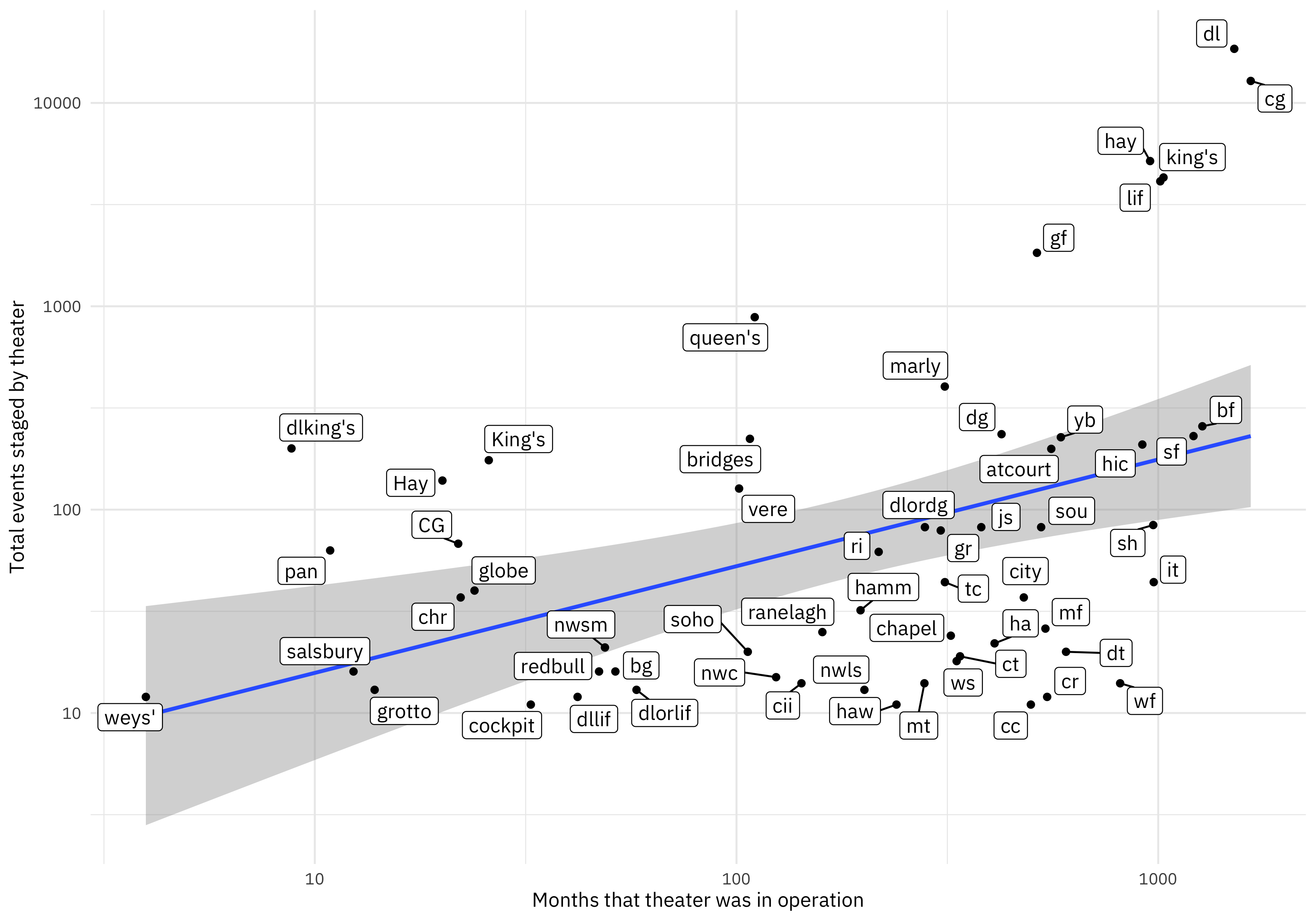
It makes sense that theaters open much longer had many more events, but we can also notice which theaters are particularly high or low in this chart. Theaters high in this chart hosted many events for how long they were in operation, and theaters low in this chart hosted few events for how long they were open.
This plot opens up many more possibilities for exploration, such as whether theaters were in constant operation or took breaks. Further date handling offers the ability to address such questions! Let me know if you have any questions. 📆